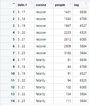
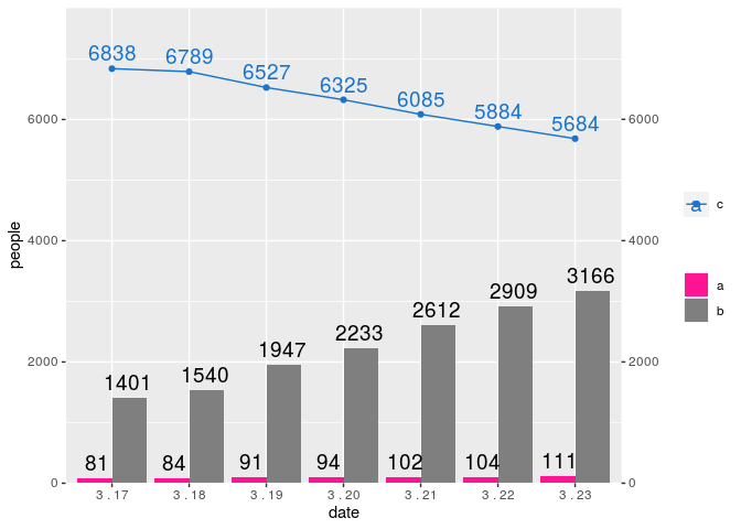
I would like to show the barplot and plot graph together on one graph like the attached picture using ggplot2. But if you follow the code I attached, Error: stat_count() can only have an x or y aesthetic. Please tell me how to solve it.
Can you please share a small part of the data set in a copy-paste friendly format?
In case you don't know how to do it, there are many options, which include:

I just saved this data to the r object.
ex) date.1 <- paste(3, "." , 17:23)
It is unlikely that someone is going to type your data from a screenshot just to help you with your problem, please post the data in a copy/paste friendly format using one of the methods I mentioned before.
Ideally, you should make your questions providing a proper REPRoducible EXample (reprex) illustrating your issue.
ing <- c(6838, 6789, 6527, 6325, 6085, 5884, 5684)
a <- paste(3, ".", 17:23)
b <- c(1401, 1540, 1947, 2233, 2612, 2909, 3166)
c <- c(81, 84, 91, 94, 102, 104, 111)
df <- data.frame(a, b, c, stringsAsFactors = FALSE)
I don't understand your code but this should take you very close to what you want
library(tidyverse)

df <- data.frame(
    stringsAsFactors = FALSE,
    date = c("3 . 17","3 . 18","3 . 19",
             "3 . 20","3 . 21","3 . 22","3 . 23"),
    recover = c(1401, 1540, 1947, 2233, 2612, 2909, 3166),
    fatality = c(81, 84, 91, 94, 102, 104, 111),
    ing = c(6838, 6789, 6527, 6325, 6085, 5884, 5684)
)

plot_data <- df %>%
    mutate(date = fct_inorder(date)) %>%
    pivot_longer(-date, names_to = "state", values_to = "people")

ggplot(mapping = aes(x = date, y = people, label = people)) +
    geom_col(data = plot_data %>% filter(state != "ing"),
             aes(fill = state), position = "dodge")+
    geom_text(data = plot_data %>% filter(state != "ing"),
              aes(group = state),
              vjust = -0.5,
              size = 5, position = position_dodge(0.8)) +
    geom_point(data = plot_data %>% filter(state == "ing"),
               aes(color = state)) +
    geom_line(data = plot_data %>% filter(state == "ing"),
               aes(color = state, group = 1)) +
    geom_text(data = plot_data %>% filter(state == "ing"),
              aes(color = state),
              size = 5,
              vjust = -0.5) +
    scale_y_continuous(expand = expansion(add = c(0, 1000)),
                       sec.axis = sec_axis(trans = ~.)) +
    scale_fill_manual(name = "",
                      values = c("Deep Pink", "Grey 50"),
                      labels = c("a", "b")) +
    scale_colour_manual(name = "",
                        values = "Dodger Blue 3",
                        labels = "c")

Created on 2021-05-22 by the reprex package (v2.0.0)
This topic was automatically closed 7 days after the last reply. New replies are no longer allowed.
If you have a query related to it or one of the replies, start a new topic and refer back with a link.