Greetings all,
I'm trying to produce a plot like the one below:
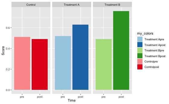
library(tidyverse)

# Create dummy data:
foo <- tibble(
  Group = rep(c("Treatment A", "Treatment B", "Control"), each = 2),
  Time = factor(rep(c(0, 1), times = 3), labels = c("pre", "post")),
  Score = c(0.52, 0.63, 0.49, 0.76, 0.51, 0.49),
  my_colors = factor(1:6, labels = paste0(Group, c("pre", "post")))
)

# Plot dummy data:
foo %>% ggplot(aes(x = Time, y = Score, fill = my_colors)) +
  geom_bar(stat = "identity") +
  facet_wrap(~ Group) +
  scale_fill_brewer(palette = "Paired")
 !
!
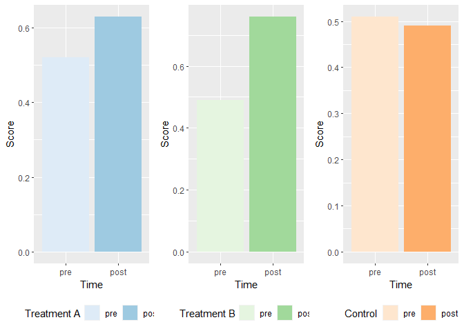
It's pretty intuitive what's going on, visually: each group is assigned a general color category, and the "levels" of each group is assigned a shade of that color.
The problem is I can't find a way of making the legend fit this simple pattern. In my mind at least it should be as simple as something like this:
foo %>% ggplot(
  aes(
    x = Time,
    y = Score,
    fill = c("Group", "Time") # This will yield an error
  )
) # + geom_... (and so on)
Do you know of any method or package that can help me achieve this? Thanks for taking the time.
Edit: What I would like to see is a separate legend for each group. Taking the above plot as an example, one legend header would read "Treatment A" and below it would be two blue color swatches, each labelled "pre" and "post"; below that would be another legend header reading "Treatment B" with its color swatches and labels below, etc.