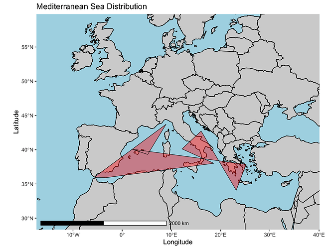
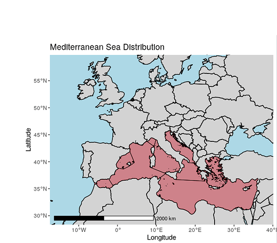
I desperately need help, I am very much a beginner with R and I need to make maps showing the previous and new distribution of a species. I downloaded a free shapefile from: Marine Regions · Mediterranean Sea (IHO Sea Area) which is supposed to spatially map the mediterranean sea (for me the previous species distribution). When I run my code my images look like this:
I need the red part to cover the mediterranean sea not be weird triangle shapes like it is now.
Here is the code:
# These were just for the basic map of the mediterranean sea
library("ggplot2")
library("sf")
library("rnaturalearth")
library("rnaturalearthdata")
library("rgeos")
library("ggspatial")
library("scales")
library("rgdal")

#This is for the map of just the Med without the distribution layer
world <- ne_countries(scale = "medium", returnclass = "sf")


shape <- st_read("~/Desktop/iho/iho.shp")
Medfill <- fortify(shape)

Med <- ggplot(data = world) +
  geom_sf(color = "black", fill = "light grey") +
  annotation_scale(location = "bl", width_hint = 0.5) +
  geom_polygon(aes(x = longitude, y = latitude), data = shape,
               colour = 'black', fill = 'red', alpha = .4, size = .3) +
  xlab("Longitude") + ylab("Latitude") +
  coord_sf(xlim = c(-17.43, 40.08), ylim = c(28.33, 59.80), expand = FALSE) +
  ggtitle("Mediterranean Sea Distribution") +
  theme(panel.grid.major = element_line(color = gray(.25), linetype = "blank",
            size = 0.2), panel.background = element_rect(fill = "light blue"))

plot_grid(Med)

