I cannot get R to plot the Inverse AR and MA roots on the unit circle. It just stopped plotting the unit circle replacing it with an overlay instead. However, when I ran the reprex it plotted the unit circle. When I tried again without the reprex I got the overlay. Please help, I need to complete this report, and everything I have tried has failed. Any help is greatly appreciated.
library("forecast")
library("ggplot2")
library("devtools")
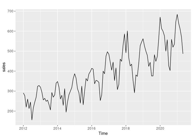
Data Set
Jan Feb Mar Apr May Jun Jul Aug Sep Oct Nov Dec
2012 291 277 220 260 213 245 156 216 245 270 324 328
2013 320 295 256 264 249 255 233 206 293 270 281 340
2014 348 320 261 279 229 312 195 246 282 300 318 363
2015 387 365 312 292 240 325 232 301 363 351 386 398
2016 414 410 337 354 351 344 253 281 400 387 475 497
2017 485 444 405 445 353 416 308 333 460 449 530 586
2018 492 601 466 426 435 353 292 381 374 440 527 546
2019 562 526 500 479 424 444 376 376 482 449 473 560
2020 670 613 600 577 500 557 427 403 559 520 535 646
2021 684 640 611 570 487
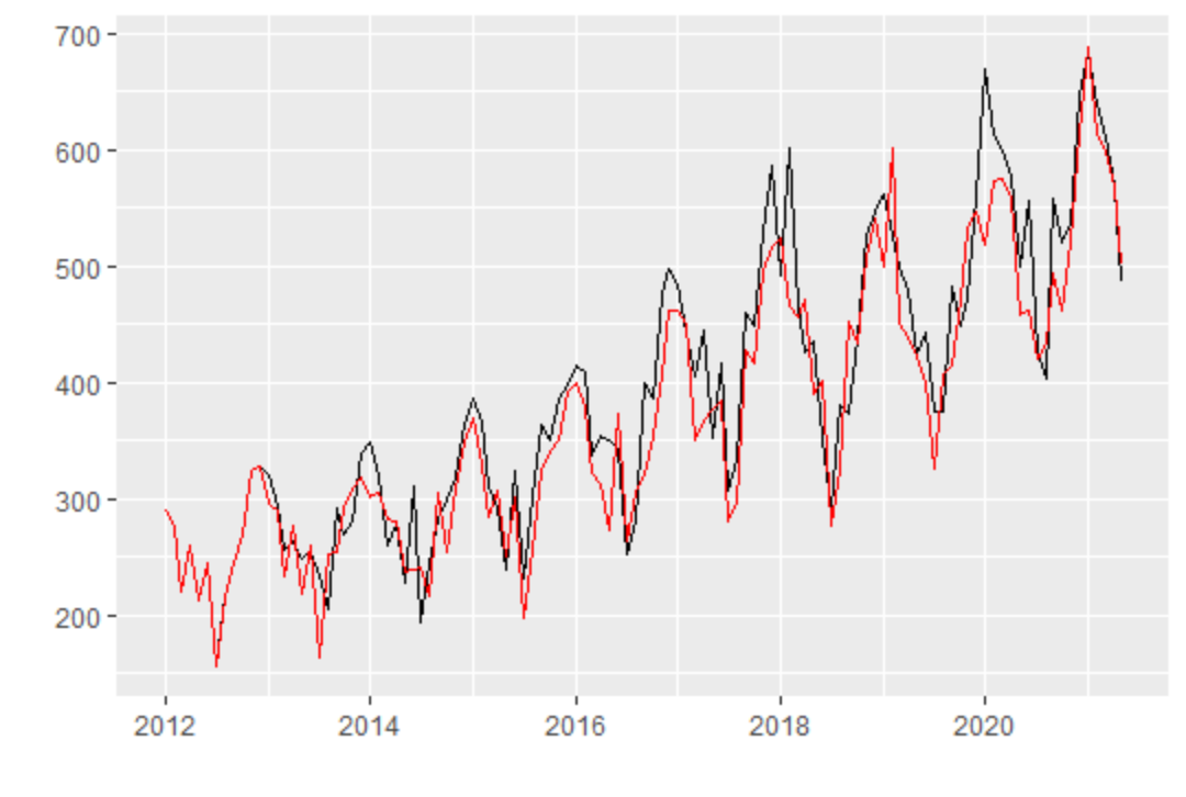
Sales.model = Arima(Sales, order=c(0,0,3), seasonal = c(0,1,1))
autoplot(Sales.model, type = c("both"))
When I run autoplot:
When reprex runs autoplot:
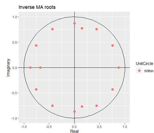
Created on 2021-12-30 by the reprex package (v2.0.1)