Hi,
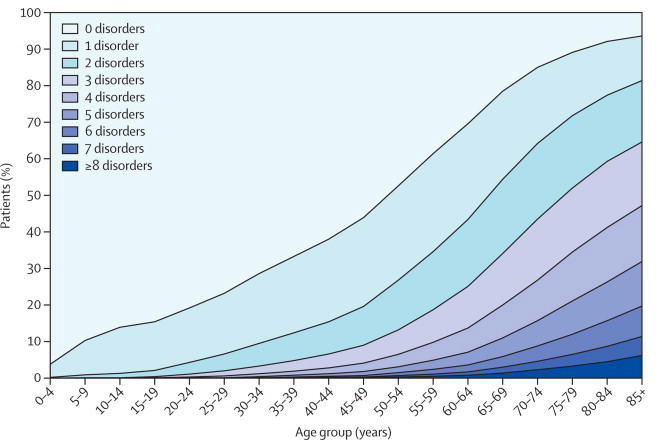
I want to plot population prevalence of different conditions: MM_binary, CMM_ICD, CMM_MP, CMM_DP, CMM_ASM as y axis, age as x. Age is in df, continuous (Age) and factorised (age_group), could be either.
CMM_dummy_df %>%
group_by(age_group, CMM_binary) %>%
summarise(n = n()) %>%
mutate(pct = round(n/sum(n)*100, 1)) %>%
ggplot(aes(x = age_group, y = pct)) +
geom_point() +
geom_path()
This gives a plot with vertical lines only.
I have dummy df in a google doc at https://docs.google.com/spreadsheets/d/1ck8W1mYQDvZEeXfZ-7Edsaawo2cvwynY32dPyI58cGM/edit#gid=0
Any advice gratefully received.
Thanks
