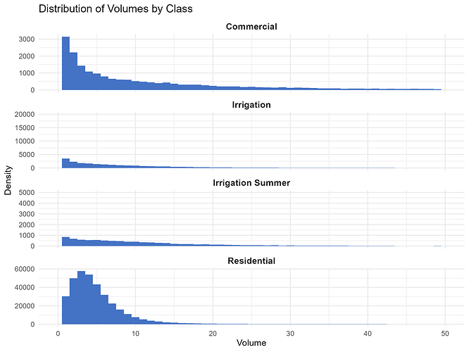
Hi all, I am trying to plot histograms showing the distribution of water consumption volumes (column 'volume_kgal') by different classes of customer (column 'class').
When I try to plot this as a histogram, the bars for some customer classes are "compressed" on the vertical axis, even though I used the argument scales = "free_y".
Please see below, where "Irrigation" and "Irrigation Summer" plots do not make use of the full vertical axis:
Here is my code:
df_all |>

  ggplot(aes(x = volume_kgal)) +
  geom_histogram(binwidth = 1, alpha = 1, fill = "#4472C4") +
  facet_wrap(~ class,
             ncol = 1,
             scales = "free_y",
             ) +
  labs(
    title = "Distribution of Volumes by Class",
    x = "Volume",
    y = "Density"
  ) +
  scale_x_continuous(limits = c(0, 30)) +  #
  theme_minimal() +
  theme(
    strip.text = element_text(size = 11, face = "bold")  # Customize facet labels
  )
Any ideas on how to fix this? I have tried removing the scale_x_continuous line but that doesn't help. Thank you!
