ggplot2 Error Bars only 1 direction (dependent on group)

Hello Everyone,

I apologize if this question has been asked already somewhere. I have found some forum posts but with no great solutions for my current situation.

I have the following made-up example data set:

'''

 Subject <- c(1,2,3,1,2,3,1,2,3,1,2,3,1,2,3,1,2,3)
 Condition <- c("A", "A", "A", "A", "A", "A", "B", "B", "B", "B", "B", "B", "C", "C", "C", "C", "C", "C")
 Time <- c(1,1,1,2,2,2,1,1,1,2,2,2,1,1,1,2,2,2)
 Value1 <- c(600,550,450,300,325,250,610,545,453,323,299,280,575,560,475,100,140,85)

 DF1 <- data.frame (Subject, Condition, Time, Value1)

'''

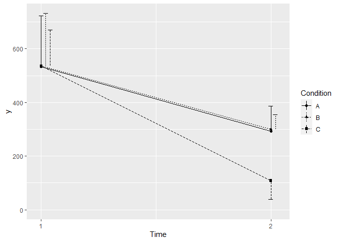
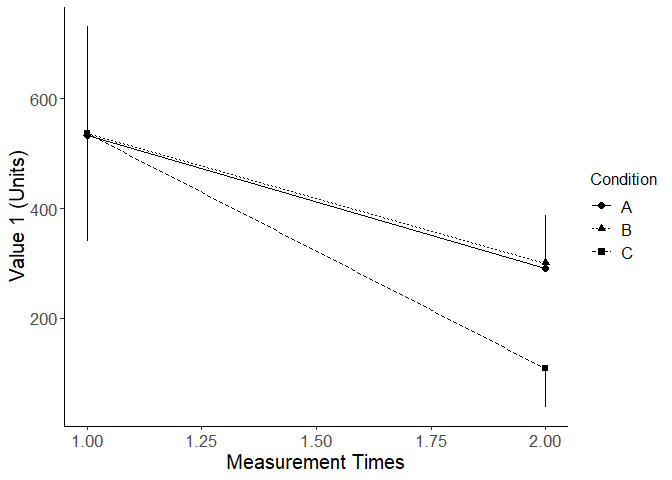
I have using ggplot to graph this data via line graph with error bars. The goal of this graph is to create an academic publication-ready figure. Therefore, due to the fact that I have large standard deviations (they are even larger in the real data), I would like to only show the upper error bar for the condition with the highest line, and the lower error bar for the conditions with lower lines to try and visually clean this up.

In my example data frame, there is only one Value however, in reality I have 9 Value variables for each Subject, in each condition, for each time. As a result, I would like to avoid (if possible) manually calculating the mean and SD for each of these combinations.

I am currently using the following ggplot code:

'''

 PublicationPlot <-ggplot(DF1, aes(Time, Value1, shape = Condition))
 PublicationPlot + stat_summary(fun = mean,
                                geom = "point",
                                 size= 2,
                                 aes(group = Condition))+
                   stat_summary(fun= mean, 
                                geom = "line",
                                aes(group = Condition,
                                linetype = Condition)) +
                   stat_summary(fun.data = mean_cl_normal,
                                geom = "errorbar",
                                width = 0.075,
                               aes(group = Condition))+
                   xlab("Measurement Times")+
                   ylab("Value 1 (Units)")+
       theme(panel.grid.major = element_blank(),
             panel.grid.minor = element_blank(),
             panel.background = element_blank(),
             axis.line=element_line(color = "black"),
             legend.key = element_rect(fill= "white"),
             axis.title.x = element_text(size = 15),
             axis.text.x = element_text(size = 13),
             axis.title.y = element_text(size = 15),
             axis.text.y = element_text(size = 13),
             legend.title = element_text( size=12), 
             legend.text=element_text(size=12))

'''''

Any help on this problem would be incredible. Thank you for your time and expertise. I look forward to learning from you.
Hi @zmcclean,
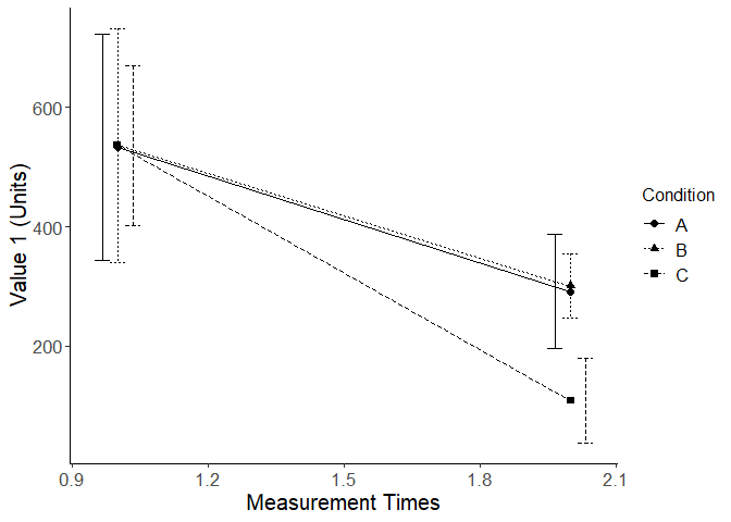
If you just "dodge" the position of the error bars and adjust the line type, I think the graph looks pretty good:

suppressPackageStartupMessages(library(tidyverse))

Subject <- c(1,2,3,1,2,3,1,2,3,1,2,3,1,2,3,1,2,3)
Condition <- c("A", "A", "A", "A", "A", "A", "B", "B", "B", "B", "B", "B", "C", "C", "C", "C", "C", "C")
Time <- c(1,1,1,2,2,2,1,1,1,2,2,2,1,1,1,2,2,2)
Value1 <- c(600,550,450,300,325,250,610,545,453,323,299,280,575,560,475,100,140,85)

DF1 <- data.frame (Subject, Condition, Time, Value1)

ggplot(DF1, aes(Time, Value1, shape = Condition)) +
 stat_summary(fun = mean,
              geom = "point",
               size= 2,
               aes(group = Condition))+
 stat_summary(fun= mean, 
              geom = "line",
              aes(group = Condition,
              linetype = Condition)) +
 stat_summary(fun.data = mean_cl_normal,
              geom = "errorbar",
              width = 0.1,
              position="dodge",
              aes(group = Condition, linetype=Condition))+
 xlab("Measurement Times")+
 ylab("Value 1 (Units)")+
       theme(panel.grid.major = element_blank(),
             panel.grid.minor = element_blank(),
             panel.background = element_blank(),
             axis.line=element_line(color = "black"),
             legend.key = element_rect(fill= "white"),
             axis.title.x = element_text(size = 15),
             axis.text.x = element_text(size = 13),
             axis.title.y = element_text(size = 15),
             axis.text.y = element_text(size = 13),
             legend.title = element_text( size=12), 
             legend.text=element_text(size=12))

Created on 2021-11-26 by the reprex package (v2.0.1)

1 Like

Hello DavoWW thank you for your suggestion!

In my original figure I had implemented exactly what you had suggested with dodged error bars. However, this is not acceptable for the journals I wish to be publishing in and therefore my primary issue of only displaying the upper error bar for the higher condition and the lower error bar for the lower conditions remains.

Here is a sketch of how I would approach this. The CL lines are not entirely honest in that they are anchored to the Condition with the maximum or minimum mean, which may not be the Condition that generated the maximum or minimum CL value.

library(dplyr)
#> 
#> Attaching package: 'dplyr'
#> The following objects are masked from 'package:stats':
#> 
#>     filter, lag
#> The following objects are masked from 'package:base':
#> 
#>     intersect, setdiff, setequal, union
library(Hmisc)
#> Warning: package 'Hmisc' was built under R version 4.1.2
#> Loading required package: lattice
#> Loading required package: survival
#> Loading required package: Formula
#> Loading required package: ggplot2
#> 
#> Attaching package: 'Hmisc'
#> The following objects are masked from 'package:dplyr':
#> 
#>     src, summarize
#> The following objects are masked from 'package:base':
#> 
#>     format.pval, units
library(ggplot2)
Subject <- c(1,2,3,1,2,3,1,2,3,1,2,3,1,2,3,1,2,3)
Condition <- c("A", "A", "A", "A", "A", "A", "B", "B", "B", "B", "B", "B", "C", "C", "C", "C", "C", "C")
Time <- c(1,1,1,2,2,2,1,1,1,2,2,2,1,1,1,2,2,2)
Value1 <- c(600,550,450,300,325,250,610,545,453,323,299,280,575,560,475,100,140,85)

DF1 <- data.frame (Subject, Condition, Time, Value1)
smean.cl.normal(DF1$Value1)
#>     Mean    Lower    Upper 
#> 384.4444 297.8141 471.0748
CL_limits <- DF1 |> group_by(Condition,Time) |> 
  dplyr::summarise(Mean=mean(Value1,na.rm = TRUE),
                   Lower=smean.cl.normal(Value1)["Lower"],
                   Upper=smean.cl.normal(Value1)["Upper"]) |> 
  group_by(Time) |> 
  summarise(Lower = min(Lower),
            Upper = max(Upper),
            MinMean=min(Mean), MaxMean=max(Mean))
#> `summarise()` has grouped output by 'Condition'. You can override using the `.groups` argument.

ggplot(DF1, aes(Time, Value1, shape = Condition)) +
  stat_summary(fun = mean,
               geom = "point",
               size= 2,
               aes(group = Condition))+
  stat_summary(fun= mean, 
               geom = "line",
               aes(group = Condition,
                   linetype = Condition)) +
  geom_linerange(aes(x=Time, ymin=Lower,ymax=MinMean),
                data = CL_limits, inherit.aes = FALSE) +
  geom_linerange(aes(x=Time, ymin=MaxMean,ymax=Upper),
                data = CL_limits, inherit.aes = FALSE) +
  xlab("Measurement Times")+
  ylab("Value 1 (Units)")+
  theme(panel.grid.major = element_blank(),
        panel.grid.minor = element_blank(),
        panel.background = element_blank(),
        axis.line=element_line(color = "black"),
        legend.key = element_rect(fill= "white"),
        axis.title.x = element_text(size = 15),
        axis.text.x = element_text(size = 13),
        axis.title.y = element_text(size = 15),
        axis.text.y = element_text(size = 13),
        legend.title = element_text( size=12), 
        legend.text=element_text(size=12))

Created on 2021-11-26 by the reprex package (v2.0.1)

1 Like

Hi @zmcclean,
Yet another approach is to calculate the statistics separately, and then break the plot down into the components over which you have fine control. Since you have some coincident (or near-coincident) means, I think it make sense to offset the associated error bars and not hide any useful information.

suppressPackageStartupMessages(library(tidyverse))

Subject <- c(1,2,3,1,2,3,1,2,3,1,2,3,1,2,3,1,2,3)
Condition <- c("A", "A", "A", "A", "A", "A", "B", "B", "B", "B", "B", "B", "C", "C", "C", "C", "C", "C")
Time <- c(1,1,1,2,2,2,1,1,1,2,2,2,1,1,1,2,2,2)
Value1 <- c(600,550,450,300,325,250,610,545,453,323,299,280,575,560,475,100,140,85)

DF1 <- data.frame (Subject, Condition, Time, Value1)

# Calculate the statistics first.
DF1 %>%
  group_by(Time, Condition) %>%
  summarise(cl_val = mean_cl_normal(Value1)) %>%
  unnest(cols=cl_val) -> stats.df
#> `summarise()` has grouped output by 'Time'. You can override using the `.groups` argument.

stats.df$x_offset <- c(0, 0.02, 0.04, 0, 0.02, 0)

stats.df$direction <- c("up","up","up","up","up","down")
stats.df$y_top <- ifelse(stats.df$direction == "up",
                         stats.df$ymax,
                         stats.df$y)

stats.df$y_bottom <- ifelse(stats.df$direction == "down",
                            stats.df$ymin,
                            stats.df$y)
stats.df
#> # A tibble: 6 x 9
#> # Groups:   Time [2]
#>    Time Condition     y  ymin  ymax x_offset direction y_top y_bottom
#>   <dbl> <chr>     <dbl> <dbl> <dbl>    <dbl> <chr>     <dbl>    <dbl>
#> 1     1 A          533. 344.   723.     0    up         723.    533. 
#> 2     1 B          536  340.   732.     0.02 up         732.    536  
#> 3     1 C          537. 403.   671.     0.04 up         671.    537. 
#> 4     2 A          292. 197.   387.     0    up         387.    292. 
#> 5     2 B          301. 247.   354.     0.02 up         354.    301. 
#> 6     2 C          108.  37.7  179.     0    down       108.     37.7

# Construct the plot in three stages.
p1 <- ggplot(data=stats.df) +
  geom_point(aes(x=Time, y=y, shape=Condition)) +
  geom_line(aes(x=Time, y=y, linetype=Condition)) +
  geom_linerange(aes(x = c(Time+x_offset),
                    ymin = y_bottom,
                    ymax = y_top,
                    linetype=Condition)) +
  scale_x_continuous(breaks=c(1,2)) +
  ylim(0,NA)

bar_width <- 0.01

p2 <- p1 + geom_linerange(data=stats.df[stats.df$direction == "up",],
                          aes(y=y_top,
                              xmin=c(Time+x_offset-bar_width),
                              xmax=c(Time+x_offset+bar_width)))

p3 <- p2 + geom_linerange(data=stats.df[stats.df$direction == "down",],
                          aes(y=y_bottom,
                              xmin=c(Time+x_offset-bar_width),
                              xmax=c(Time+x_offset+bar_width)))
p3

Created on 2021-11-27 by the reprex package (v2.0.1)

1 Like

This topic was automatically closed 7 days after the last reply. New replies are no longer allowed.

If you have a query related to it or one of the replies, start a new topic and refer back with a link.