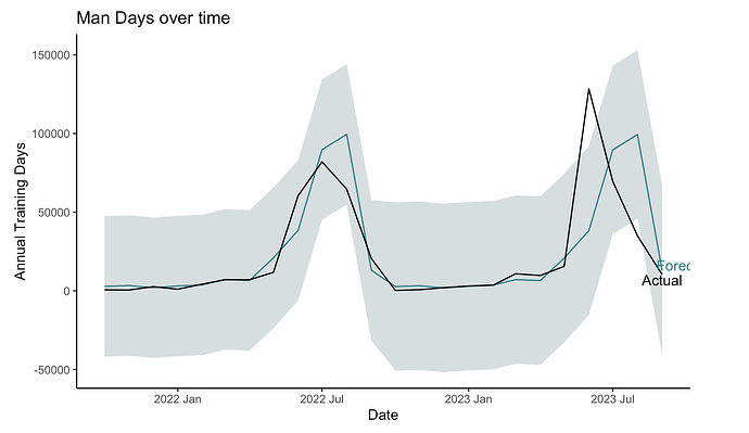
I am using the following code to make a graph, I'd like the labels not to get cut off on the right hand side and also to move them farther apart.
ggplot(fc_simple |> filter(.model == "modelAA"), aes(x = mrows_start_ym)) +
        vjust="bottom",
        hjust=.1,
              na.rm = TRUE)+
geom_text(data = annual_training_total_test, aes(label=label, y=at_man_days),
        colour="black",
        vjust = "top",
        hjust=.5,
              na.rm = TRUE)+
theme(plot.margin = unit(c(2,20,2,2), "cm"))+
Could you supply some sample data?
A handy way to supply some sample data is the dput() function. In the case of a large dataset something like dput(head(mydata, 100)) should supply the data we need. Just do dput(mydata) where mydata is your data. Copy the output and paste it here between
```
coord_cartesian(clip = "off")
I'll work on getting some sample data
cartesian helped some, but I can't figure out how to change the x limits with an x variable in year month format
FJCC
February 27, 2024, 5:38am
6
Here are a couple of examples of adjusting the x axis to avoid cutting off text. The first plot shows the truncated text.
library(ggplot2)
DF <- data.frame(Date = seq.Date(from = as.Date("2022-01-01"), to = as.Date("2023-12-31"), by = 1),
                 Value = sin(seq(0, 3, length.out = 730)))
ggplot(DF, aes(Date, Value)) + geom_line() +
  geom_text(aes(label = LONG), data = data.frame(Date = as.Date("2023-12-31"),Value = 0.14, LONG = "Yadayadayada"))
ggplot(DF, aes(Date, Value)) + geom_line() +
  geom_text(aes(label = LONG), data = data.frame(Date = as.Date("2023-12-31"),Value = 0.14, LONG = "Yadayadayada")) +
  scale_x_date(expand = expansion(add = c(10,100)))
ggplot(DF, aes(Date, Value)) + geom_line() +
  geom_text(aes(label = LONG), data = data.frame(Date = as.Date("2023-12-31"),Value = 0.14, LONG = "Yadayadayada")) +
 coord_cartesian(xlim = c(as.Date("2022-01-01"), as.Date("2024-01-30")))
Created on 2024-02-26 with reprex v2.0.2
I think these are all fabulous solutions but I'm not getting any of them to work I believe because my data is in ym format from lubridate but I can't seem to get ggplot to read that as a valid date
system
March 25, 2024, 8:07pm
8
This topic was automatically closed 21 days after the last reply. New replies are no longer allowed.


