ggplot2 bar chart with secondary y axis. Coloring the bars and legend.

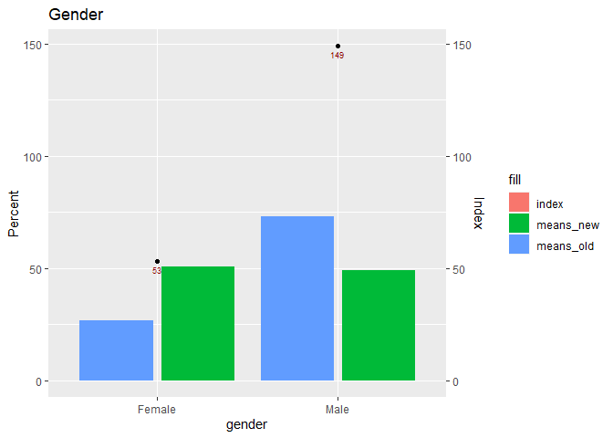
For some reason, I can't get the bars and legend color coded and labeled. I'm not sure why. I've used similar code with different data and it works fine. So, I'm not sure if it has something to do with the second y-axis which is new. Thanks for the help!

library(ggplot2)

fulldata <- data.frame(
  gender = c("F","M"),
  freq_new = c(49770, 47994),
  means_new = c(.509, .491),
  freq_old = c(1860,5091),
  means_old = c(.268,.732),
  index = c(53,149)
)

fulldata

percents<-fulldata[c(1,3,5)] %>% gather(variable, values, -gender )
percents

indexes<-fulldata[c(1,6)]
indexes


## try and get the numbers on there also.
ggplot(data=indexes, aes(x=gender, y=index)) +
  geom_point(aes(fill='index'), show.legend=FALSE ) +
  geom_text(aes(label = index), vjust = 1.6, color = "dark red", size = 2.5) +
  scale_y_continuous(sec.axis = sec_axis(~.*1, name="Index")) +
  geom_col(data=percents, aes(x=gender, y=values*100, group=variable, color = variable),
           position=position_dodge2(reverse=TRUE)) +
  scale_x_discrete(labels = c("Female",
                              "Male")) +
  labs(title = "Gender",
       y = "Percent")

 ###  This doesn't do anything.
  # scale_fill_manual(
  #   limits=c(1,0),
  #   values = c("#FF69B4","#4CBB17"),
  #   labels = c("New Customers","Old Customers"),
  #   name = element_blank()) 

### This outlines the legend key and labels the legends but that's it.
  # scale_color_manual(
  #   limits=c(1,0),
  #   values = c("#FF69B4","#4CBB17"),
  #   labels = c("New Customers ","Old Customers"),
  #   name = element_blank()) 

Do you mean to use the fill aesthetic in geom_col?

library(ggplot2)
library(tidyr)
fulldata <- data.frame(
  gender = c("F","M"),
  freq_new = c(49770, 47994),
  means_new = c(.509, .491),
  freq_old = c(1860,5091),
  means_old = c(.268,.732),
  index = c(53,149)
)

fulldata
#>   gender freq_new means_new freq_old means_old index
#> 1      F    49770     0.509     1860     0.268    53
#> 2      M    47994     0.491     5091     0.732   149

percents<-fulldata[c(1,3,5)] %>% gather(variable, values, -gender )
percents
#>   gender  variable values
#> 1      F means_new  0.509
#> 2      M means_new  0.491
#> 3      F means_old  0.268
#> 4      M means_old  0.732

indexes<-fulldata[c(1,6)]
indexes
#>   gender index
#> 1      F    53
#> 2      M   149


## try and get the numbers on there also.
ggplot(data=indexes, aes(x=gender, y=index)) +
  geom_point(aes(fill='index'), show.legend=FALSE ) +
  geom_text(aes(label = index), vjust = 1.6, color = "dark red", size = 2.5) +
  scale_y_continuous(sec.axis = sec_axis(~.*1, name="Index")) +
  geom_col(data=percents, aes(x=gender, y=values*100, group=variable, fill = variable),
           position=position_dodge2(reverse=TRUE)) +
  scale_x_discrete(labels = c("Female",
                              "Male")) +
  labs(title = "Gender",
       y = "Percent")

Created on 2020-04-25 by the reprex package (v0.3.0)

Yes, but I can't get it the manual colors and the manual legend to work. I'm trying to get the blue and green to coded colors and to keep the index (red) off of the legend. Does that make sense? Thanks!

# I was trying to get something like this to work.
   scale_fill_manual(
     limits=c(1,0),
     values = c("#FF69B4","#4CBB17"),
     labels = c("New Customers","Old Customers"),
     name = element_blank())

This topic was automatically closed 21 days after the last reply. New replies are no longer allowed.