For future reference, reprex is especially helpful when you're askin questions about data visualization, since it automatically includes the output. 
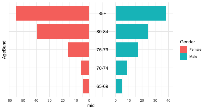
This is a little bit tricky, since you're basically "duping" the chart into creating the pyramid shape by using negative values, that are actually positive.
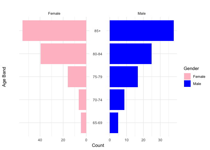
What creates the two different axis limits on either side in your original plot is the scales = "free" argument.
library(tidyverse)
library(ggpol)

df <- tibble(
  Population = c(5, 8.7, 16.7, 24.8, 38, -4.6, -6.4, -16.1, -39.6, -55.3),
  Gender = c("Male", "Male", "Male", "Male", "Male", "Female", "Female", "Female", "Female", "Female"),
  AgeBand = c("65-69", "70-74", "75-79", "80-84", "85+", "65-69", "70-74", "75-79", "80-84", "85+")
)

ggplot(df, aes(x = AgeBand, y = Population, fill = Gender)) +
  geom_bar(stat = "identity") +
  facet_share(~Gender, dir = "h", scales = "free", reverse_num = TRUE) +   # note: scales = "free"
  coord_flip() +
  theme_minimal() +
  labs(y = "Count", x = "Age Band", title = " ") +
  scale_fill_manual(values = c("pink", "blue"))

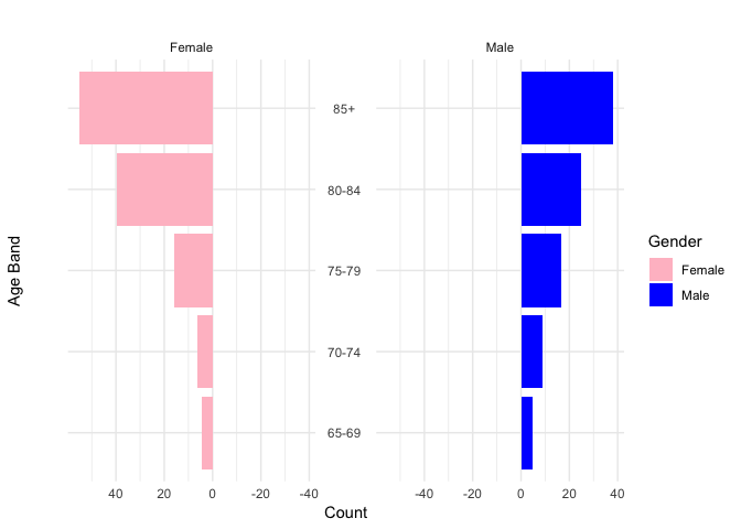
If you remove that argument, you get matching scales in each facet (note, below, they're both the same). However, your limits are set based on the range of values, which has it going all the way to negative 40.
ggplot(df, aes(x = AgeBand, y = Population, fill = Gender)) +
  geom_bar(stat = "identity") +
  facet_share(~Gender, dir = "h", reverse_num = TRUE) +
  coord_flip() +
  theme_minimal() +
  labs(y = "Count", x = "Age Band", title = " ") +
  scale_fill_manual(values = c("pink", "blue"))

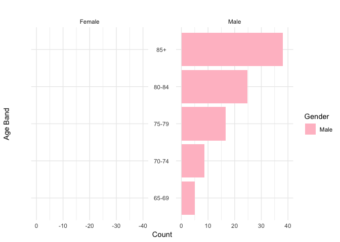
If you manually set the scale (it's the y-axis, since you used coord_flip()), you'll lose your female bars, since the range becomes negative on that side (male turns pink, since the fill has pink first, and it's the only data being plotted).
ggplot(df, aes(x = AgeBand, y = Population, fill = Gender)) +
  geom_bar(stat = "identity") +
  facet_share(~Gender, dir = "h", reverse_num = TRUE) +
  coord_flip() +
  theme_minimal() +
  labs(y = "Count", x = "Age Band", title = " ") +
  scale_fill_manual(values = c("pink", "blue")) +
  scale_y_continuous(limits = c(0, 40))
#> Warning: Removed 5 rows containing missing values (position_stack).

Created on 2018-09-25 by the reprex package (v0.2.1.9000)
I'm actually not sure what the best solution is here. Since facet_share() is from ggpol, I'd recommend taking a look at the source code there to see exactly how that's being accomplished, and/or looking to see if anyone else has filed or given a workaround in the issues.
That, or someone else here might have a good idea! 

