ggplot2 aes() not mapping subscale

Hi! I began with an imported .xlsx survey file which I called NAMST1 from which I selected subscales using brackets as follows:

slf_eff <- NAMST1[c("slf_eff_1","slf_eff_2", "slf_eff_3","slf_eff_4")]

I then wanted to make box plots with ggplot2 however the only code I have been able to successfully get any plot with is the following:

ggplot(stack(slf_eff), aes(ind,y=values)) +
  geom_boxplot(outlier.colour = "red", outlier.shape = 16, 
               outlier.size = 2, notch = FALSE)
## and it still returns the following warning
## Warning message: Removed 16 rows containing non-finite values (stat_boxplot). 

I can't seem to understand what aes() needs to map to or why it works with the stack() function but still has an error. I am wondering if it is due to the way I created the subscale groups and if so what is a better solution.

Thank you for you patience.
Hi!

To help us help you, could you please prepare a reproducible example (reprex) illustrating your issue? Please have a look at this guide, to see how to create one:

Ok so this is the methodology of what I did HOWEVER I have 922 observations and when I do this same process the warning "Warning message: Removed 32 rows containing non-finite values (stat_boxplot)." appears. The number of rows it removes varies based on the item survey subscale I am using.

item_1 <-c(3, 3, 2, 4)
item_2 <-c(2, 4, 5 ,6)
item_3 <-c(4, 5 ,6, 6)

survey <- data.frame(item_1, item_2, item_3)

survey_subscale <- survey[c("item_1", "item_3")]

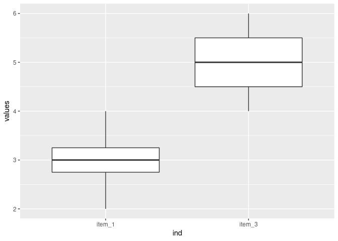
ggplot(stack(survey_subscale), aes(ind,y=values)) +
  geom_boxplot(outlier.colour = "red", outlier.shape = 16, 
               outlier.size = 2, notch = FALSE)

I hope this is enough to work with.

Part of what I am trying to grasp is how to know what the values of x and y need to be for the aes() of ggplot.

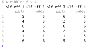
This is what a snapshot of my data shows
Screen Shot 2022-06-27 at 4.16.22 PM

What can I populate aes with based off of this?

The reprex you have provided doesn't actually reproduce your issue, but I guess you are getting that warning message because your real data set contains missing values, for example, if a manually place a missing value in your sample data I get the same warning message but it doesn't actually affect the outcome, it is only making me aware that there are missing values.

library(ggplot2)

item_1 <-c(3, 3, 2, 4)
item_2 <-c(2, 4, 5 ,6)
item_3 <-c(4, 5 ,6, NA) # Introducing a missing value

survey <- data.frame(item_1, item_2, item_3)

survey_subscale <- survey[c("item_1", "item_3")]

ggplot(stack(survey_subscale), aes(x = ind,y = values)) +
    geom_boxplot(outlier.colour = "red", outlier.shape = 16, 
                 outlier.size = 2, notch = FALSE)
#> Warning: Removed 1 rows containing non-finite values (stat_boxplot).

Created on 2022-06-27 by the reprex package (v2.0.1)

The way you are making the plot is perfectly valid, the stack() function is reshaping your data frame into a long format which is exactly what you need to plot several boxplots by a categorical variable. Although, since you are using ggplot2 which is part of the tidyverse family of packages you might prefer a more idiomatic syntax like this one.

survey %>% 
    select(item_1, item_3) %>% 
    pivot_longer(cols = everything(),
                 names_to = "item",
                 values_to = "value") %>% 
    ggplot(aes(x = item, y = value)) +
    geom_boxplot(outlier.colour = "red", outlier.shape = 16, 
                 outlier.size = 2, notch = FALSE)

First: Thank you so much!

Second: You are correct. The code I provided does not reproduce the error though it reproduces the methodology. I did explore my data set and there are no missing values. I also did the following:

  1. I reinstalled the ggplot2 package. After this I ran the same code and the warning did not occur
  2. what is peculiar to me is what aes() is actually pulling the mapping of x and y from. The screen shot I provided of the head() function to get a preview of the actual data I am working with does not show any row names, yet when using the stack() function I am able to use: aes( ind, y=values) even though there is not language in my data frame that depicts that so my question becomes:
  3. What does the aes() function ACTUALLY map to in a data frame?

the stack() function creates two columns named values and ind containing the values and column names of the original dataset respectively, then when you call aes( ind, y=values) the first argument for aes() is x so by passing the ind variable unnamed aes() assumes it is passed as the first argument so you effectively are mapping aes(x = ind, y = values), which textually described would be mapping the column names of your original data set to the x axis and their values to the y axis of the plot.

THANK YOU. I will try ver hard for this to be the last question:

So when I do NOT use the stack() function, and it is just ggplot2 as in:

ggplot(data) (aes(x =, y = ) + geom_boxplot()

and the data print of head() looks like this

Screen Shot 2022-06-27 at 4.16.22 PM

what goes in the aes() for x and y?

A box plot has categories on the x axis and numeric values on the y axis. To make a box plot, ggplot() expects to receive a data frame that has one column with the categories and another column with the values. The data layout in your last post does not have any column with the categories. You need to reshape the data to make a column of categories. There may be a way to hack a solution without reshaping the data but it isn't worth the effort.
The categories in your data set are stored in the column names. Either the stack() function or the pivot_longer() function from @andresrcs's post can be used to do that. Here is an example of what stack() does.

DF <- data.frame(A=1:4,B=11:14,C=21:24)
DF
#>   A  B  C
#> 1 1 11 21
#> 2 2 12 22
#> 3 3 13 23
#> 4 4 14 24
stack(DF)
#>    values ind
#> 1       1   A
#> 2       2   A
#> 3       3   A
#> 4       4   A
#> 5      11   B
#> 6      12   B
#> 7      13   B
#> 8      14   B
#> 9      21   C
#> 10     22   C
#> 11     23   C
#> 12     24   C

Created on 2022-06-27 by the reprex package (v2.0.1)
The column names of the original data set are distributed to a single column. You can then tell ggplot() that the x categories are in the column ind and the y values are in values. You cannot use the original data layout, with the column names A, B, and C, because there is no column that you can assign as the x in ggplot().

This makes perfect sense. Thank you for your patience and for turning the light on, I now can now see the door and let myself out. Thank you.

You may benefit from studying this useful book.
https://r4ds.had.co.nz/

Thank you so much! This is very helpful!

This topic was automatically closed 21 days after the last reply. New replies are no longer allowed.

If you have a query related to it or one of the replies, start a new topic and refer back with a link.