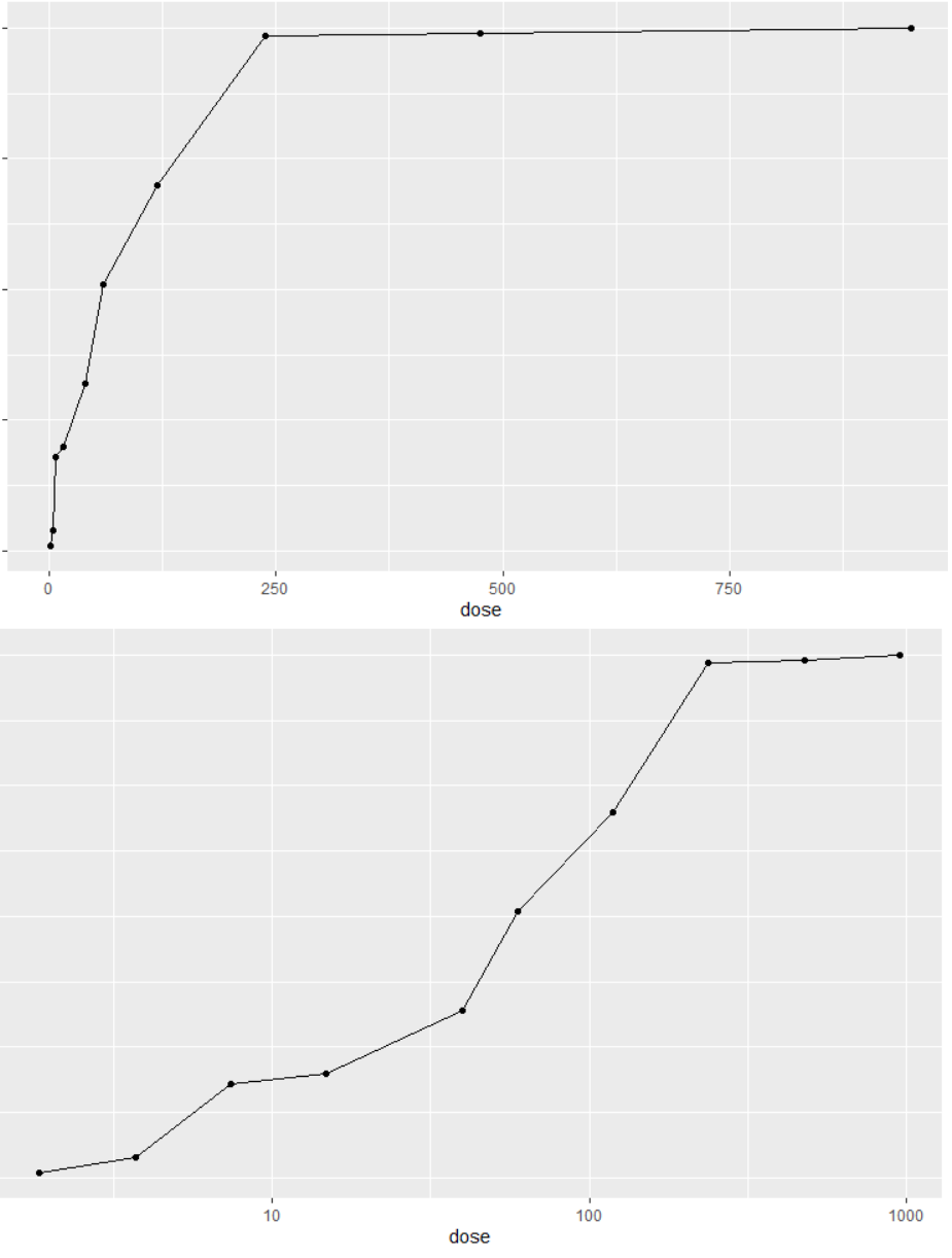
I have a simple plot whose x-axis goes from 1.85 to 950. I want to plot the x-axis on a log10 scale, so I use scale_x_log10()
Weirdly - the x-axis labels now just show the linear-scale values of 10, 100, and 1000 (even though the data are on a log10 scale).
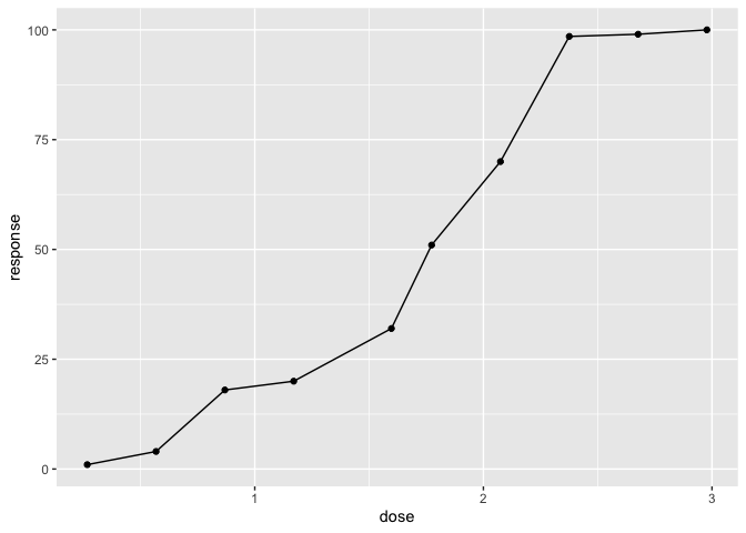
How can I keep these 3 ticks, in their same position, but as a log10 value? The points should be 1, 2, and 3.
library(ggplot2)
mydf <- data.frame("dose"=c(950,475,237.5,118.75,59.37,39.6,14.8,7.4,3.7,1.85),
                   "response"=c(100,99,98.5,70,51,32,20,18,4,1))
#linear scale
ggplot(mydf, aes(x=dose, y=response)) + geom_point() + geom_line(aes(dose, response), data=mydf)

#log10 scale is correct - but labels are not
ggplot(mydf, aes(x=dose, y=response)) + geom_point() + geom_line(aes(dose, response), data=mydf) + scale_x_log10()