Hi all,
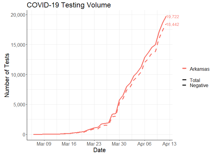
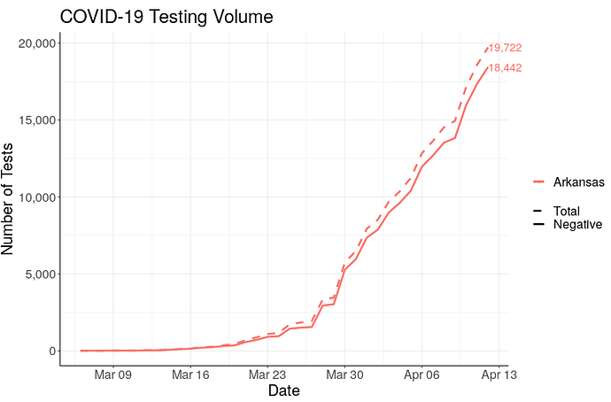
I've been working on an app with a colleague to visualize the COVID-19 data in the USA but am running into a strange issue. I have a ggplot where I want different lines to be a certain linetype depending on a column value. I use scale_linetype_manual to do this. It works perfectly well in RStudio during local testing, but once on the ShinyServer, the scale_linetype_manual seems to be ignored and the linetypes just take the default order of solid for the first line, second one dashed etc.
Here is a reprex app (the real one is much more complex)
library(ggplot2)
library(shiny)
library(dplyr)

ui <- fluidPage(
  checkboxGroupInput("line", "Pick a line", c("A", "B")),
  plotOutput("plot")
)

server <- function(input, output, session) {
  data = data.frame(x = c(rep(1:10, 2)), y = c(runif(10), rep(2, 10)),
                    group = c(rep("A", 10), rep("B", 10)))


  output$plot = renderPlot({
    ggplot(data %>% filter(group %in% input$line),
           aes(x = x, y = y, linetype = group)) +
      geom_line(size = 2) +
      scale_linetype_manual(values = c("dashed", "dotted"),
                            breaks = c("A", "B"),
                            labels = c("Group A", "Group B"))
  })

}

shinyApp(ui, server)
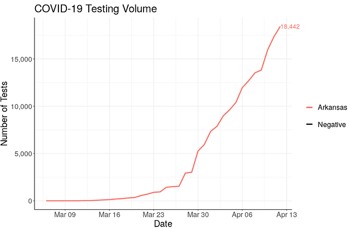
As expected, in the app, if you select line A it will always be dashed, and B always dotted. However, in the app online, it will default to solid line if only one line is displayed and solid, dashed if two, regardless of which line is selected.
Does anyone know why this is happening? I've experimented and searched a long time but can't seem to find the problem...
The real app is hosted on https://covid19watcher.com/ and in the Testing tab, I would like the lines for Total = solid, Positive = dotted and Negative = dashed, regardless now many are selected. Now you'll see it defaults to solid if only one is selected.
PJ


