ggplot warning message:

Hi R Com!

I have this df ('data.frame': 41218 obs. of 6 variables:) and want to make a ggplot with:

ggplot(data = df,
mapping = aes(GPMT))+
geom_bar(size = 5, color = "red")

GPMT is numeric, and getting this error

Warning message:
Computation failed in stat_count():
Elements must equal the number of rows or 1

any idea?

Please post the output of

dput(head(df,20))

and put lines with three back ticks before and after the output, like this
```
Your output here
```

Hi FJCC
used this code dput(head(df[, c(1, 1:6)])) hope it's ok

structure(list(X.Volume. = c(117.5, 65, 50, 50, 105, 104.3), 
    X.Volume..1 = c(117.5, 65, 50, 50, 105, 104.3), X.Orders. = structure(c(1L, 
    1L, 1L, 1L, 1L, 1L), .Label = "1", class = "factor"), X.Profit. = c(2659.3, 
    1862.4, 6345.6, 1372.4, 474.1, 480), X.Turnover. = c(96828.1, 
    22947.6, 22345.6, 18022.4, 46207.6, 46584.7), margin = c(0.0274641348947258, 
    0.0811588139936203, 0.283975368752685, 0.0761496803977273, 
    0.0102602169340109, 0.0103038121958497), GPMT = c(22.6323404255319, 
    28.6523076923077, 126.912, 27.448, 4.5152380952381, 4.60210930009588
    )), row.names = c(NA, 6L), class = "data.frame")

I do not get any error with the data you posted and your ggplot code. I only changed your code to decrease the width of the bar so that more of the data would be visible. I suspect you do not want to use a bar plot because it just counts how many times each GPMT value appears, which is once. What are you trying to show with the plot?

DF <- structure(list(X.Volume. = c(117.5, 65, 50, 50, 105, 104.3), 
               X.Volume..1 = c(117.5, 65, 50, 50, 105, 104.3), 
               X.Orders. = structure(c(1L, 1L, 1L, 1L, 1L, 1L), 
                                     .Label = "1", class = "factor"), 
               X.Profit. = c(2659.3, 1862.4, 6345.6, 1372.4, 474.1, 480), 
               X.Turnover. = c(96828.1,22947.6, 22345.6, 18022.4, 46207.6, 46584.7), 
               margin = c(0.0274641348947258, 0.0811588139936203, 0.283975368752685, 0.0761496803977273, 0.0102602169340109, 0.0103038121958497), 
               GPMT = c(22.6323404255319, 28.6523076923077, 126.912, 27.448, 4.5152380952381, 4.60210930009588)), 
               row.names = c(NA, 6L), class = "data.frame")
library(ggplot2)
ggplot(data = DF,
       mapping = aes(GPMT))+
  geom_bar(size = 0.5, color = "red")
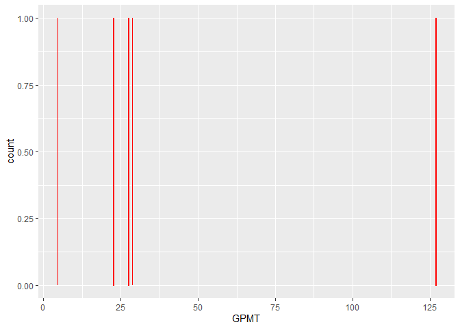
Created on 2021-11-03 by the reprex package (v2.0.1)

there are 40.000 + observation if we groupe them by an interval and then count them as the graph above it would make more sense. intervals of 10.000 or 20.000 (guess its the group by func? thanks

Try using geom_histogram with the binwidth argument set to 10 or 20.

ggplot(data = DF,
       mapping = aes(GPMT))+
  geom_histogram(binwidth = 10, fill = "red")

can i narrow the x axis

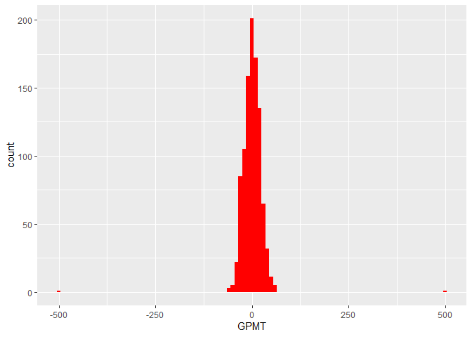
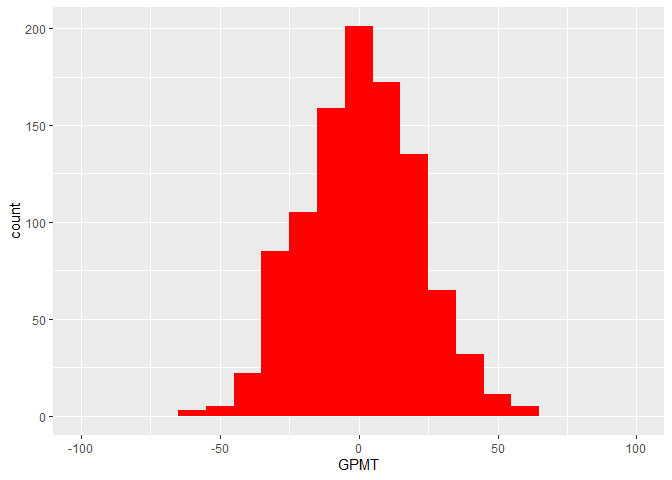
You can adjust the axis limits or filter the data. the following code shows both.

library(ggplot2)
library(dplyr)
#> 
#> Attaching package: 'dplyr'
#> The following objects are masked from 'package:stats':
#> 
#>     filter, lag
#> The following objects are masked from 'package:base':
#> 
#>     intersect, setdiff, setequal, union

DF <- data.frame(GPMT=c(rnorm(n = 1000,mean = 0,sd = 20),-500,500))

ggplot(data = DF,
       mapping = aes(GPMT))+
  geom_histogram(binwidth = 10, fill = "red")

#adjust x axis limits
ggplot(data = DF,
       mapping = aes(GPMT))+
  geom_histogram(binwidth = 10, fill = "red") +
  coord_cartesian(xlim = c(-100,100))

#filter before plotting
DF |> filter(GPMT>=-100,GPMT<=100) |> 
ggplot(mapping = aes(GPMT))+
  geom_histogram(binwidth = 10, fill = "red")

Created on 2021-11-04 by the reprex package (v2.0.1)

This topic was automatically closed 21 days after the last reply. New replies are no longer allowed.

If you have a query related to it or one of the replies, start a new topic and refer back with a link.