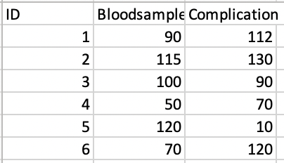
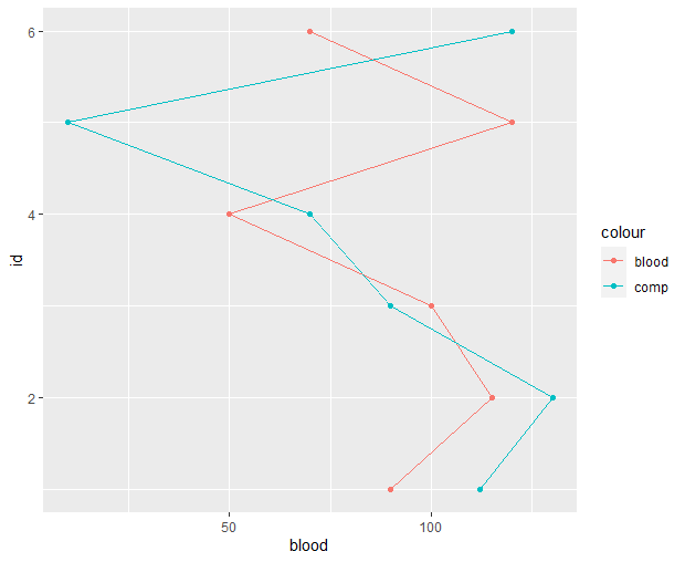
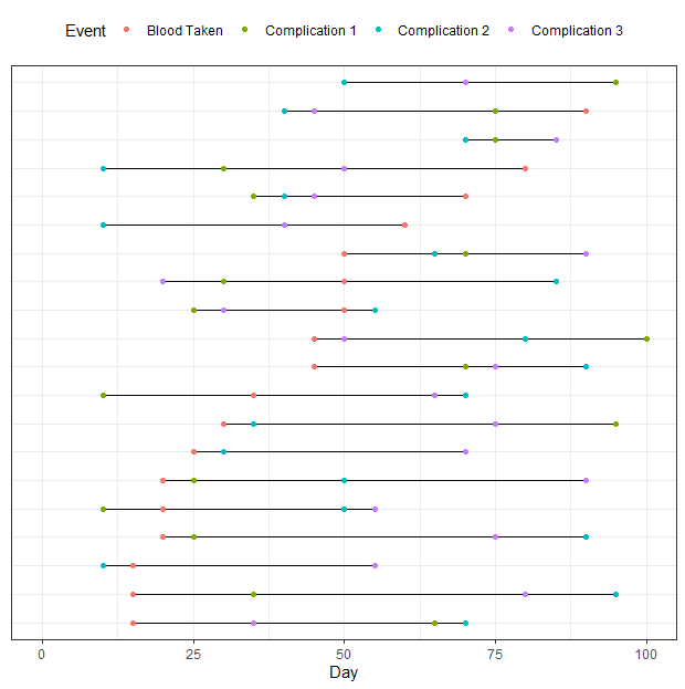
Thank you so much for your help - I am having a bit of trouble with this second plot
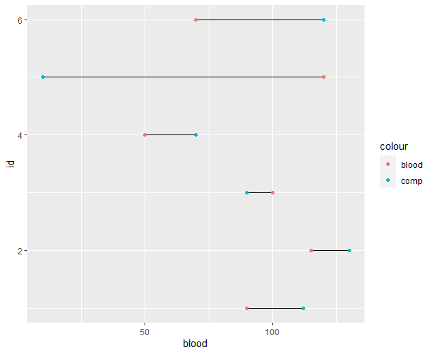
dat = tibble(id = 1:20,
blood = sample(vec, 20, replace = T),
comp1 = sample(vec, 20, replace = T),
comp2 = sample(vec, 20, replace = T),
comp3 = sample(vec, 20, replace = T))
Is it correct that I should prepare my data similarly? when writing ID = 1:20, your referring to your min and max ID values - as my ID is a factor there isn't any min and max. So for now I wrote
df3= tibble(id,
blood = sample(df3, replace = T),
comp1 = sample(df3, replace = T),
comp2 = sample(df3, replace = T),
comp3 = sample(df3, replace = T))
df3 being my dataset. I understand that the vector your creating is just some mock data, but I'm unsure what I should replace this with in my own dataset.
However this can be run by R, and then I just copy pasted your code
df3 |>
pivot_longer(-id) |>
group_by(id) |>
mutate(max = max(value),
min = min(value)) |>
ggplot(aes(y = id, x = value)) +
geom_segment(aes(x = min, xend = max, yend = id)) +
geom_point(aes(color = name))
Which doesn't run - Probably becasuse I made a mistake from the beginning. I'm not sure if I'm supposed to fill in min and max values or if R can read this. Again thanks for helping an R newbie