ggplot: plot hundreds of lines between points

Hi R community,

I'm looking to create a plot (probably using geom_line()) with the following information:

  • The x axis contains two points (Age 1 and Age 2). These are technically discrete, but I have expressed them in the example below as continuous so that I can use geom_line().
  • The y axis is also continuous (some value denoting 'intensity' - in this instance it is regarding the level of gene expression, fpkm values)
  • The data is organised by another categorical variable (species) of which there are two (MS and FTD)- this should be mapped to the color aesthetic.
  • Each line on the graph should correspond to another categorical variable (the gene of interest).

Now, this may not be "best practice" or whatever, but it is what I need to achieve. My data is in a long format currently, with each row representing one observation (for the continuous variable mapped to y, fpkm) and columns representing the other variables (one variable per column) - species, gene, age.

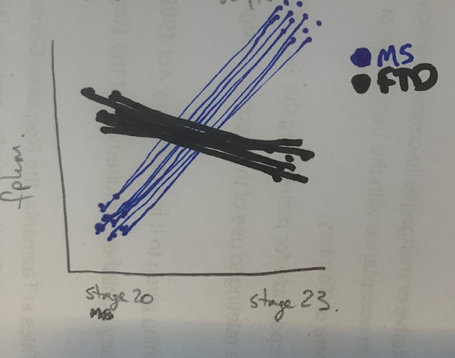
I've attached an sketch of what the graph should look like: note, each line is connecting the value for the variable fpkm across the two ages. Being able to distinguish the individual lines is not important, but I don't want to express this as an average.

So a reprex:

library(reprex)

#some data of equivalent format
Age <- rep(1:2, 60)
Species <- c(rep("FTD", 30),rep("MS", 30))
fpkm <- sample(1:10, size = 60, replace = TRUE)
geneID <- c(rep(c(1:15), each = 2),rep(c(1:15), each = 2))

df <- data.frame(Age, Species, fpkm, geneID)

library(ggplot2)
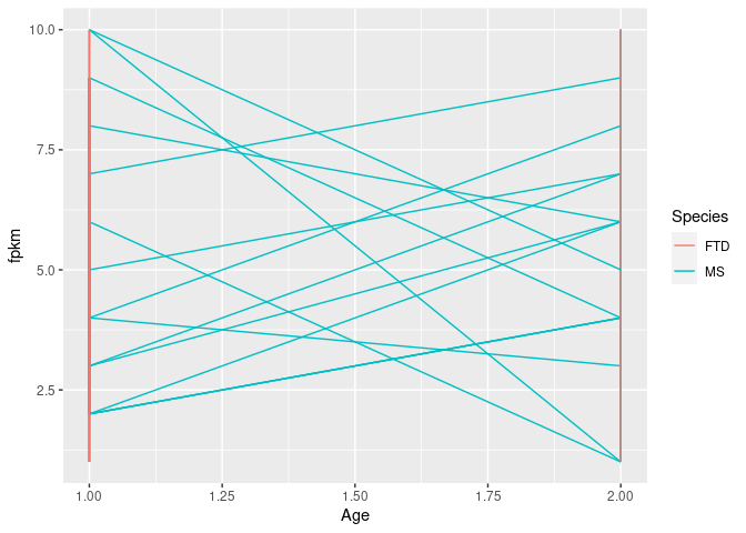
#incorrect plotting
ggplot(df, aes(x = Age, y = fpkm, color = Species, group = geneID)) +
  geom_line()
Created on 2020-09-02 by the reprex package (v0.3.0)

I'm not worried about the labelling of the x-axis, but for some reason the colouring doesn't seem to map correctly?

I've tried to put the color aesthetic in the geom_line() call but this didn't help. geom_point() seems to generate the data correctly, but then if I try to draw lines between the points (which would be the ideal graph) it performs similar to the above.... I'm not really sure why this is the case and would appreciate some help!

As a note, I am looking to generate this graph for 100s of genes, so manual entry is not an option (I experimented with some for loops for this but to no avail)

thanks
Is the following close to what you want? Since the geneID repeats between the Species, I made the group depend on both the geneID and the Species.

library(ggplot2)
Age <- rep(1:2, 60)
Species <- c(rep("FTD", 30),rep("MS", 30))
fpkm <- sample(1:10, size = 60, replace = TRUE)
geneID <- c(rep(c(1:15), each = 2),rep(c(1:15), each = 2))

df <- data.frame(Age, Species, fpkm, geneID)
ggplot(df, aes(x = factor(Age), y = fpkm, group = interaction(geneID, Species), 
               color = Species)) + geom_line()

Created on 2020-09-01 by the reprex package (v0.3.0)

Yes it is!

I had tried to do this with group = c(Species,geneID) but that didn't work - didn't know about using interaction() like this!

thanks!

Try geom_segment() instead.

library(ggplot2)
library(dplyr)
#> 
#> Attaching package: 'dplyr'
#> The following objects are masked from 'package:stats':
#> 
#>     filter, lag
#> The following objects are masked from 'package:base':
#> 
#>     intersect, setdiff, setequal, union
library(tidyr)

#some data of equivalent format
# I made your data a little smaller
Age <- rep(c("stage20", "stage23"), 20)
Species <- c(rep("FTD", 20),rep("MS", 20))
fpkm <- sample(1:10, size = 40, replace = TRUE)
geneID <- c(rep(c(1:10), each = 2),rep(c(1:10), each = 2))

df <- data.frame(Age, Species, fpkm, geneID)


# I'm not changing how you construct your data, I just pivotted it wider for you
wdf <- df %>%
  pivot_wider(names_from = Age, values_from = fpkm)

ggplot(wdf, aes(x = "stage 20",
                xend = "stage 23",
                y = stage20,
                yend = stage23,
                color = Species,
                group = geneID)) +
  geom_segment()

Created on 2020-09-01 by the reprex package (v0.3.0)

this is also really good thanks.

So the objects stage20 and stage23 come from when you pivot_wider.

So is the purpose of pivot_wider here just so that you can convert the Age variable into 2 separate variables for the two stages?

Well, I changed the Age variable to be stage20 and stage23 instead of 1 and 2 so when it pivotted wider it took those as names instead of 1 and 2 which could be problematic.

Here's how pivoting wider changes the data. The idea is to ensure each geneID has only one row.

library(tidyr)
#some data of equivalent format
# I made your data a little smaller
Age <- rep(c("stage20", "stage23"), 20)
Species <- c(rep("FTD", 20),rep("MS", 20))
fpkm <- sample(1:10, size = 40, replace = TRUE)
geneID <- c(rep(c(1:10), each = 2),rep(c(1:10), each = 2))

df <- data.frame(Age, Species, fpkm, geneID)
head(df)
#>       Age Species fpkm geneID
#> 1 stage20     FTD    9      1
#> 2 stage23     FTD    1      1
#> 3 stage20     FTD    5      2
#> 4 stage23     FTD    2      2
#> 5 stage20     FTD    2      3
#> 6 stage23     FTD    2      3
# I'm not changing how you construct your data, I just pivotted it wider for you
wdf <- df %>%
  pivot_wider(names_from = Age, values_from = fpkm)
head(wdf)
#> # A tibble: 6 x 4
#>   Species geneID stage20 stage23
#>   <chr>    <int>   <int>   <int>
#> 1 FTD          1       9       1
#> 2 FTD          2       5       2
#> 3 FTD          3       2       2
#> 4 FTD          4       2       5
#> 5 FTD          5       9       5
#> 6 FTD          6      10       4

Created on 2020-09-01 by the reprex package (v0.3.0)

So I went to do this with my actual dataset and the output was a bit unexpected. The new age columns (stage 20 and stage 23) had 1 value in 1 column (e.g. row one would have 0.5 as the fpkm value under stage 20) but an NA in the other and the geneIDs were still split across many columns.

This may be because I there are other columns in the dataframe (which I am not using for graphing) in addition to those that I've specified in my example?

But when I went to try and reproduce what you had done here, I also got unexpected results:

library(reprex)

#some data of equivalent format
Age <- rep(c("stage20", "stage23"), 60)
Species <- c(rep("FTD", 30),rep("MS", 30))
fpkm <- sample(1:10, size = 60, replace = TRUE)
geneID <- c(rep(c(1:15), each = 2),rep(c(1:15), each = 2))

df <- data.frame(Age, Species, fpkm, geneID)

library(tidyr)
df2 <- df %>%
        pivot_wider(names_from = Age, values_from = fpkm)
#> Warning: Values are not uniquely identified; output will contain list-cols.
#> * Use `values_fn = list` to suppress this warning.
#> * Use `values_fn = length` to identify where the duplicates arise
#> * Use `values_fn = {summary_fun}` to summarise duplicates

head(df2)
#> # A tibble: 6 x 4
#>   Species geneID stage20   stage23  
#>   <chr>    <int> <list>    <list>   
#> 1 FTD          1 <int [2]> <int [2]>
#> 2 FTD          2 <int [2]> <int [2]>
#> 3 FTD          3 <int [2]> <int [2]>
#> 4 FTD          4 <int [2]> <int [2]>
#> 5 FTD          5 <int [2]> <int [2]>
#> 6 FTD          6 <int [2]> <int [2]>

Created on 2020-09-02 by the reprex package (v0.3.0)

All I changed in the above from my original data was the values of the Age variable though?

What am I missing here?

Look at the warning after you called pivot_wider().

It looks like you have some duplicate values in your df object. What happens if you replace the fpkm assignment with,

fpkm <- runif(60)

Edit: nevermind, look at what you did for Age.
Age has length 120 while the rest are length 60, so every value is duplicated.

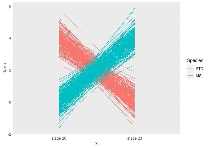
Edit 2: Here's another reprex where I have added a variable n and modified the df creation which ensures the geneIDs can be uniquely identified.

I also changed the data so the plot will look more like your hand drawing.

library(ggplot2)
library(tidyr)

n <- 250

# simulated data
Age <- rep(c("stage20", "stage23"), 2 * n)
Species <- c(rep("FTD", 2 * n),rep("MS", 2 * n))
fpkm <- sample(1:10, size = 4 * n, replace = TRUE)
fpkm <- rnorm(4 * n, 0, 0.5)
geneID <- rep(rep(seq_len(n), each = 2), 2)
df <- data.frame(Age, Species, fpkm, geneID)
df[df[["Species"]] == "FTD" & df[["Age"]] == "stage20",
   "fpkm"] <- df[df[["Species"]] == "FTD" & df[["Age"]] == "stage20",
                 "fpkm"] + 4

df[df[["Species"]] == "MS" & df[["Age"]] == "stage23",
   "fpkm"] <- df[df[["Species"]] == "MS" & df[["Age"]] == "stage23",
                 "fpkm"] + 4

wdf <- df %>%
  pivot_wider(names_from = Age, values_from = fpkm)
head(wdf)
#> # A tibble: 6 x 4
#>   Species geneID stage20 stage23
#>   <chr>    <int>   <dbl>   <dbl>
#> 1 FTD          1    4.40  -0.375
#> 2 FTD          2    4.28  -0.593
#> 3 FTD          3    3.74  -0.204
#> 4 FTD          4    4.35  -0.484
#> 5 FTD          5    3.52   0.331
#> 6 FTD          6    3.92   0.129

ggplot(wdf, aes(x = "stage 20",
                xend = "stage 23",
                y = stage20,
                yend = stage23,
                color = Species,
                group = geneID)) +
  geom_segment() +
  ylab("fkpm")

Created on 2020-09-01 by the reprex package (v0.3.0)

1 Like

thanks for this, that's awesome.

As a note, in my actual dataset I found NAs were introduced because Age was encoded in another variable as well, so the rows couldn't be effectively collapsed. Removing this column solved the issue.

This topic was automatically closed 7 days after the last reply. New replies are no longer allowed.

If you have a query related to it or one of the replies, start a new topic and refer back with a link.