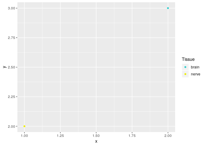
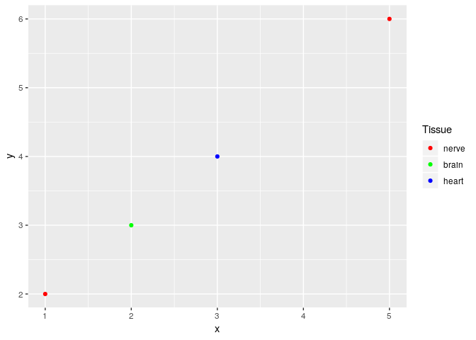
I have this simple dataframe in the form:
x    y    tissue    color_code
1    2    nerve     #EEEE00
2    3    brain     #33CCCC
There are several thousands rows for each tissue. Each tissue will have the same color_code (e.g. all rows with nerve have a color code of #EEEE00, etc.)
I would like to make a simple line plot of y vs x and color by tissue using the corresponding color code.
When I attempt to plot this, the two points are red and black, instead of yellow (#EEEE00) and cyan (#33CCCC).
library(ggplot2)

test_df = data.frame("x"=c(1,2),"y"=c(2,3),"tissue"=c("nerve","brain"),"color_code"=c("#EEEE00","#33CCCC"))

ggplot(test_df,aes(x=x,y=y,color=tissue))+
  geom_point()+
  scale_color_manual(values=test_df$color_code)