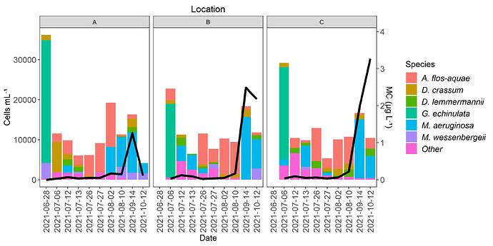
ggplot line plot over stacked bar plot with two Y-axis

I have a data set with columns of date, location, concentration, species, species count. For example...

date location concentration species count
6-4 A 0.5 shark 4
6-4 A 0.5 turtle 6
6-4 B 0.7 shark 4
6-4 B 0.7 turtle 2
6-4 B 0.7 ray 5
6-5 A 1.8 shark 6
6-5 A 1.8 ray 2
6-5 A 1.8 turtle 4
6-5 A 1.8 barracuda 3
6-5 B 1.5 shark 9
6-5 B 1.5 ray 1
6-5 B 1.5 turtle 3

I am trying to make a plot with two y-axis (1 for count, 1 for concentration) and the x-axis is as.factor(date). I want a stacked-bar plot for the species counts with color associated to each species, a line that shows the changing concentration, and facet_wrap( ~ location)

I have made this plot without having stacked bars, as the bars represent the total count of all species combined. Combining all species counts to one value allows for there to only be one observation per date at each location with one value of concentration, which is why the line code works.

The problem with making the stacked bar plot is that concentration has repeat observations of the same value. All the other plotting code works for setting up the two axis and scales, plotting the stacked bars, but the line will not plot.

Any tips for dealing with this issue? Thank you in advance!
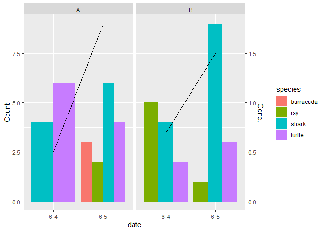
I chose to use the mean to simplify the concentration data.

library(tidyverse)
#> Warning: package 'tibble' was built under R version 4.1.2
DF <- read.delim("~/R/Play/Dummy.csv",sep = " ")
Conc <- DF |> group_by(date, location) |> 
  summarize(Concentration = mean(concentration))
#> `summarise()` has grouped output by 'date'. You can override using the `.groups` argument.
Conc
#> # A tibble: 4 x 3
#> # Groups:   date [2]
#>   date  location Concentration
#>   <chr> <chr>            <dbl>
#> 1 6-4   A                  0.5
#> 2 6-4   B                  0.7
#> 3 6-5   A                  1.8
#> 4 6-5   B                  1.5
ggplot() + geom_col(aes(date, count, fill = species), data = DF,
                    position = "dodge") +
  geom_line(aes(date, Concentration * 5, group = location), data = Conc) +
  scale_y_continuous(sec.axis = sec_axis(~ . / 5, name = "Conc.")) + 
  facet_wrap(~ location) + labs( y = "Count")

Created on 2022-03-10 by the reprex package (v2.0.1)

2 Likes

Thank you!

Separating the concentration from the from the species counts , making two data frames was the move. I modified your code a little bit with some of mine to get the specific second Y-axis outcomes I wanted.

ylim.prim <- c(0, 37000)
ylim.sec <- c(0, 4)

b <- diff(ylim.prim)/diff(ylim.sec)
a <- ylim.prim[1] - b*ylim.sec[1]

ggplot() +
geom_col(aes(x = as.factor(date), y = cellsml, fill = cyano2),
data = data, group = 1,
position = "stack") +
geom_line(aes(x = as.factor(date), y = a + toxin*b),
data = total, size = 1.5, group = 1) +
facet_wrap(~ location) +
scale_y_continuous(sec.axis = sec_axis(~ (. - a)/b, name = "MC (µg L⁻¹)")

2 Likes

This topic was automatically closed 7 days after the last reply. New replies are no longer allowed.

If you have a query related to it or one of the replies, start a new topic and refer back with a link.