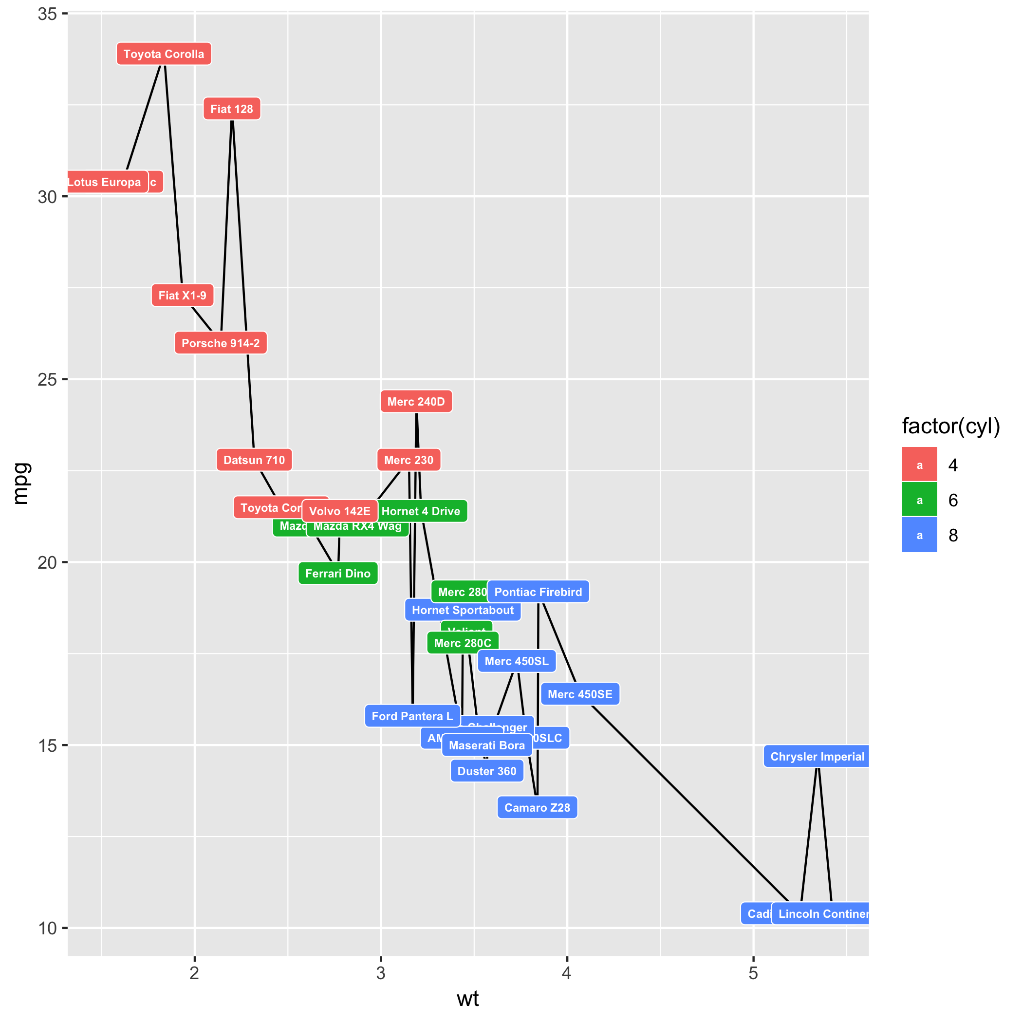
A reproducible example, called a reprex would get you a more focused answer, so I'll have to assume that you have something like
library(ggplot2)
library(RColorBrewer)
data(mtcars)

p <- ggplot(mtcars, aes(wt, mpg, label = rownames(mtcars))) + geom_line() + geom_label(aes(fill = factor(cyl)), colour = "white", fontface = "bold", size = 2)
p
Created on 2019-02-04 by the reprex package (v0.2.1)

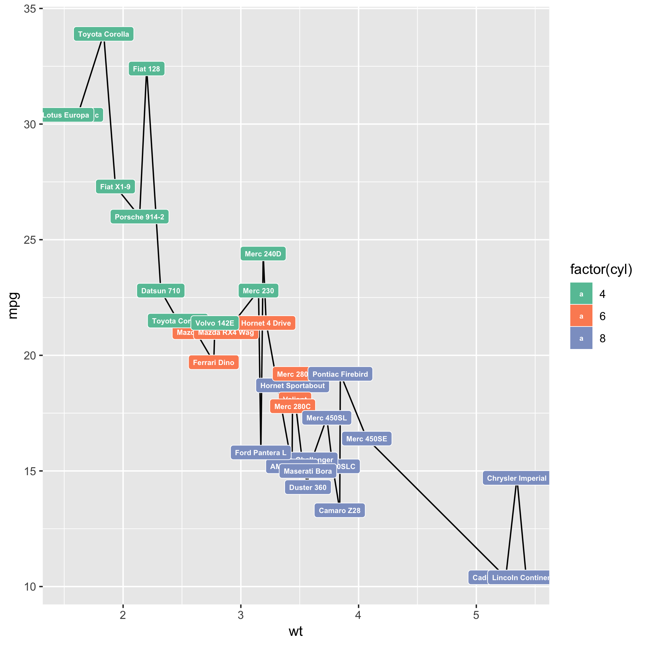
and you want to be able to do something like this
library(ggplot2)
library(RColorBrewer)
data(mtcars)

q <- ggplot(mtcars, aes(wt, mpg, label = rownames(mtcars))) + geom_line() + geom_label(aes(fill = factor(cyl)), colour = "white", fontface = "bold", size = 2) + scale_fill_brewer(palette = "Set2")
q
Created on 2019-02-04 by the reprex package (v0.2.1)

Yes, you can, at the expense of hours of experiementation to find just the right colors. Also look at http://colorspace.r-forge.r-project.org
A more detailed explaination for color options (for maps, but the princples are similar) is my post at https://technocrat.rbind.io/2018/12/03/color-map-atlas-for-continuously-scaled-maps/