ggplot; how to adjust the layout?

Hi!
I ploted the results from a questionaire, but I would like to chance some things. I only don't know find how to adjust these things.
I uploaded a photo from the plot.
I would like to;

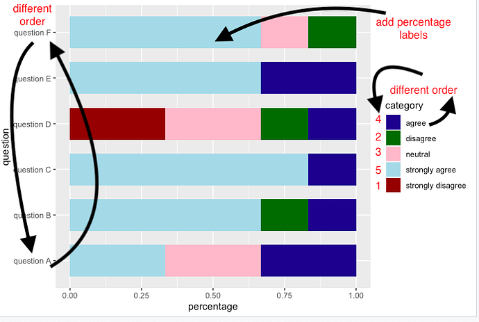
  1. reverse the sequence of the questions on de Y-axis
  2. display the exact percentage in each color bar
  3. Arrange the subgroups in category from 1 (strongly disagree) to 5 (strongly agree)

Does anybody know a good link where to find this info or can anyone explain how to do this?
Thanks in advance!
#Colours
myColors <- c("darkblue","darkgreen","pink","lightblue","darkred")
#Function
ggplot(data = Plotbehandeling , aes(x =percentage, y = question , fill = category)) + geom_bar(stat="identity", width = 0.7) + scale_fill_manual (values=myColors)

  library(tidyverse)     
  PlotTAQbehandeling <- data.frame(   
  stringsAsFactors = FALSE,
  check.names = FALSE,


     question = c("question A","question A", "question A","question A","question A",
                  "question B","question B","question B","question B","question B",
                  "question C","question C","question C","question C", "question C",
                  "question D","question D","question D","question D","question D",
                  "question E","question E", "question E","question E","question E",
                  "question F", "question F","question F","question F","question F"),

      category = c("strongly disagree","disagree", "neutral","agree","strongly agree",
                   "strongly disagree","disagree","neutral","agree","strongly agree",
                   "strongly disagree","disagree","neutral","agree","strongly agree",                      
                   "strongly disagree","disagree","neutral", "agree","strongly agree",
                   "strongly disagree","disagree", "neutral","agree","strongly agree",
                   "strongly disagree","disagree","neutral","agree","strongly agree"),

     responses = c(0,0,2,2,2,0,1,0,1,4,0, 0,0,1,5,2,1,2,1,0,0,0,0,2,4,0,1,1,0,4),

           `%` = c(0,0,33.333,33.333,33.333,0,
                   16.667,0,16.667,66.667,0,0,0,16.667,83.3333,
                   33.3333,16.667,33.3333,16.667,0,0,0,0,33.3333,
                   66.667,0,16.667,16.667,0,66.667),

    percentage = c(0,0,0.33333,0.33333,0.33333,
                   0,0.16667,0,0.16667,0.66667,0,0,0,0.16667,
                   0.833333,0.333333,0.16667,0.333333,0.16667,0,0,0,0,
                   0.333333,0.66667,0,0.16667,0.16667,0,0.66667))
This is a a good starting point

If you need more specific help, please provide a proper REPRoducible EXample (reprex) illustrating your issue.

Didn't find the info I was looking for in the document.
I tried to make a correct reprex...

here is your reprex with minor repair so that the data called by the function is the name for the data you shared from df_paste. also added is the minimum library required to load and run

library(tidyverse)

Plotbehandeling <- data.frame(
  stringsAsFactors = FALSE,
  question = c("vraag a",
               "vraag a","vraag a","vraag a","vraag a"),
  category = c("Helemaal niet akkoord","Enigszins niet akkoord","Neutraal",
               "Enigszins akkoord","Helemaal akkoord"),
  responses = c(0, 0, 2, 2, 2),
  percentage = c(0, 0, 33.333, 33.333, 33.333)
) #Colours
myColors <- c("darkblue","darkgreen","pink","lightblue","darkred")

ggplot(data = Plotbehandeling ,
       aes(x =percentage, y = question ,
           fill = category)) +
  geom_bar(stat="identity", width = 0.7) + 
  scale_fill_manual (values=myColors)

also I used 3 backticks on a line to format the code as code so it looks good for the forum, its recommended you do this in future.
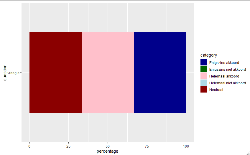
here is the result of what you provided:


you only provide example data for question "vraag a", so this implies helping you arrange the plot for multiple questions, your reprex is lacking. maybe go from 5 to a larger number to include more questions, if you need help with that.

1 Like

I dont understand your mention of subgroups (are they in your data?)
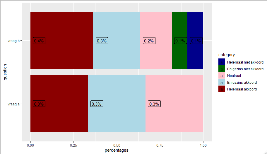
here is with added labels

library(tidyverse)

Plotbehandeling <- data.frame(
  stringsAsFactors = FALSE,
  question = c(rep("vraag a",5),rep("vraag b",5)),
  category = rep(c("Helemaal niet akkoord","Enigszins niet akkoord","Neutraal",
               "Enigszins akkoord","Helemaal akkoord"),2),
  responses = c(0, 0, 2, 2, 2,1,1,2,3,4)
) %>% group_by(question) %>% mutate(percentages=responses/sum(responses),
                                    plabel=paste0(round(percentages,1),"%"),
                                    cump = 1-cumsum(percentages))

Plotbehandeling$category <- forcats::as_factor(Plotbehandeling$category)
myColors <- c("darkblue","darkgreen","pink","lightblue","darkred")

ggplot(data = Plotbehandeling , aes(x =percentages, y = question , fill = category)) + 
  geom_bar(stat="identity") + 
  geom_label(mapping=aes(x=cump,label=plabel), nudge_x = .05,alpha=.5) + 
  scale_fill_manual (values=myColors)+
  xlim(0,1)

1 Like

Hi thanks for the help!
I uploaded an example for more data then only 'question A'. I hope my reprex is made correctly this time, sorry if it's not :slight_smile:
My english is not that good, so I uploaded a photo were I did indicate what I would like to change.
With the subgroups, I meant the 'strongly disagree' till strongly agree, now they are all mixed, but i would like that the 'category legend' starts with 'strongly disagree' and ends with 'strongly agree'.
Sorry for all the questions...

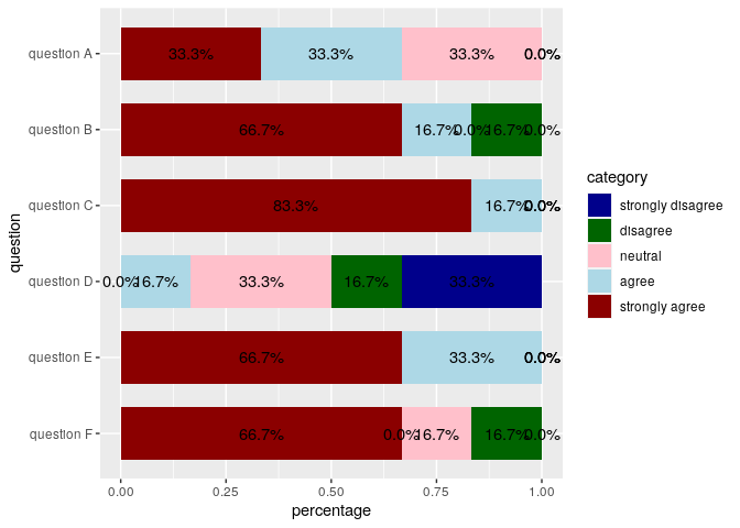
This is close to what you want, you can use this as a starting point to get the plot the way you want.

library(tidyverse)

PlotTAQbehandeling <- data.frame(
    question = c("question A","question A", "question A","question A","question A",
                 "question B","question B","question B","question B","question B",
                 "question C","question C","question C","question C", "question C",
                 "question D","question D","question D","question D","question D",
                 "question E","question E", "question E","question E","question E",
                 "question F", "question F","question F","question F","question F"),
    category = c("strongly disagree","disagree", "neutral","agree","strongly agree",
                 "strongly disagree","disagree","neutral","agree","strongly agree",
                 "strongly disagree","disagree","neutral","agree","strongly agree",                      
                 "strongly disagree","disagree","neutral", "agree","strongly agree",
                 "strongly disagree","disagree", "neutral","agree","strongly agree",
                 "strongly disagree","disagree","neutral","agree","strongly agree"),
    responses = c(0,0,2,2,2,0,1,0,1,4,0, 0,0,1,5,2,1,2,1,0,0,0,0,2,4,0,1,1,0,4),
    percentage = c(0,0,0.33333,0.33333,0.33333,
                   0,0.16667,0,0.16667,0.66667,0,0,0,0.16667,
                   0.833333,0.333333,0.16667,0.333333,0.16667,0,0,0,0,
                   0.333333,0.66667,0,0.16667,0.16667,0,0.66667))
PlotTAQbehandeling %>%
    mutate(question = fct_rev(question),
           category = fct_inorder(category)) %>% 
    ggplot(aes(x = percentage, y = question, fill = category)) +
    geom_col(width = 0.7) +
    geom_text(aes(label = scales::percent(percentage, accuracy = 0.1), group = category),
              position = position_stack(vjust = .5)) +
    scale_fill_manual(values = c("darkblue","darkgreen","pink","lightblue","darkred"))

Created on 2020-06-29 by the reprex package (v0.3.0)

1 Like

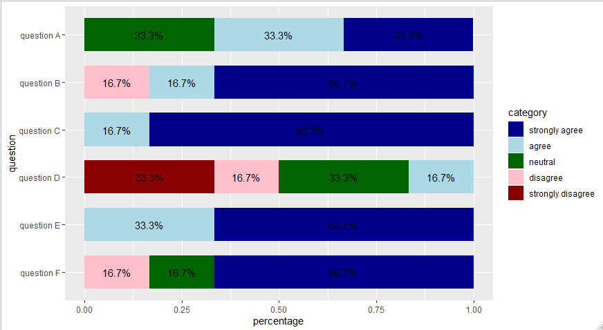
Hi @andresrcs, thanks for your answer.
I tried the code and it worked indeed.
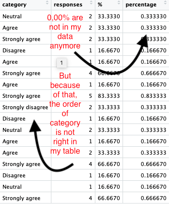
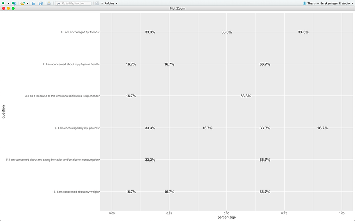
One problem, I would like that the 0,00% are not shown on the figure.
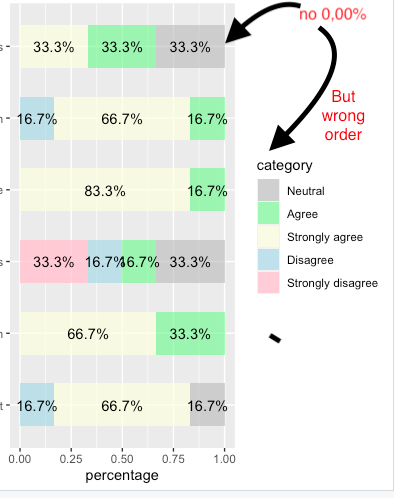
What I did was to filter my data and delete all the 0,00%, so that these were not on the figure...the next problem is then that de category isn't in the right order anymore (since fct_inorder uses the order in wicht the category first appears in the dataset).
So is there an other way to not show the 0,00% on the figure?
I uploaded 2 photos, since I am not sure my explanation of the problem is very clear.... Schermafbeelding 2020-06-30 om 12.51.57 Schermafbeelding 2020-06-30 om 12.52.11 Schermafbeelding 2020-06-30 om 12.52.31


mycols <- c("darkblue","lightblue","darkgreen","pink","darkred")
names(mycols)<-c("strongly agree",
                 "agree",
                 "neutral",
                 "disagree",
                 "strongly disagree")
mycols

PlotTAQbehandeling %>% 
  filter(responses != 0)  %>% 
  mutate(question = fct_rev(question),
         category = factor(category,
                           levels=c("strongly agree",
                                    "agree",
                                    "neutral",
                                    "disagree",
                                    "strongly disagree"))) %>% 
  ggplot(aes(x = percentage, y = question, fill = category)) +
  geom_col(width = 0.7) +
  geom_text(aes(label = scales::percent(percentage, accuracy = 0.1), group = category),
            position = position_stack(vjust = .5)) +
  scale_fill_manual(values = mycols)

@nirgrahamuk, now this (see photo) is the output?