I encountered a bizarre result when trying to plot some data - geom_bar() generated super-wide bars for one of my datasets (and not others, which also had data in this range). I've reduced the example to exclude the facet_grid() code, as the strange behaviour persists. I've figured out how to "fix" it (geom_bar(width = 1)), but I'd love to know what the default was doing...
Reprex:
mydata <-
data.frame(
  stringsAsFactors = FALSE,
                 type = c("A",
                          "A","A","A",
                          "B","B","B","B","B",
                          "B","B","B","B","B",
                          "B","B","B","B","B",
                          "B","B","B","B","B",
                          "B","B","B","B","B",
                          "B","B","B","B","B",
                          "B","B","B","B","B",
                          "B","B","B","B","B",
                          "B","B","B","B","B",
                          "B","B","B","B",
                          "B","B","B","B","B",
                          "B","B","B","B","B",
                          "B","B","B","B","B",
                          "B","B","B","B","B",
                          "B","B","B","B","B",
                          "B","B","B","B","B",
                          "B","B","B","B","B",
                          "B","B","B","B","B",
                          "B","B","B","B","B",
                          "B","B","B","B"),
          Duration_me = c(1096,1096,1096,1827,
                          30,30,30,30,30,30,30,30,30,30,30,30,30,30,
                          30,30,30,30,30,30,30,30,30,30,30,30,30,
                          30,30,30,30,30,30,30,30,30,30,30,30,30,30,
                          30,30,30,30,30,30,30,30,30,30,30,30,30,
                          30,30,30,30,30,30,30,30,30,30,30,30,366,
                          182,183,181,182,30,181,184,184,182,184,184,
                          184,181,181,181,184,184,181,365,365,181,182,
                          182,365,181,181,181,366,366,366,184))

mydata %>% ggplot(aes(x = Duration_me, fill = type)) + geom_bar()  + xlab("Duration")+ ylab("Number of people")
Notice the super-wide red bars on the right - they actually correspond to only 3 and 1 cases, respectively, but they're heaps wider than the ones plotted for B!
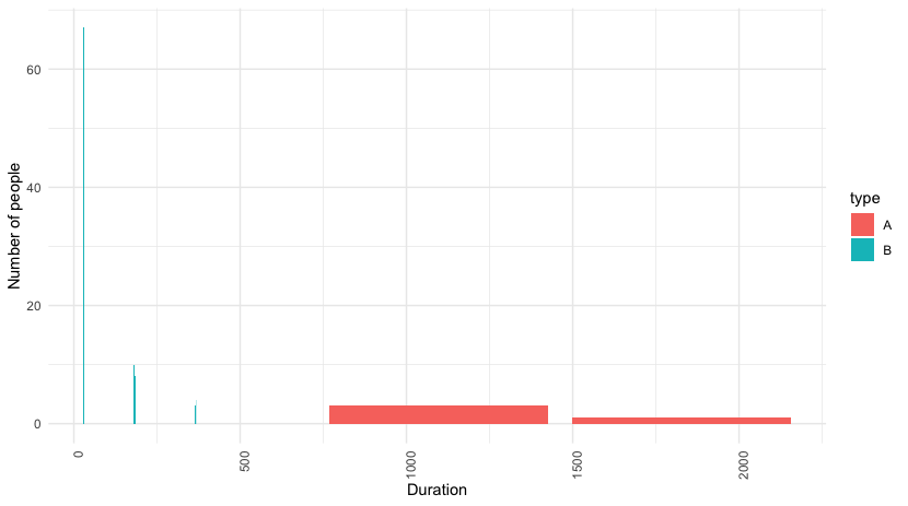
What was going on under the hood?