Hi, I am having trouble creating a scatter plot with a regression line using this code:
ggplot(data=df, aes(x = u, y = k), xlim=c(0, 1))+
geom_point() +
geom_smooth(method=lm, formula=y~x, se=TRUE)
Sometimes, the plot is created properly with a regression line and other times, x-axis gets totally messed up and no regression line is added in the Cloud version of RStudio on Posit Cloud. In the downloaded RStudio version (updated to the latest version), I didn't get a proper plot with a regression line at all. Please developers fix this issue with ggplot2 package. As such, I have noticed that there's always some issue with this package not working.
Can anyone help me fix this issue with ggplot2? Am I missing some package needed to resolve this issue?
This the correct plot using ggplot2, which I could not reproduce using the same code again in Posit Cloud version of RStudio. I could not get this plot with the same code on the desktop version at all!
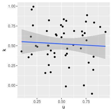
I cannot see any problem with your code on a desktop, using some simulated data. Note than I have renamed "df" to "dat1" as "df" is a base R function and using it as the name of a data.frame or tibble, etc., can occasionally mess things up.
library(ggplot2)
set.seed(23)
dat1  <- data.frame(u = rnorm(50, mean = 0.5, sd = .25), k = rnorm(50, mean = 0.5, sd = .25) )

ggplot(data = dat1, aes(x = u, y = k), xlim = c(0, 1)) +
geom_point() +
    geom_smooth(method = lm, formula = y ~ x, se = TRUE)
Also, can you supply us with ALL of your code, especially any libraries you are loading in case you are getting masking of functions across libraries? Often, various libraries use the same function name for different functions and depending on the sequence in whitch the libraries load one can over-write the other.
It probably would also help to have some sample data. A handy way to supply some sample data is the dput() function. In the case of a large dataset something like dput(head(mydata, 100)) should supply the data we need. Just do dput(mydata) where mydata is your data. Copy the output and paste it here between
```
@R_Chhabra - Looking at the ugly plot at the end of your post, it is very likely that your x values are not numbers but characters or a factor. Run the summary() function on that data frame as it is when it is passed to ggplot(). What is the output concerning the the column used as x?
Thanks for this solution. Although I could see the x-axis datatype to be double but converting it to numeric helped. Somehow ggplot2 considers datatype differently at different times.