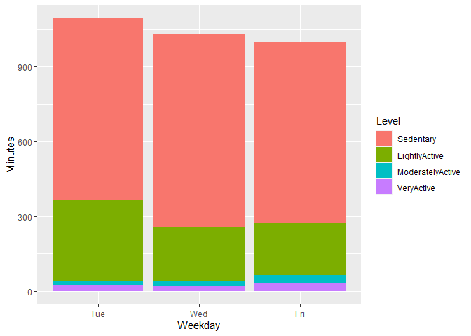
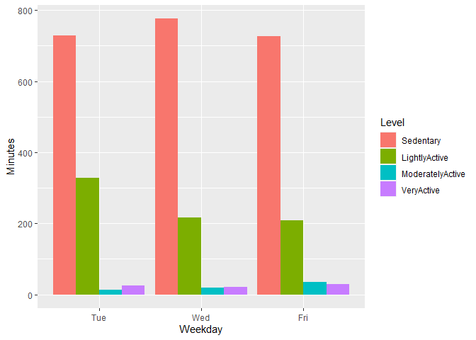
Hi! I wanted to share a big thanks for helping me. I was able to change the column names and move forward. I am hoping you can help me a little more.
-
I really want to plot something that shows the different levels of activity distance (given the total) across each of the weekdays. Ultimately Im wanting to look at the amount of light, moderate and very active minutes each weekday. This is a given but each equal the TotalDistance column.
-
Im wanting to have plots that show the level of intensity vs amount of calories (assuming there is a positive reln there) but then to cross referencing those levels across each weekday. Are ppl doing higher intensity workouts on given days of the week? My thought is that should align with seeing a higher number of calories burned on those days too.
Data is taken from dailymerged df.
dput(head(dailymerged,3))
structure(list(Id = c(1503960366, 1503960366, 1503960366), Date = structure(c(16903,
16904, 16906), class = "Date"), Weekday = structure(c(3L, 4L,
6L), .Label = c("Sun", "Mon", "Tue", "Wed", "Thu", "Fri", "Sat"
), class = c("ordered", "factor")), Calories = c(1985L, 1797L,
1745L), TotalSteps = c(13162L, 10735L, 9762L), TotalDistance = c(8.5,
6.96999979019165, 6.28000020980835), VeryActiveDistance = c(1.87999999523163,
1.57000005245209, 2.14000010490417), ModeratelyActiveDistance = c(0.550000011920929,
0.689999997615814, 1.25999999046326), LightActiveDistance = c(6.05999994277954,
4.71000003814697, 2.82999992370605), SedentaryActiveDistance = c(0,
0, 0), VeryActiveMinutes = c(25L, 21L, 29L), FairlyActiveMinutes = c(13L,
19L, 34L), LightlyActiveMinutes = c(328L, 217L, 209L), SedentaryMinutes = c(728L,
776L, 726L), TotalSleepRecords = c(1L, 2L, 1L), TotalMinutesAsleep = c(327L,
384L, 412L), TotalTimeInBed = c(346L, 407L, 442L)), row.names = c(NA,
3L), class = "data.frame")
I did this so far but its not really giving me what I am looking for.
ggplot(dailymerged, aes(x= Weekday, y= c("LightlyActiveDistance"), color= Weekday))+
  geom_col()

ggplot(dailymerged, aes(x= Weekday, y= c("ModeratelyActiveDistance"), color= Weekday))+
  geom_col()

ggplot(dailymerged, aes(x= Weekday, y= c("VeryActiveDistance"), color= Weekday))+
  geom_col()
How can I change this to get the effects that Im looking for. I know there has to be a simple way and Im aware of facet_wrap but not sure exactly how to use it for what Im trying to achieve.
Thanks,
Kathryn


