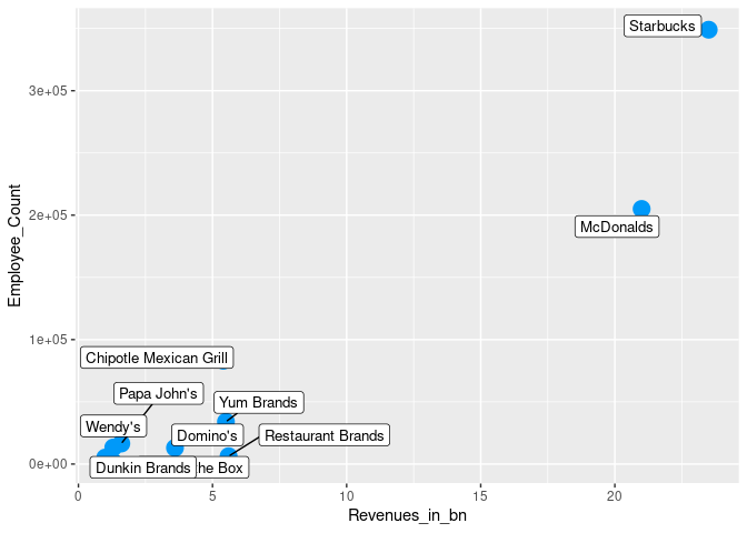
I am getting an error when trying to plot a very simple data frame. It is saying Error: Aesthetics must be either length 1 or the same as the data (10): label
I also attempted to do a reprex here but am getting an odd error message. I'm unsure if this will work:
library(readxl)
library(ggplot2)
library(tidyverse)
library(ggrepel)
library(reprex)
library(readxl)
McDonalds_Restaurants <- read_excel("McDonalds & Restaurants.xlsx",
    sheet = "QSR Companies")
View(McDonalds_Restaurants)
summary(McDonalds_Restaurants)
names(McDonalds_Restaurants) <- c("Company_Name", "Employee_Count", "Revenues_in_bn")
ggplot(McDonalds_Restaurants, aes(x = Employee_Count, y = Revenues_in_bn)) +
  geom_point(size = 5, color = "#0099f9")
ggplot(McDonalds_Restaurants, aes(x = Revenues_in_bn, y = Employee_Count)) +
  geom_point(size = 5, color = "#0099f9") +
  geom_label_repel(label = rownames(McDonalds_Restaurants$Company_Name), size = 3.5)
FJCC
May 23, 2021, 1:29pm
2
I think the problem is using rownames(McDonalds_Restaurants$Company_Name). You probably mean either rownames(McDonalds_Restaurants) or simply Company_Name.
Ok I changed it to just McDonalds_Restaurants but
the name's of the restaurants show up only as numbers
my Employee_Count axis shows the Employee_Count values as: 0e+00, 1e+05, 2e+05, 3e+05. Instead of 0; 100,000; 200,000; 300,00.
I even swapped which category was on the y-axis and x-axis to give the Employee_Count values more room
Can you please share a small part of the data set in a copy-paste friendly format?
In case you don't know how to do it, there are many options, which include:
If you have stored the data set in some R object, dput function is very handy.
In case the data set is in a spreadsheet, check out the datapasta package. Take a look at this link .
I followed the steps in the example. My Console says that there is a Reprex on the clipboard but this is all I am getting as an output:
No user-supplied code found … so we’ve made some up. You’re welcome!
sprintf("Happy %s!", weekdays(Sys.Date()))
#> [1] "Happy Sunday!"
Created on 2021-05-23 by the reprex package (v2.0.0)
That is not what I am asking for, I'm only asking you for sample data in a copy/paste friendly format, it is as simple as running this code and posting the output you get.
dput(McDonalds_Restaurants)
dput(McDonalds_Restaurants)
library(tidyverse)
library(ggrepel)

# Sample data on a copy/paste friendly format
McDonalds_Restaurants <- structure(list(Company_Name = c("McDonalds", "Starbucks", "Jack in the Box",
"Yum Brands", "Restaurant Brands", "Chipotle Mexican Grill",
"Wendy's", "Domino's", "Papa John's", "Dunkin Brands"), Employee_Count = c(205000,
349000, 5200, 34000, 6300, 83000, 13300, 13000, 16500, 1700),
Revenues_in_bn = c(21, 23.5, 1, 5.5, 5.6, 5.402, 1.3, 3.6,
1.6, 1.3)), row.names = c(NA, -10L), class = c("tbl_df",
"tbl", "data.frame"))

# Relevant code

McDonalds_Restaurants %>%
    ggplot(aes(x = Revenues_in_bn, y = Employee_Count)) +
    geom_point(size = 5, color = "#0099f9") +
    geom_label_repel(aes(label = Company_Name), size = 3.5, max.overlaps = 3000)
Created on 2021-05-23 by the reprex package (v2.0.0)
Ok how do I get the Employee_Count axis to show the proper values instead of the 0e+00; 1e+05; 2e+05; 3e+05
JReezy
May 23, 2021, 7:19pm
10
I'd also like for the specific Revenues_in_bn to show for each restaurant when you hover over the point or label.. Is there a way to address that?
JReezy
May 23, 2021, 10:39pm
11
Never mind. Figured out the number formatting with the 'scales_y_continuous(labels = comma)' code
Not with ggplot2 for interactive graphics use plotly
system
May 31, 2021, 12:54am
13
This topic was automatically closed 7 days after the last reply. New replies are no longer allowed.
