Ggplot doesn't take an Empty dataset what to do?

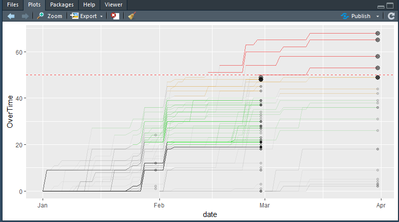
I was writing a code where I have to change certain lines in green color, or orange or red based on a certain criteria. it works fine when I have the data in code. But when it produces empty dataset then I have the problem. Just to give you a synopsis.

data_black_lines %>%
    ggplot(aes(
        date,
        cum,
        group = emp_code,
        text = paste("Name:", name)
    )) +
    geom_line(alpha = I(.05)) +
    geom_line(
        data = data_green_lines,
        color = I('green'),
        alpha = I(.10)
    ) +
    geom_line(
        data = ,
        color = I('orange'),
        alpha = I(.2)
        ,
        size = I(.5)
    ) +
    geom_line(
        data = data_red_lines,
        color = I('red'),
        alpha = I(.5)
        ,
        size = I(.5)
    ) +
    
    geom_point(data = data_top_10,
               aes(
                   date,
                   cum,
                   fill = I('steelblue')
               ),
               size=3,
               alpha=I(.4)) +
    
    geom_point(data = data_last_date,
               aes(
                   date,
                   cum,
                   fill = I('royalblue')
               ),
               alpha=I(.12)) +
    
    geom_hline(
        yintercept = 50,
        color = 'red',
        size = I(.7),
        alpha = I(.7),
        linetype = 'dashed'
    ) +
    
    ylab('OverTime')

this is the code. and it produces this error.

Error: Aesthetics must be either length 1 or the same as the data (1): x, y, group, text

but data_orange_lines and data_red_lines are sometimes empty.

> data_orange_lines
[1] emp_code date     cum      name    
<0 rows> (or 0-length row.names)

what should I do. It works fine if there is some data in the dataset but it doesn't work at all when the dataframe is empty....

Please guide.
I tried writing it in an if statement but it doesn't work either.

data_black_lines %>%
    ggplot(aes(
        date,
        cum,
        group = emp_code,
        text = paste("Name:", name)
    )) +
    geom_line(alpha = I(.05)) +
    
    if(nrow(data_green_lines)!=0){
        geom_line(
            data = data_green_lines,
            color = I('green'),
            alpha = I(.10)
        )
    }else{NULL}+
    if(nrow(data_orange_lines)!=0){
        geom_line(
            data =  data_orange_lines,
            color = I('orange'),
            alpha = I(.2)
            ,
            size = I(.5)
        )
                    
    }else{NULL}+
    if(nrow(data_red_lines)!=0){
        geom_line(
            data = data_red_lines ,
            color = I('red'),
            alpha = I(.5)
            ,
            size = I(.5)
        )
    }else{NULL}+
    geom_point(data = data_top_10,
               aes(
                   date,
                   cum,
                   fill = I('steelblue')
               ),
               size=3,
               alpha=I(.4)) +
    
    geom_point(data = data_last_date,
               aes(
                   date,
                   cum,
                   fill = I('royalblue')
               ),
               alpha=I(.12)) +
    
    geom_hline(
        yintercept = 50,
        color = 'red',
        size = I(.7),
        alpha = I(.7),
        linetype = 'dashed'
    ) +
    
    ylab('OverTime')

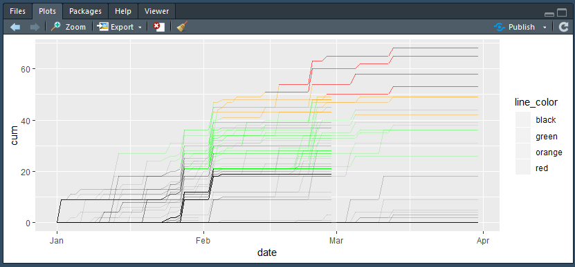
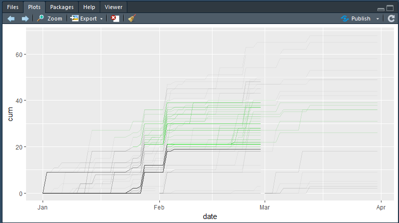
it produces

which means it omits those lines entirely. however it should produce a plot like this. with red and orange lines...

Still don't know what to do please do reply if you know the answer.

From the look of your first plot, it seems that you do have the data to make the red/orange lines, but whatever logic you have used to create the data_red_lines and data_orange_lines is not always producing what you expect.

Are you able to provide the data/code to create the data so we can help you investigate, please? Ideally as a self-contained, reproducible example reprex.

1 Like

I could not upload my data in the website so I am posting it through cloud.rstudio.com

https://rstudio.cloud/project/36144

The data is regarding overtime of employees which shouldn't exceed 20 hours in a month and 50 hours in a quarter. Which I want to highlight through colors. You will find the dataset in a sqlite database.

Let me know if this doesn't work I have created a file than has just the data creation and graph plotting logic from my shiny app...

please let me know if there is something I should do in this case.

i used this method to solve my problem but its long and tedious if someone has a better approach please do let me know.


##### creating data for the plot
data_black_lines<- 
    fulldata[organization == 'honda', .(emp_code = as.character(emp_code),
                                        date, cum, name)]

     
data_green_lines<-
    fulldata[organization == 'honda'
             & cum %between% c(20, 40)
             , .(emp_code = as.character(emp_code),
                 date, cum, name)]

    
data_orange_lines<- 
    
    fulldata[organization == 'honda'
             &
                 cum %between% c(40.01, 49.99)
             , .(emp_code = as.character(emp_code),
                 date, cum, name)]


data_red_lines<- 
    
    fulldata[organization == 'honda'
             & cum >= 50
             , .(emp_code = as.character(emp_code),
                 date, cum, name)]

data_top_10<-
    
    fulldata[, .(cum = sum(overtime),
                 date = max(date)),
             .(emp_code, name)][order(-cum),][1:10, ]

setkey(data_top_10,emp_code)

fulldata[data_top_10,.(name,emp_code,
                       date,
                       overtime,cum)]
data_last_date<- 
    fulldata[, .(cum = sum(overtime),
                 date = max(date)),
             .(emp_code, name)]

##### creating the plot layer by layer using if statements to control layers.


base_blank<-data_black_lines %>%
            ggplot(aes(
                date,
                cum,
                group = emp_code,
                text = paste("Name:", name)
            )) 

base_black<-if(nrow(fulldata)!=0){
    base_blank +
        geom_line(alpha = I(.05))
}else{base_blank} 
            

base_green<-if(nrow(data_green_lines)!=0){
    base_black+    
    geom_line(
        data = data_green_lines,
        color = I('green'),
        alpha = I(.10)
    )
}else{base_black}
            

base_orange<-if(nrow(data_orange_lines)!=0){
    base_green+
    geom_line(
        data = data_orange_lines,
        color = I('orange'),
        alpha = I(.2)
        ,
        size = I(.5)
    )
}else{base_green}


base_red<-if(nrow(data_red_lines)!=0){
    base_orange+
        geom_line(
            data = data_red_lines,
            color = I('red'),
            alpha = I(.5)
            ,
            size = I(.5)
        )
}else{base_orange}          
             
            
gg_main_plot<-   
    base_red+
    geom_point(data = data_top_10,
                       aes(
                           date,
                           cum,
                           fill = I('steelblue')
                       ),
                       size=3,
                       alpha=I(.4)) +
            
            geom_point(data = data_last_date,
                       aes(
                           date,
                           cum,
                           fill = I('royalblue')
                       ),
                       alpha=I(.12)) +
            
            geom_hline(
                yintercept = 50,
                color = 'red',
                size = I(.7),
                alpha = I(.7),
                linetype = 'dashed'
            ) + ylab('OverTime')


gg_main_plot%>%
    ggplotly() %>%
    hide_legend() %>%
    layout(plot_bgcolor = 'transparent',
           paper_bgcolor = 'transparent')

Hi,

Does this help at all? I've used rbind to concatenate the data.frames and then named values in scale_colour_manual to force them to be the right colour even when missing.

I've ignored the geom_point bits, as the question related to the line data, but these can also be identified within (or added to) a single DF.

Most of this code relates to making example data, the rbind and compound ggplot are all that is required. Except that you need to add a dataset identifier (dset below) to your records.

library(ggplot2)
# Some dummy data to play with...
data_black_lines <- data.frame(emp_code = rep(1:2,each=5),
                               date = rep(1:5,times=2),
                               cum = c(cumsum(runif(5)), cumsum(runif(5))),
                               dset = 'black_lines',
                               stringsAsFactors = FALSE)
data_green_lines <- data.frame(emp_code = rep(3:4,each=5),
                               date = rep(1:5,times=2),
                               cum = 1+c(cumsum(runif(5)), cumsum(runif(5))),
                               dset = 'green_lines',
                               stringsAsFactors = FALSE)
data_orange_lines <- data.frame(emp_code = rep(5:6,each=5),
                                date = rep(1:5,times=2),
                                cum = 1.5+c(cumsum(runif(5)), cumsum(runif(5))),
                                dset = 'orange_lines',
                                stringsAsFactors = FALSE)
data_red_lines <- data.frame(emp_code = rep(7:8,each=5),
                             date = rep(1:5,times=2),
                             cum = 2+c(cumsum(runif(5)), cumsum(runif(5))),
                             dset = 'red_lines',
                             stringsAsFactors = FALSE)
# 
DF<-rbind(data_black_lines, data_green_lines, data_orange_lines, data_red_lines)
ggplot(DF,aes(x=date,y=cum,group=emp_code,colour=dset)) +
  geom_line() +
  scale_colour_manual(values=c(black_lines = 'black', green_lines = 'green',
                               orange_lines = 'orange', red_lines = 'red'))
#
# No orange data
DF1<-rbind(data_black_lines, data_green_lines, data_red_lines)
ggplot(DF1,aes(x=date,y=cum,group=emp_code,colour=dset)) +
  geom_line() +
  scale_colour_manual(values=c(black_lines = 'black', green_lines = 'green',
                               orange_lines = 'orange', red_lines = 'red'))
#
# Orange data creating function returned NULL
orange_data_null <- NULL
DF2<-rbind(data_black_lines, data_green_lines, orange_data_null, data_red_lines)
ggplot(DF2,aes(x=date,y=cum,group=emp_code,colour=dset)) +
  geom_line() +
  scale_colour_manual(values=c(black_lines = 'black', green_lines = 'green',
                               orange_lines = 'orange', red_lines = 'red'))

Regards,
Ron.

1 Like

Thank you very much for your response @ron. I didn't knew you could use scale_color_manual for this type of manipulations. I loved it.

But when I try to write it.

fulldata[,line_color:=ifelse(cum<=20,'black',ifelse(
    cum %between% c(20.01,40),'green',ifelse(
        cum %between% c(40.01,49),'orange','red')
))]


fulldata %>% 
ggplot(aes(date,cum,group=emp_code,color=line_color))+
    geom_line(alpha=I(.2))+
    scale_colour_manual(values=c(black = 'black', 
                                 green = 'green',
                                 orange = 'orange', 
                                 red = 'red'))

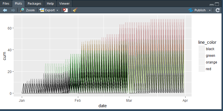
this gives me a graph like this one

it is entirely different from the one I want that I have posted above.

I don't know why it happens but it does...

I want to show overtime data of employees as it increases towards 50 hours in a quarter. It should change it's color when approaching from 0 to 20 to 40 to 50 or above.... so that we can trace it...

and the data that I have is not symmetrical. What I mean is

there are more black lines than green one. more green lines than orange and more orange then red. because only a few people would do overtime and that too not everyone will exceed the limit.

I am not sure if it has to do with that.

But I would suggest you to please take a look at data by going to this link

I have already found a solution that I have posted above but I need to know if there is any elegant solution that I am missing.

It looks like your underlying data in the "fulldata" table includes many situations where the same employee carries different overtime balances with different organizations. You're seeing each of their lines oscillate each day between the main number you expected and zero for their balance with another org.

If you replace

ggplot(aes(date,cum,group=emp_code,color=line_color))+

with

 ggplot(aes(date,cum,group=interaction(emp_code,organization),
             color=line_color))+

you should get cleaner lines the way you had before.

1 Like

thanks for your reply jon but that code didn't work for me and my calculation don't depend on organization.

I just want to change the colors of the line after a perticular point. I don't want to change the colors entirely. But only after a perticular point has been crossed the rest of the line should change the color and doing so sometime involves empty datasets.

I have already posted one solution above. I am trying to find is there a better alternative than that.

somehow the code you mentioned doesn't work that way.

I haven't looked at your data, but the suggestion by @jonspring looked like a good idea to me.

I'd try group=interaction(line_color,emp_code).

1 Like

That’s interesting. I loaded your Rstudio.cloud project and that change corrected the chart issue there, so I’m curious why it’s not working for you otherwise.

I hear what you’re saying about how your calculation doesn’t depend on organization, but in any case the data on your cloud project does. When i opened the full data table, and sorted it by date and then by employee, I saw that there were two data points for many employees each day, with different organizations. The cumulative total for one of the orgs was usually zero. That seemed consistent with the zigzag shape in your chart. Adding the interaction formula fixed it there.

2 Likes

great, GREAT, GREAT it just worked..

I don't know why it didn't work yesterday...I had some problem with tidy verse yesterday (Unable to load tidyverse).

I used this code and it worked like magic...


fulldata[,line_color:=ifelse(cum<=20,'black',ifelse(
    cum %between% c(20.01,40),'green',ifelse(
        cum %between% c(40.01,49),'orange','red')
))]


fulldata %>% 
ggplot(aes(date,cum,group=interaction(emp_code,organization),
           color=line_color))+
    geom_line(alpha=I(.1))+
    scale_colour_manual(values=unique(fulldata$line_color))+
    geom_hline(yintercept = 50,linetype=3)        

Thanks a lot for helping me out. Thank you very much.

There is one more thing I want to know. Is there a way I can relate my alpha level to colors... this is a subset of data. I will have to plot like 800 some people on the graph and I want to highlight only the orange and red part of the line... Is there a way I can dynamically control the alpha level of these lines. Please do reply. I really want to use this code in production as it is much easier to understand.

And just for reference where can I learn how to use this interaction formula in ggplot2. I never knew something like that exists...

One way to have the alpha vary within the line would be to switch from using geom_line to geom_segment. You'd need to do a bit of data-prep work first to make it work, since you'd need to define the start and end coordinates of each segment, and the alpha for that segment. I suspect it might take longer to render, too, but I don't know if that'd be a problem.

Maybe something like... (I haven't tried it so maybe typos)

fulldata %>%
group_by(emp_code, organization) %>%
mutate(prior_date = lag(date),
       prior_cum  = lag(cum),
       alpha      = if_else(cum > 50, 0.2, 0.05)) %>%
ungroup() %>%
ggplot(aes(x = date, y = cum, xend = prior_date, yend = prior_cum, 
           alpha = alpha, group = interaction(emp_code, organization), 
           color = line_color))

Another alternative might be to continue using geom_line, but prep your data to separate the data before and after the overtime threshold. (To make the lines appear continuous, both copies would need to include an overlapping observation in the middle. I'm not sure about a good way to do that.)

Something like (also not tested)...

threshold <- 50

fulldata %>%
    mutate(OT = if_else(cum <= threshold, TRUE, FALSE)) %>%
    ggplot(aes(date,cum,group=interaction(emp_code,organization),
           color=line_color, alpha = OT)) +
   scale_alpha_manual(# Here define what alphas you want...

1 Like

Great again. You are the MAN!!!!:sunglasses::sunglasses::sunglasses::sunglasses:

I finally solved it. in one go

fulldata %>% 
ggplot(aes(date,cum,group=interaction(emp_code,organization),
           color=line_color,alpha=line_color))+
    geom_line()+
    scale_colour_manual(values=unique(fulldata$line_color))+
    scale_alpha_manual(values = c(black=.1,
                                  green=.2,
                                  orange=.4,
                                  red=.6))

Thanks for such a simple and elgent solution It worked like magic...

I learned 2 things today there is a scale called manual which you can set for situations like this and there is something called interaction that can solve some complex calculations in a ggplot2 plot. Thanks a lot again.

But I noticed a difference if I plot it directly via ggplot2 it takes like 50 some seconds but if I pass the same plot in ggplotly function it takes only 5 seconds to plot it. I need an interactive plot for shiny dashboard so I have to use plotly anyway but is it just me or the difference is real.