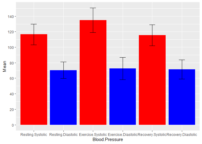
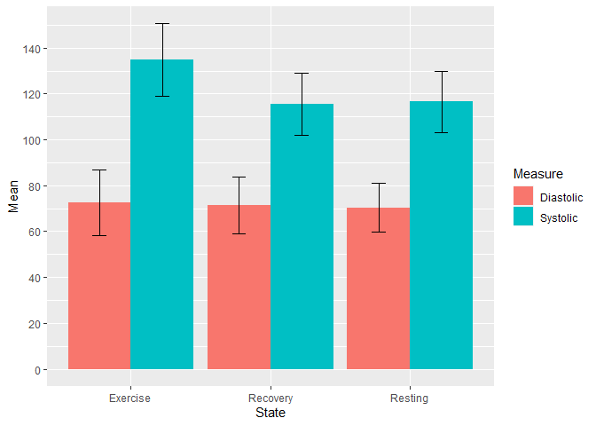
I'm trying to make a Barchart with GGPLOT the code I am using is as follows:
ggplot(data = Clean.Blood.Preasure, mapping = aes(Blood.Pressure, Mean.BP)) +
  geom_bar(stat = "summary" ) +
  geom_errorbar(aes(ymin = Mean.BP-se.BP, ymax = Mean.BP + se.BP), width = .2)
My data is as follows, I didn't know how else I could attach it other than just copying it from the excel spreadsheet to here:
|Blood.Pressure|Mean|SD|SEM|Count|P Value|
|Resting.Systolic|116.5746|13.39587|1.157227|134|2.20E-16|
|Resting.Diastolic|70.29104|10.6233|0.9177134|134|0.06099|
|Exercise.Systolic|134.8806|15.72128|1.358112|134|2.20E-16|
|Exercise.Diastolic|72.47761|14.21358|1.227866|134|0.06099|
|Recovery.Systolic|115.4104|13.52926|1.16875|134||
|Recovery.Diastolic|71.33582|12.36472|0.9177134|134||
I'm trying to show the mean of each category on the y axis so assuming stat = summary achieves this?
If anyone could please help with how I could achieve the following I would be extremely grateful.
- The tick marks on the y axis firstly don't go all the way to the top of the axis and secondly are too sparse I would like them to be at intervals of 20.
- I would like the bars to be ordered in the following order- resting systolic, resting diastolic, exercise systolic, exercise diastolic, recovery systolic, recovery diastolic
- I would like to colour systolic bars differently to diastolic bars to show contrast
- Also is it possible to include asterixes to show the statistical significance between resting systolic/exercise systolic, and resting diastolic and exercise diastolic.
Thank you in advance with any help you can give.