Hello,
d.wastewaternew$sampledate = mdy(d.wastewaternew$ï..DateResult)
d.wastewaternew %>%
  ggplot(aes(x = ï..DateResult, y= SARS2_levels, color = Hall)) + geom_line()
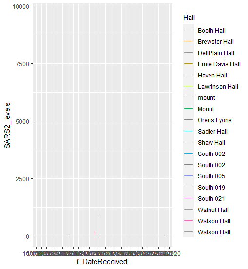
and the result I got was the first image, which shows now data plots and has the dates all jumbled up
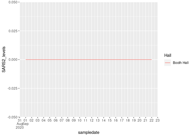
On the second try, I changed ï..DateResult in the sting to sampledate, which was the new mdy variable I had created for this data set and it gave me the following. Now instead of plotting by day its just plotting months, which is not what I need for the graph
any tips would be greatly appreciated
Hi!
To help us help you, could you please prepare a repr oducible ex ample (reprex) illustrating your issue? Please have a look at this guide, to see how to create one:
A minimal reproducible example consists of the following items:
A minimal dataset, necessary to reproduce the issue
The minimal runnable code necessary to reproduce the issue, which can be run
on the given dataset, and including the necessary information on the used packages.
Let's quickly go over each one of these with examples:
> datapasta::df_paste(head(d.wastewaternew))
named list()
> reprex::reprex({
+ library("ggplot2")
+ library(lubridate)
+ library(magrittr)
+ library(dplyr)
+ d.wastewaternew$sampledate = mdy(d.wastewaternew$ï..DateResult)
+ d.wastewaternew %>%
+   ggplot(aes(x = ï..DateResult, y= SARS2_levels, color = Hall)) + geom_line()
+ datapasta::df_paste(head(d.wastewaternew))
+ data.frame(
+   stringsAsFactors = FALSE,
+      ï..DateResult = c("9/1/2020","9/4/2020",
+                        "9/10/2020","9/15/2020","9/17/2020","9/22/2020"),
+               Hall = c("Booth Hall","Booth Hall",
+                        "Booth Hall","Booth Hall","Booth Hall","Booth Hall"),
+       SARS2_levels = c(0, 0, 0, 0, 0, 0),
+         sampledate = c("2020-09-01","2020-09-04",
+                        "2020-09-10","2020-09-15","2020-09-17","2020-09-22")
+ )})
Not quite a reprex but good enough I think.
To plot dates in the x-axis you need to use a proper date variable, not character strings, and to customize the "date breaks" of your plot you can use the scale_x_date() function. Check this example:
library(tidyverse)

d.wastewaternew <- data.frame(
    stringsAsFactors = FALSE,
    ï..DateResult = c("9/1/2020","9/4/2020",
                      "9/10/2020","9/15/2020","9/17/2020","9/22/2020"),
    Hall = c("Booth Hall","Booth Hall",
             "Booth Hall","Booth Hall","Booth Hall","Booth Hall"),
    SARS2_levels = c(0, 0, 0, 0, 0, 0),
    sampledate = as.Date(c("2020-09-01","2020-09-04",
                   "2020-09-10","2020-09-15","2020-09-17","2020-09-22"))
)

d.wastewaternew %>%
    ggplot(aes(x = sampledate, y = SARS2_levels, color = Hall)) +
    geom_line() +
    scale_x_date(date_breaks = "1 day",
                 labels = scales::label_date_short())
Created on 2021-04-18 by the reprex package (v2.0.0)
system
May 9, 2021, 5:40pm
5
This topic was automatically closed 21 days after the last reply. New replies are no longer allowed.