GGplot and geom_histogram

Hi,

The histogram does visualise the distribution of a single continuous variable by dividing the x axis into bins and counting the number of observations in each bin.
I would like to know (count) how many values do I have in each bin in my histogram. How do I do it ?
Additionally is it possible to find out what values of my variable are placed in what particular bin ?
Any help will be greatly appreciated.

my_variable < - c(12.901, 5.605, 7.959, 7.824, 17.713, 16.642, 20, 16.44, 18.783, 
8.145, 8.539, 8.081, 4.389, 5.972, 18.69, 14.026, 12.01, 1.933, 
1, 17.341, 15.358, 17.801, 13.872, 17.018, 9.63, 17.894, 11.272, 
5.542, 6.514, 17.892)

my_variable <- data.frame(my_variable)

ggplot(my_variable, aes(x=my_variable)) + geom_histogram()

Hello,

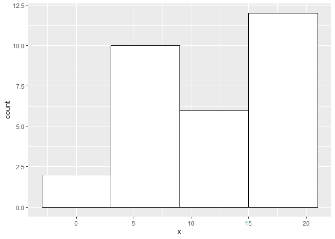
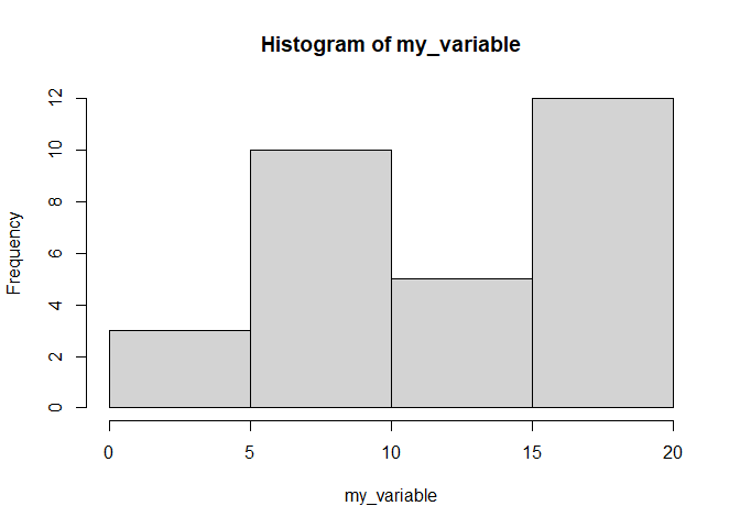
So base provides some really great ways to select good bins and you can explore more of that with breaks within the function hist. As you will see I printed the hist object and extracted all the info you required. You can change the argument for breaks and extract it in the same way then construct your ggplot with that info for binwidth. If you run your example you see that R also warns you stat_bin() using bins = 30. Pick better value with binwidth which is already telling you that you need to specify more for it to be appropriate.

As you will see I used the info from the first plot to create the ggplot version.

library(ggplot2)
# data --------------------------------------------------------------------

my_variable <- c(12.901, 5.605, 7.959, 7.824, 17.713, 16.642, 20, 16.44, 18.783, 
                  8.145, 8.539, 8.081, 4.389, 5.972, 18.69, 14.026, 12.01, 1.933, 
                  1, 17.341, 15.358, 17.801, 13.872, 17.018, 9.63, 17.894, 11.272, 
                  5.542, 6.514, 17.892)


# basic example with base -------------------------------------------------

output <- 
hist(my_variable,breaks="FD")

output
#> $breaks
#> [1]  0  5 10 15 20
#> 
#> $counts
#> [1]  3 10  5 12
#> 
#> $density
#> [1] 0.02000000 0.06666667 0.03333333 0.08000000
#> 
#> $mids
#> [1]  2.5  7.5 12.5 17.5
#> 
#> $xname
#> [1] "my_variable"
#> 
#> $equidist
#> [1] TRUE
#> 
#> attr(,"class")
#> [1] "histogram"

breaks <- pretty(range(my_variable), n = nclass.FD(my_variable), min.n = 1)


breaks
#> [1]  0  5 10 15 20


# Using base's reasonable breaks for ggplot -------------------------------

bwidth <- breaks[2] - breaks[1] 
df <- data.frame(my_variable)
names(df) <- c("x")

gg_output <- 
ggplot(df,aes(x))+geom_histogram(binwidth=bwidth+1,fill="white",colour="black")

gg_output 

Created on 2021-10-18 by the reprex package (v2.0.0)

Thank you @GreyMerchant,

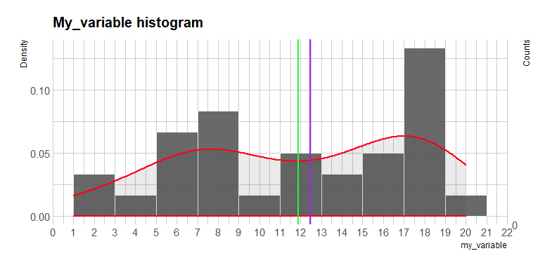
I have read and expanded a code a bit and now I have got this:

ggplot(my_variable, aes(x = my_variable)) + geom_histogram(aes(y=..density..), position = "identity", binwidth=2, color="#e9ecef", alpha=0.9) + stat_density(col = "red", size = 1, alpha=.1) + 
 ggtitle("My_variable histogram")  +
 theme_ipsum() +  
 theme(plot.title = element_text(size=15)) +
 scale_y_continuous("Counts", breaks = round(ybreaks / (2 * n_obs), 3), labels = ybreaks) + 
 scale_y_continuous("Density", sec.axis = sec_axis(
  trans = ~ . * 2 * n_obs, name = "Counts", breaks = ybreaks)) + scale_x_continuous(breaks = seq(0, 25, 2.5), lim = c(0, 25)) + scale_x_continuous(breaks = breaks, labels = labels, limits = c(-5,30)) +
scale_x_continuous(breaks = scales::pretty_breaks(n = 20)) +
 geom_vline(xintercept=mean(my_variable$my_variable), color="green", size = 1) +
 geom_vline(xintercept=median(my_variable$my_variable), color="purple", size = 1)
labs(x = "my_variable") +
 geom_bar(stat = "count") + 
stat_count(geom = "text", colour = "white", size = 3.5,
aes(label = ..count..),position=position_stack(vjust=0.5))


my_variable <- c(
  12.901, 5.605, 7.959, 7.824, 17.713, 16.642, 20, 16.44, 18.783,
  8.145, 8.539, 8.081, 4.389, 5.972, 18.69, 14.026, 12.01, 1.933,
  1, 17.341, 15.358, 17.801, 13.872, 17.018, 9.63, 17.894, 11.272,
  5.542, 6.514, 17.892
)


my_variable <- data.frame(my_variable)

library(tidyverse)
library(hrbrthemes)


n_obs = sum(!is.na(my_variable$b))


ybreaks = seq(0, 25,5) 

n_obs = sum(!is.na(my_variable$b))

breaks <- seq(0, 25, 2.5)

labels <- as.character(breaks)
labels[!(breaks %% 2.5 == 0)] <- ''
tick.sizes <- rep(.5, length(breaks))
tick.sizes[(breaks %% 2.5 == 0)] <- 1

and I would like to place number of values on each bin (and percent of total), I have tried as you can see, but it
not gives me what I want. Please help.
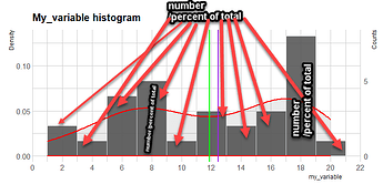
Something like in here:
https://forum.posit.co/t/labels-in-histograms/118194

best,
Have a look here on how to accomplish that:

You want to create something like the below. Have a look at stats_bin

 stat_bin(aes(y=..count.., label=..count..), geom="text", vjust=-.5) 

Thank you @GreyMerchant ,
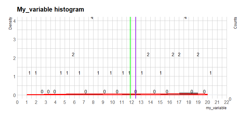
I have tried this before but somehow it does not give me what I want.
Maybe the line of code you suggested is placed in wrong place by me ?


ggplot(my_variable, aes(x = my_variable)) + geom_histogram(aes(y=..density..), position = "identity", binwidth=2, color="#e9ecef", alpha=0.9) + stat_density(col = "red", size = 1, alpha=.1) + 
stat_bin(aes(y=..count.., label=..count..), geom="text", vjust=-.5) +
 ggtitle("My_variable histogram")  +
 theme_ipsum() +  
 theme(plot.title = element_text(size=15)) +
 scale_y_continuous("Counts", breaks = round(ybreaks / (2 * n_obs), 3), labels = ybreaks) + 
 scale_y_continuous("Density", sec.axis = sec_axis(
  trans = ~ . * 2 * n_obs, name = "Counts", breaks = ybreaks)) + scale_x_continuous(breaks = seq(0, 25, 2.5), lim = c(0, 25)) + scale_x_continuous(breaks = breaks, labels = labels, limits = c(-5,30)) +
scale_x_continuous(breaks = scales::pretty_breaks(n = 20)) +
 geom_vline(xintercept=mean(my_variable$my_variable), color="green", size = 1) +
 geom_vline(xintercept=median(my_variable$my_variable), color="purple", size = 1)
labs(x = "my_variable") +
 geom_bar(stat = "count") + 
stat_count(geom = "text", colour = "white", size = 3.5,
aes(label = ..count..),position=position_stack(vjust=0.5))

because it gives me this:

and I would like to have that:

I want a number of values in each and every bin (count) and % of total counts beside it.


my_df <- data.frame(my_variable = c(
  12.901, 5.605, 7.959, 7.824, 17.713, 16.642, 20, 16.44, 18.783,
  8.145, 8.539, 8.081, 4.389, 5.972, 18.69, 14.026, 12.01, 1.933,
  1, 17.341, 15.358, 17.801, 13.872, 17.018, 9.63, 17.894, 11.272,
  5.542, 6.514, 17.892
))

bins_to_use <- 10

density_scale_param <- 7
slide_up_text <- .25

library(ggplot2)

num_entries <- nrow(my_df)

ggplot(my_df) +
  aes(x = my_variable) +
  geom_histogram(aes(y = ..count..), 
                 bins = bins_to_use) +
  geom_density(aes(y = density_scale_param * ..scaled..),
               color = "red") +
  stat_bin(geom = "text", 
           aes(y = ..count.., 
               label = paste0(..count.. ,", ",
                              scales::percent(..count../num_entries))),
           bins = bins_to_use,
           position = position_nudge(y = slide_up_text))

Does it mean that with code I provided, this is not possible to do it ? I mean to have two y-axes etc.

+ scale_y_continuous(sec.axis=
                    sec_axis(trans = ~ ./ density_scale_param,
                     name = "Density"))

Thank you very much indeed Nir,
I adopted, mixed and used your code and finally it looks the way I wanted.

ggplot(my_variable) +
  aes(x = my_variable$liczby) +
  geom_histogram(aes(y = ..count..),
    bins = bins_to_use, color = "#e9ecef", alpha = 0.9, closed = "left"
  ) +
  stat_density(col = "red", size = 2, alpha = .1) +
  geom_density(aes(y = density_scale_param * ..scaled..),
    color = "red", size = 2) +
  stat_bin(geom = "text", aes(y = ..count.., label = paste0(
        ..count.., ", ",
        scales::percent(..count.. / num_entries))
    ), bins = bins_to_use,
    position = position_nudge(y = slide_up_text)
  ) +
  scale_y_continuous(sec.axis = sec_axis(trans = ~ . / density_scale_param,
        name = "Density")) +
  geom_vline(xintercept = mean(my_variable$liczby), color = "green", size = 1) +
  geom_vline(xintercept = median(my_variable$liczby), color = "purple", size = 1) +
  labs(x = "my-variable") +
  theme_ipsum() +
  theme(plot.title = element_text(size = 15)) +
  scale_x_continuous(breaks = scales::pretty_breaks(n = 10))+
 ggtitle("My_variable histogram") 

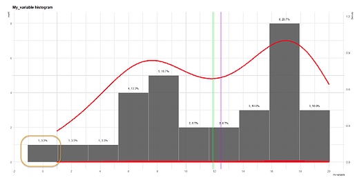
which gives me this:

I was wondering as well, why when min(my_variable) == 1, that histogram shows a bin below zero and one (marked with yellow rounded rectangle) ?

This topic was automatically closed 7 days after the last reply. New replies are no longer allowed.

If you have a query related to it or one of the replies, start a new topic and refer back with a link.