Ggplot and excel graph looking different

Hello,

I'm a bit of a novice at R and ggplot, but have been trying to learn to use them for creating graphs with my data, but I've run into a bit of a problem.

I have produced a graph using ggplot and one on excel from the same data, but there are slight differences, despite using the same data both times.

I also tried to outline the bars on the barplot in R, but I ended up with strange sections as you can see in the second picture. Some of these are on the variables where there is a discrepancy between the two graphs.

Does anyone have any idea what might be causing all of this? I've included the code I used for the barplot below:

ggplot(data=Initial_iron_experiments, mapping=aes(x=Sample, y=Percentage_killing, fill=Dilution))+
geom_bar(stat="identity", position="dodge", colour="black")+
scale_y_continuous("Percentage killing", breaks=c(0,10,20,30,40,50,60,70,80,90,100))+
labs(title="Killing effect of P.aeruginosa on R.microsporus")+
theme(plot.title=element_text(hjust=0.5))
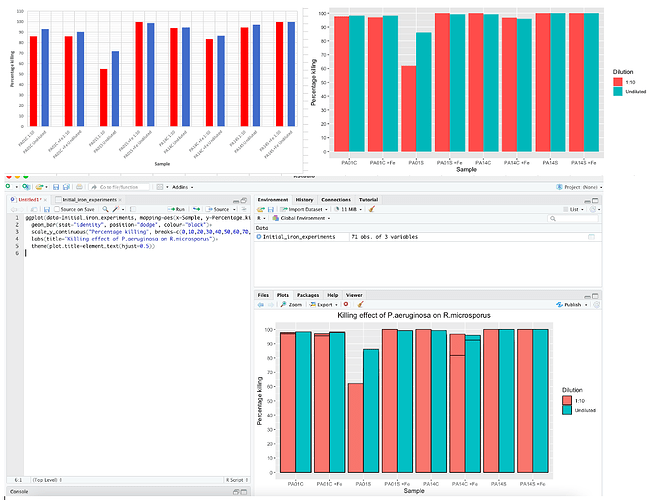
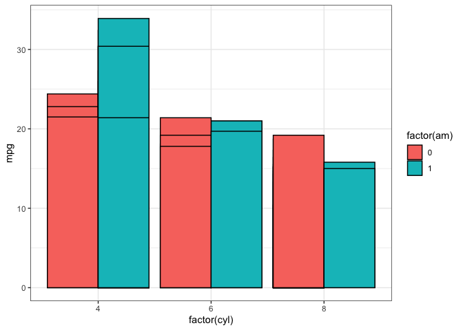
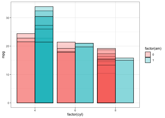
It looks like you have multiple bars plotted one on top of the other. This occurs when you have more than one row of data for a given group of data. In your case, there can be more than one row of data for a given combination of Sample and Dilution and each of these values is plotted one on top of the other as separate bars.

If you show us a sample of your data, we can provide more specific feedback. For now, here's an example with the built in mtcars data frame that shows the same issue you're having. The second graph uses transparency (alpha=0.3) to make the overplotting more easily visible.

library(tidyverse)

ggplot(mtcars, aes(x=factor(cyl), y=mpg, fill=factor(am))) +
  geom_bar(stat="identity", colour="black", position="dodge") +
  theme_bw()

ggplot(mtcars, aes(x=factor(cyl), y=mpg, fill=factor(am))) +
  geom_bar(stat="identity", colour="black", position="dodge", alpha=0.3) +
  theme_bw()

Created on 2021-11-05 by the reprex package (v2.0.1)

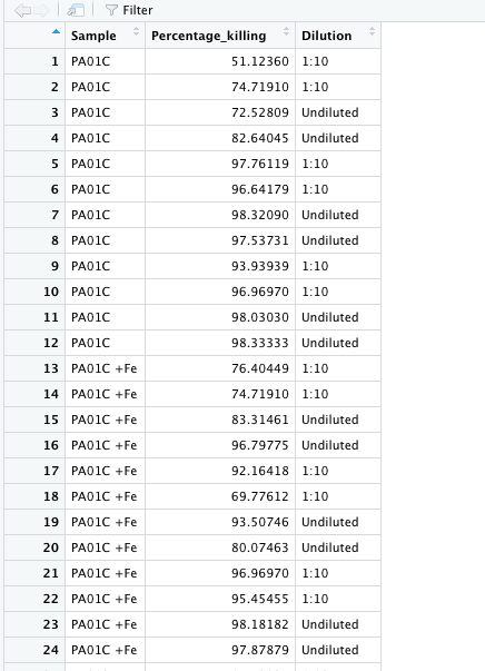
Thank you so much that makes sense. This is a snippet of what my data looks like, so I'm guessing I just need to input the averages for each data point rather than having the whole set of raw data and this should fix the issue?

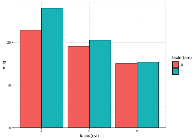
Yes, if you want to plot averages, you can either summarize the data first and pass the summarized data to ggplot, or you can use the stat_summary function within ggplot to calculate the means. Here are examples with the mtcars data. Note that I've used geom_col instead of geom_bar. geom_col() is equivalent to geom_bar(stat="identity").

library(tidyverse)

mtcars %>% 
  group_by(cyl, am) %>% 
  summarise(mpg=mean(mpg, na.rm=TRUE)) %>% 
  ggplot(aes(x=factor(cyl), y=mpg, fill=factor(am))) +
    geom_col(colour="black", position="dodge") +
    scale_y_continuous(expand=expansion(c(0,0.05))) +
    theme_bw()

mtcars %>% 
  ggplot(aes(x=factor(cyl), y=mpg, fill=factor(am))) +
  stat_summary(fun=mean, geom="col", position="dodge", colour="black") +
  scale_y_continuous(expand=expansion(c(0,0.05))) +
  theme_bw()

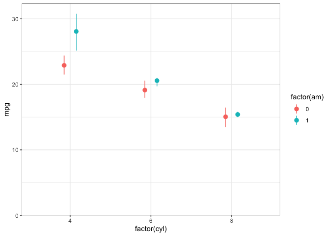
For future reference, stat_summary allows you to calculate additional statistics from the raw data. For example, below we add both the mean and bootstrapped 95% confidence intervals. You can always calculate any statistics outside of ggplot and then use ggplot to visualize them, but stat_summary can sometimes be more convenient, depending on what you're trying to do:

library(tidyverse)

mtcars %>% 
  ggplot(aes(x=factor(cyl), y=mpg, colour=factor(am))) +
  stat_summary(fun.data=mean_cl_boot, geom="pointrange", 
               position=position_dodge(0.3)) +
  scale_y_continuous(limits=c(0,NA), expand=expansion(c(0,0.05))) +
  theme_bw()

Created on 2021-11-06 by the reprex package (v2.0.1)

This is super helpful, thank you so much for all your help!!!

This topic was automatically closed 7 days after the last reply. New replies are no longer allowed.

If you have a query related to it or one of the replies, start a new topic and refer back with a link.