How do you add color to a ggplot scatter plot?
Hi @diw8! Welcome!
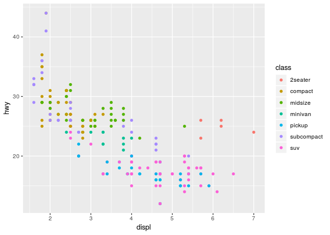
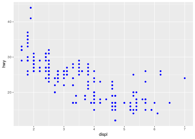
The answer to your question depends on whether you want the color to be mapped to some aspect of the data (i.e. different colors for different groups), or whether you just want a single fixed color for your points that's different from the default black.
To learn how to map the color of points to an aspect of the data, see: 3 Data visualisation | R for Data Science
An example from that link (this will make more sense if you read the explanation at the link!):
library(ggplot2)

ggplot(data = mpg) +
  geom_point(mapping = aes(x = displ, y = hwy, color = class))

Created on 2018-10-17 by the reprex package (v0.2.1)
You can contrast that with the code to make all the points a single, fixed color:
library(ggplot2)

ggplot(data = mpg) +
  geom_point(mapping = aes(x = displ, y = hwy), color = "blue")

Created on 2018-10-17 by the reprex package (v0.2.1)
If neither of those are what you had in mind, I think you'll need to explain more about what you're doing (and showing some code would help in that case!) ![]()