I am really new to R and learning the ggplot.
First, I pulled the map of united state using map_data function with the "state" dataset
Next, I merged my impression data broken down by states with the "states" data to get the impression by state.
Last, I used gglot to show the map and fill with the impression data.
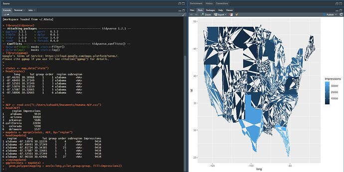
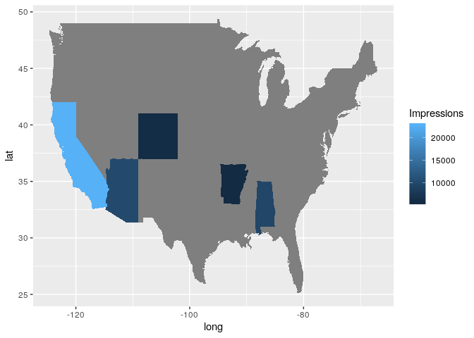
However, the final plot shown as the screenshot below is not quite right.
the AEP data I used below is simple as below:
data.frame(Impressions = c(9434L, 10060L, 5686L, 22694L, 5998L),
    region = as.factor(c("alabama", "arizona", "arkansas", "california",
        "colorado")))
#>   Impressions     region
#> 1        9434    alabama
#> 2       10060    arizona
#> 3        5686   arkansas
#> 4       22694 california
#> 5        5998   colorado
Created on 2019-10-08 by the reprex package (v0.3.0)
library(tidyverse)
library(ggmap)
states <- map_data("state")
head(states)
AEP <- read.csv("C:/Users/czhao01/Documents/Humana-AEP.csv")
head(AEP)
mapdata <- merge(states, AEP, by="region") (I pasted the sample merged data below)
data.frame(stringsAsFactors = FALSE, region = c("alabama", "alabama",
    "alabama", "alabama", "alabama"), long = c(-87.53076171875,
    -87.4849319458008, -87.8172378540039, -87.5708694458008,
    -87.525032043457), lat = c(30.3323860168457, 30.3724918365479,
    30.3438453674316, 30.3266544342041, 30.3724918365479), group = c(1,
    1, 1, 1, 1), order = c(4L, 2L, 23L, 5L, 3L), subregion = c(NA,
    NA, NA, NA, NA), Impressions = c(9434L, 9434L, 9434L, 9434L,
    9434L))
#>    region      long      lat group order subregion Impressions
#> 1 alabama -87.53076 30.33239     1     4        NA        9434
#> 2 alabama -87.48493 30.37249     1     2        NA        9434
#> 3 alabama -87.81724 30.34385     1    23        NA        9434
#> 4 alabama -87.57087 30.32665     1     5        NA        9434
#> 5 alabama -87.52503 30.37249     1     3        NA        9434
Created on 2019-10-08 by the reprex package (v0.3.0)
ggplot(data = mapdata) +
geom_polygon(mapping = aes(x=long,y=lat,group=group, fill=Impressions))

