Dear colleagues,
I am trying to use ggpubr() in particular ggdotchart() to make a nice plot, as an alternative to traditional bar-plots. Here is the link to my data,
https://www.dropbox.com/s/tklmaux3k03pwky/percent.csv?dl=0
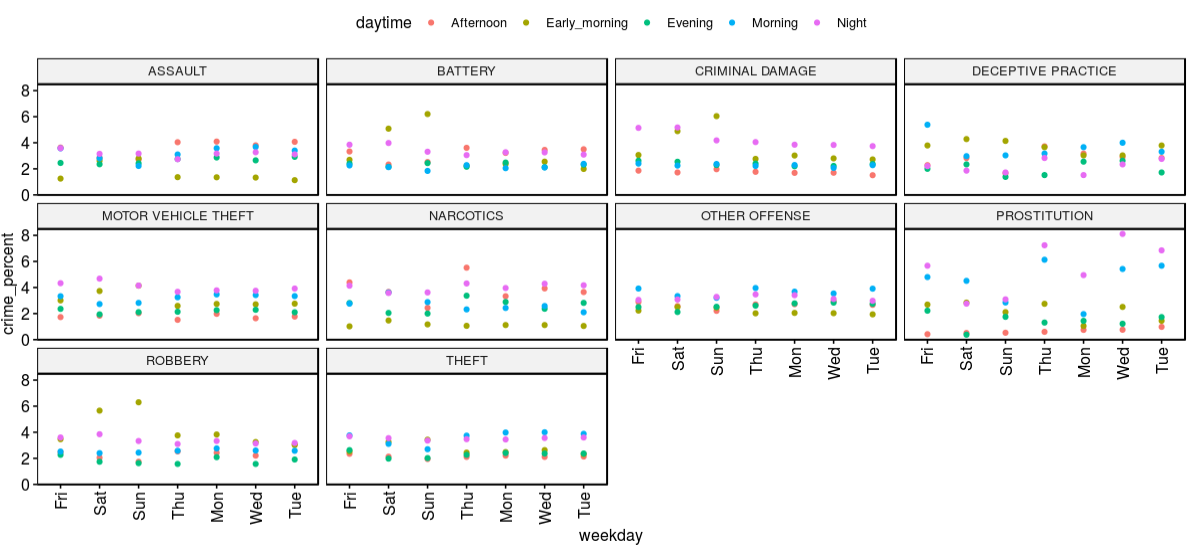
The goal is to do. facetting on the field, Primary.Type, and do the grouping on the variable daytime. Here is my attempt at this;
ggdotchart(data,x="weekday",y="crime_percent",
           group="daytime",
           fill="daytime",
           facet.by = c("Primary.Type")

           #add="segments",
           #position = position_dodge(0.3)
           )
But the dots are not getting shaded as per the daytime. Here is the plot I am getting,
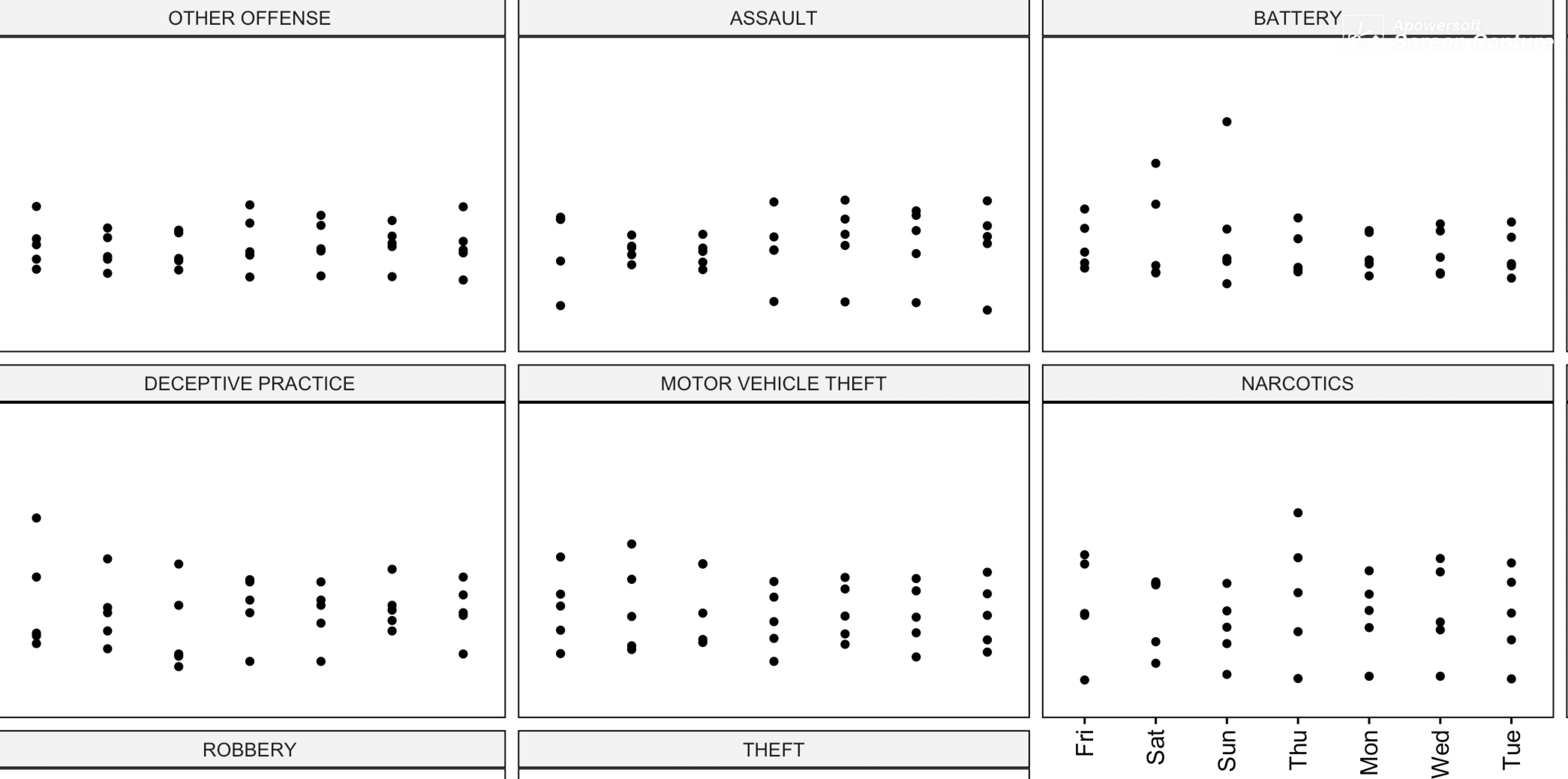
As seen, the dots are not getting colored with different colors.Can I kindly get help to get this idea implemented properly? thanks in advance.