ggcompeting risk / cmprsk - Fitting the plot correctly

NOTE: I changes my data to a publically avaliable data set. Therefore, restricting this dataset to 24 months might not make sense.

Dear R community,

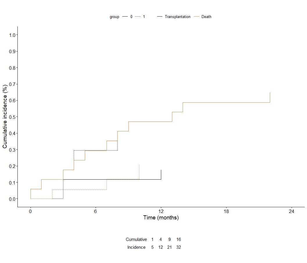
I have some troubles fitting the x axis in a cumulative incidence curve. I tried to scale it setting ticks every 6 (months) starting from 0 - 24 months. Therefore, I used ggcompetingrisk from ggplot2, since it creates better figrues than solely the cmprsk package.

However, using this code (which I have adopted from various internet pages), I can only adopt the y axis, but not the x axis. Can you help me find the mistake?

library(cmprsk)
library(ggplot2)
library(survminer)

my.data <- survminer::BMT
attach <- my.data


p <-ggcompetingrisks(fit=cuminc(my.data$ftime,my.data$status,my.data$dis), 
multiple_panels = FALSE,main="", xlab="Time (months)", ylab="Cumulative incidence (%)") + 
scale_color_manual(name="",values=c("black","peru"), labels=c("Transplantation", "Death"))

ggpar(p,ylim=c(0,1),yticks.by=0.2,xlim=c(0,24),xticks.by=6)

Additionally, I am trying to place a table with "numbers at risk" below the cumulative incidence curve. It should look similar to this example and the usual layout of survival curves (http://forum.r-statistik.de/viewtopic.php?f=8&t=2153&p=10588&hilit=survminer#p10588).

I tried to use ggparagraph and ggarange, however, I cannot manage to place the respective numbers directly below each other

text <-paste("Cumulative                            6                                   12                                   18                                   24\n  
      Incidence                               6                                   12                                   18                                   24")
text.paragraph <- ggparagraph(text, lineheight = 0.4)

ggarrange(p, text.paragraph, heights = c(10, 1.8),ncol = 1, nrow = 2)

Do you have an idea how to solve this in a reasonable way?
Thanks a lot!
1 Like
p <-ggcompetingrisks(fit=cuminc(my.data$ftime,my.data$status,my.data$dis), 
                     multiple_panels = FALSE,main="", xlab="Time (months)", ylab="Cumulative incidence (%)") + 
  scale_color_manual(name="",values=c("black","peru"), labels=c("Transplantation", "Death")) +
  scale_y_continuous(limits=c(0,1),
                     breaks=seq(from=0,
                                to=1,
                                by=0.1)) +
  scale_x_continuous(limits=c(0,24),
                     breaks=seq(from=0,
                                to=24,
                                by=6))
1 Like

(df_t <- cbind(
  c("Cumulative", "Incidence"),
  t(data.frame(
    c = 1:4 * 6,
    i = 1:4 * 6
  ))
))

tt <- ggtexttable(df_t, 
                  rows = NULL, 
                  theme = ttheme("blank"))

ggarrange(p, tt, heights = c(10, 1.8),ncol = 1, nrow = 2)

Thank you so much!!!

Thank you also for your extremely fast reply and solving my problem.
However, do you maybe know if I can stretch the table?

Right now, the table is very tight - right in the middle of the plot.
It would be perfect, if the numbers were exactly beyong the repective time points,
e.g. "1" and "4" beyond 6, "2" and "5" beyong 12 and so on..

Thanks so much!!!

This topic was automatically closed 7 days after the last reply. New replies are no longer allowed.

If you have a query related to it or one of the replies, start a new topic and refer back with a link.