Getting the user-selected entry of a data table in Shiny to actually make a scatterplot ?

Hello,

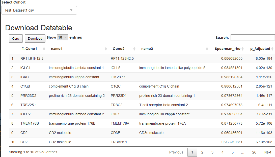
I have a dataset that lists Gene 1, Gene 2, and their correlation value. Using Shiny DT, I'm able to call this data and it looks like this :

The code to generate it :

library(shiny)
library(DT)

# Define UI for application that creates a datatables
ui <- fluidPage(fluidRow(selectInput("TheFile", "Select Cohort", 
                                     choices = c("Test_Dataset1.csv", "Test_Dataset2.csv", "Test_Dataset3.csv.csv"))),
                fluidRow(column(12, div(dataTableOutput("dataTable")))),
                
                # Application title
                titlePanel("Download Datatable")
                
                # Show a plot of the generated distribution
                , mainPanel(
                  DT::dataTableOutput("fancyTable")
                ) # end of main panel
                
) # end of fluid page

# Define server logic required to create datatable
server <- function(input, output, session) {
  
  myCSV <- reactive({
    read.csv(input$TheFile)
  })


  output$fancyTable <- DT::renderDataTable(
    datatable( data = myCSV()
               , extensions = 'Buttons'
               , options = list( 
                 dom = "Blfrtip"
                 , buttons = 
                   list("copy", list(
                     extend = "collection"
                     , buttons = c("csv", "excel", "pdf")
                     , text = "Download"
                   ) ) # end of buttons customization
                 
                 # customize the length menu
                 , lengthMenu = list( c(10, 20, -1) # declare values
                                      , c(10, 20, "All") # declare titles
                 ) # end of lengthMenu customization
                 , pageLength = 10
                 
                 
               ) # end of options
               
    ) # end of datatables
  )
} # end of server

# Run the application 
shinyApp(ui = ui, server = server)

Next I have another dataset called "Expression". For every Gene it has expression values, several samples for every gene.

If I reference the Expression dataset, I can use ggplot2 to make a scatterplot.

Which was made with by manually typing in the names of Gene1 and Gene 2 like this:
ggplot(Expression, aes(x=Gene1, y=Gene2)) + geom_point(size=2) + geom_smooth(method=lm, size=2) +  geom_rug(col="darkred", size=0.9, sides="bl", alpha = 0.3)

My question :
How can I have a user select an entry (pair of genes) from the first data table and then have R lookup those two genes on the Expression table (in the background) , then use the code I've listed with ggplot2 to make a corresponding scatterplot?

Any help towards the right direction in much appreciated!
Hi @cwright1. Because you didn't provide sample data, it make you dummy data frame df and Expression. First you have to enable the selection of the data table. And the selected row will return via input$fancyTable_rows_selected. Then you can use the row to get each pair of genes selected and to filter the Expression data frame for plotting.

library(shiny)
library(tidyverse)
library(DT)

df <- data.frame(Gene1 = LETTERS[1:5], Gene2 = LETTERS[6:10], stringsAsFactors = FALSE)
Expression <- data.frame(matrix(sample(1:50), ncol = 10, byrow = TRUE)) %>%
  `colnames<-`(LETTERS[1:10])

# Define UI for application that creates a datatables
ui <- fluidPage(fluidRow(selectInput("TheFile", "Select Cohort", 
                                     choices = c("Test_Dataset1.csv", "Test_Dataset2.csv", "Test_Dataset3.csv.csv"))),
                fluidRow(column(12, div(dataTableOutput("dataTable")))),
                
                # Application title
                titlePanel("Download Datatable")
                
                # Show a plot of the generated distribution
                , mainPanel(
                  DT::dataTableOutput("fancyTable"),
                  plotOutput("plot")
                  
                ) # end of main panel
                
) # end of fluid page

# Define server logic required to create datatable
server <- function(input, output, session) {
  
  myCSV <- reactive({
    # read.csv(input$TheFile)
    df
  })


  output$fancyTable <- DT::renderDataTable(
    datatable( data = myCSV()
               , extensions = 'Buttons',
               selection = 'single'
               , options = list( 
                 dom = "Blfrtip"
                 , buttons = 
                   list("copy", list(
                     extend = "collection"
                     , buttons = c("csv", "excel", "pdf")
                     , text = "Download"
                   ) ) # end of buttons customization
                 
                 # customize the length menu
                 , lengthMenu = list( c(10, 20, -1) # declare values
                                      , c(10, 20, "All") # declare titles
                 ) # end of lengthMenu customization
                 , pageLength = 10
               ) # end of options
               
    ) # end of datatables
  )
  
  observe({
    req(input$fancyTable_rows_selected)
    selRow <- myCSV()[input$fancyTable_rows_selected,]
    print(selRow[[1]])
    output$plot <- renderPlot({
      ggplot(Expression, aes_string(x=selRow[[1]], y=selRow[[2]])) + 
        geom_point(size=2) + 
        geom_smooth(method=lm, size=2) +  
        geom_rug(col="darkred", size=0.9, sides="bl", alpha = 0.3)
    }) 
  })
} # end of server

# Run the application 
shinyApp(ui = ui, server = server)
2 Likes

Hi @raytong,

Thank you a TON for this, I've been playing around and it works beautifully! I want to ask you a follow up : Is there any way I can have the resulting plot appear to the right of the data table , rather than below it?

Again - thanks for your help. Your example code taught me more than a day of google searching!

@cwright1. The easiest way is use fluidRow and column as follow.

mainPanel(
                  fluidRow(
                    column(6, DT::dataTableOutput("fancyTable")),
                    column(6, plotOutput("plot"))
                  )
                )

Hmm...the code still works when I use fluidRow as you showed, but there is no difference in plot location. Can you tell me where I should be putting it in the original code? i would have expected an error but instead the original code ran as before with no layout change.

Thank you!

@cwright1. Try the code like the following.

library(shiny)
library(tidyverse)
library(DT)

df <- data.frame(Gene1 = LETTERS[1:5], Gene2 = LETTERS[6:10], stringsAsFactors = FALSE)
Expression <- data.frame(matrix(sample(1:50), ncol = 10, byrow = TRUE)) %>%
  `colnames<-`(LETTERS[1:10])

# Define UI for application that creates a datatables
ui <- fluidPage(fluidRow(selectInput("TheFile", "Select Cohort", 
                                     choices = c("Test_Dataset1.csv", "Test_Dataset2.csv", "Test_Dataset3.csv.csv"))),
                fluidRow(column(12, div(dataTableOutput("dataTable")))),
                
                # Application title
                titlePanel("Download Datatable")
                
                # Show a plot of the generated distribution
                , mainPanel(
                  fluidRow(
                    column(6, DT::dataTableOutput("fancyTable")),
                    column(6, plotOutput("plot"))
                  )
                ) # end of main panel
                
) # end of fluid page

# Define server logic required to create datatable
server <- function(input, output, session) {
  
  myCSV <- reactive({
    # read.csv(input$TheFile)
    df
  })


  output$fancyTable <- DT::renderDataTable(
    datatable( data = myCSV()
               , extensions = 'Buttons',
               selection = 'single'
               , options = list( 
                 dom = "Blfrtip"
                 , buttons = 
                   list("copy", list(
                     extend = "collection"
                     , buttons = c("csv", "excel", "pdf")
                     , text = "Download"
                   ) ) # end of buttons customization
                 
                 # customize the length menu
                 , lengthMenu = list( c(10, 20, -1) # declare values
                                      , c(10, 20, "All") # declare titles
                 ) # end of lengthMenu customization
                 , pageLength = 10
               ) # end of options
               
    ) # end of datatables
  )
  
  observe({
    req(input$fancyTable_rows_selected)
    selRow <- myCSV()[input$fancyTable_rows_selected,]
    print(selRow[[1]])
    output$plot <- renderPlot({
      ggplot(Expression, aes_string(x=selRow[[1]], y=selRow[[2]])) + 
        geom_point(size=2) + 
        geom_smooth(method=lm, size=2) +  
        geom_rug(col="darkred", size=0.9, sides="bl", alpha = 0.3)
    }) 
  })
} # end of server

# Run the application 
shinyApp(ui = ui, server = server)

@raytong,

I'm definitely marking this as the solution, as this placement worked. Thank you! Anything other guidance on placement would be appreciated but I got the initial goal (plot to the right-hand side).

When I applied this to the dataset I'm working with, the plot is a bit off-place. I'm not sure if it's possible to have the plot aligned with the bottom of the data table plot, but a nice end result for what I'm working on would be like this :

I adjusted the values after 'column' but I think that just refers tot he final plot's width.

Either way - thank you!

This topic was automatically closed 7 days after the last reply. New replies are no longer allowed.