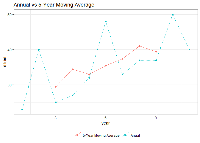
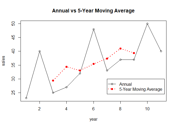
Unless you're constrained to use ggplot2 and forecast, you can simply do something like this:
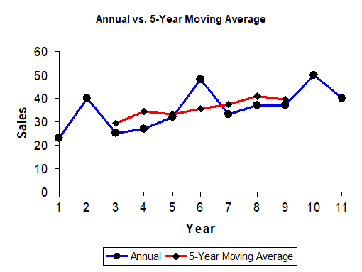
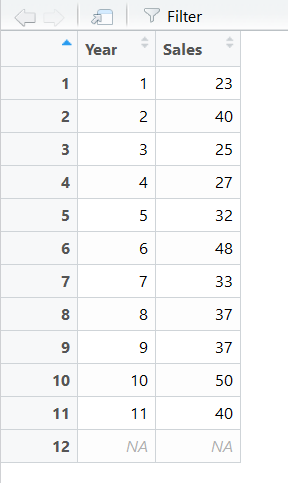
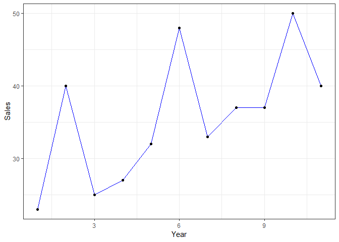
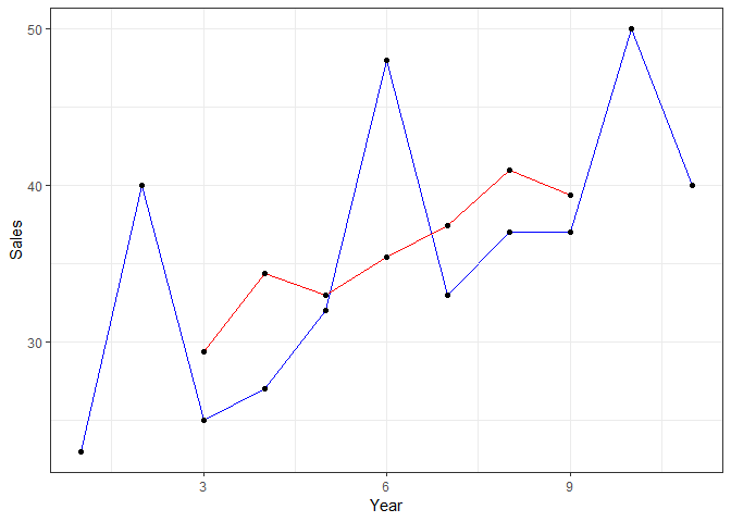
dataset <- data.frame(year = c(1, 2, 3, 4, 5, 6, 7, 8, 9, 10, 11),
                      sales = c(23, 40, 25, 27, 32, 48, 33, 37, 37, 50, 40))

with(data = dataset,
     expr = {
       original_time_series <- ts(data = sales)
       moving_averages <- filter(x = original_time_series,
                                 filter = rep(x = (1 / 5),
                                              times = 5))
       matplot(x = year,
               y = cbind(original_time_series, moving_averages),
               type = "o",
               lty = c(1, 3),
               lwd = c(1, 2),
               pch = c(1, 19),
               col = c(1, 2),
               xlab = "year",
               ylab = "sales",
               main = "Annual vs 5-Year Moving Average")
       legend(x = 7,
              y = 30,
              legend = c("Annual", "5-Year Moving Average"),
              col = c(1, 2),
              lty = c(1, 3),
              lwd = c(1, 2),
              pch = c(1, 19))
     })
Created on 2019-06-30 by the reprex package (v0.3.0)