geoMapX
Authors: Camill Head
Abstract: Application is a tool which serves to visualize coordinates on a map and perform spatial analysis. You can easily toggle between coordinates of deliveries or pickups, select areas on a map and more. The app is based on logistitcs industry.
Full Description: Application can be used in every industry branch where geolocation and GPS tracking play important role in daily operations. Application allows you to perform spatial analysis on a map. Dashboard with detailed data/charts and statistics is available for the end users as well.
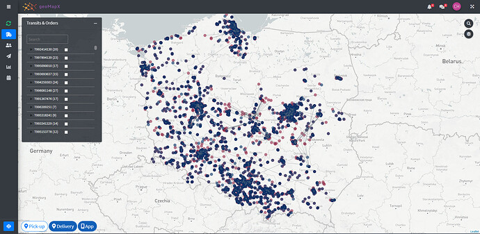
In case of this app all the logic is based on logistics industry. Every single driver has a dedicated mobile app (different that this one, provided to drivers by logistics company) which enables setting shipments' status both on delivery or on pickup. For instance - driver goes to a customer to pick up a shipment, opens his app and sets status 'delivered' (or different one). Once he did it the coordinates of the place where status was set go directly to the database with some other important information. After that, I can visualize shipment's status coordinates on a map. You can toggle between deliveries/pickups using blue buttons on the left- bottom side of the page (Pickup/Delivery/App - the last one shows driver's status coordinates). Need to mention that data loaded to the app consider only one day (2020-11-18). The reason for this is that it takes quite a long time for points to render on a map when date range is greater than 1 day. Moreover, app is dedicated to daily work with live data. Then it works fast and efficient. When it comes to historic data user can download on-demand report. Below you can find a few crucial assumptions for the app:
-
once you open the app many lines connecting points are visible. Those lines connect coordinates of the status set for shipment by driver (his mobile app) and coordinates of customer's business premises (on delivery/pickup). Why those lines are shorter or longer results from the fact that driver can set status in some other place (not at customer's), not caring much about good quality of service he is obliged to. What we require from drivers is to set status at customer's - then we know that driver was there, delivered/picked-up shipment and finally did his job well. In this case, you can just open geoMapX to analyze which lines are the longest and probably which drivers potentially have a bad quality of work (status set far away from client = bad quality). You can then focus on those drivers and undertake steps to improve their quality of work. This fact causes, that when you toggle buttons (delivery/pickup) you will almost always see lines connecting driver's app and customers's coordinates, just to facilitate daily work with data. Buttons' logic (displaying) is also based on this assumption.
-
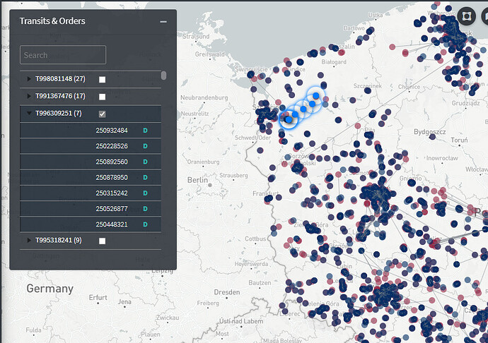
sidebar panel enables you navigating to different areas of interest. Tabs 'Transits' and 'Drivers' display tables with all transit numbers assigned to drivers. Each transit number can consist of many orders (shipments) which given driver must deliver or pickup. If you expand transit/driver row (in a table) you can see orders assigned to them. In every single row (tab 'Transits') there's also coloured 'P' or 'D' character which stands for Pickup/Delivery. In 'Drivers' tab you can see additional info about distance (in km) from place where driver set status to customer's coordinates (premises). The bigger distance the worse (distance > 1km is highlighted in red). You can click whichever table's row (or many rows) to visualize this shipment on a map (pulse icons).
-
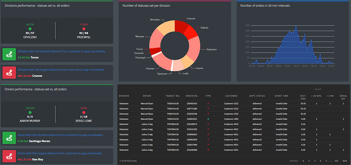
in the sidebar pane you can also visit the tab 'Report' which allows you to generate Excel report for all shipments for a given date range. 'Calendar' allows you to pick up date range. On the top of a sidebar you can see 'Refresh' button which refreshes data and map (in this app it's not possible because it sctrictly connected with SQL server operations). Tab 'dashboard' will display dashboard with many useful utilities. It lets you have a closer look at data in details (table) and also have a broader view on how your division and drivers perform.
-
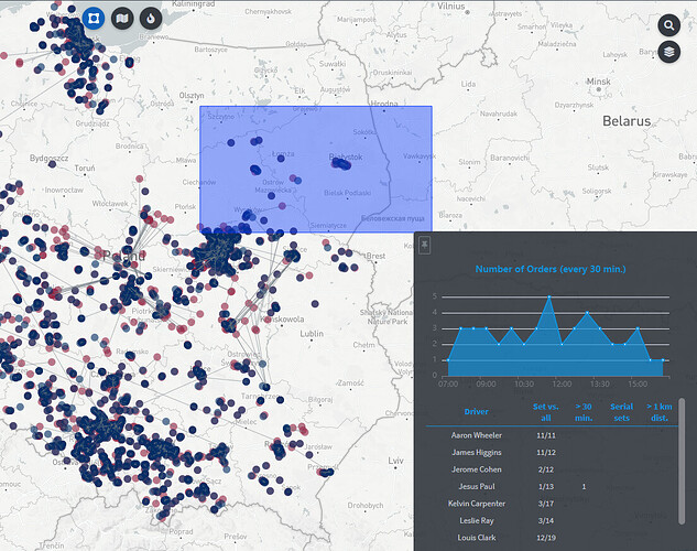
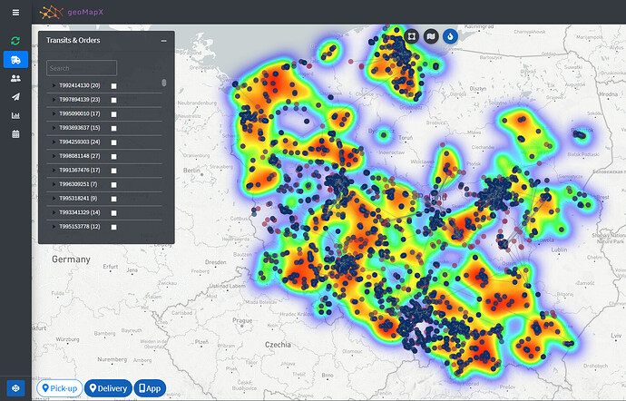
on the bottom of the sidebar there's a small, blue button. If you click on it, the panel consisting of 3 buttons fade in on the top of the page. First one is used to select points on a map and quickly analyze them. After selection the controlbar on the right slides out and you can see quick stats summarizing those points (chart + table). Second button allows you to put choropleth on the map. Same logic here - by clicking any shape (choropleth) a controlbar on a right slides out showing some important statistics. It's worth adding that when shapes/area are clicked/selected then tables in 'Transits' and 'Drivers' tabs are filtered instantly as well. It definitely helps anlayzing concrete drivers/transits/orders. Third button - 'Heatmap' - enables displaying intensity of all statuses set by drivers in every region of the country.
-
in the header section you can see notifications and messages. Notifications ('bell' icon) are strictly related to SQL logic and inform end users of a driver entering customer's GPS area. Such areas can be defined (drawn) programmatically on a map or on a server side. When driver enters such area (with his mobile app open or using any other tracking device) then notification comes. Next button - 'messages from drivers'. Every single driver has an opportunity to send a message from his dedicated app (e.g. driver got stuck in a traffic, will be late, something happened) to the end users (freigh-forwarders) as to communicate them that they got some problem. Then, every end user which uses geoMapX can react quickly on a message received from a driver.
-
statistics in a table (controlbar on a map or table in dashboard). It happens sometimes that drivers set shimpent's status far away from customer - if driver sets status > 1km then it's considered a bad quality. Same with setting status up to 30 mins from delivery/pickup. If driver exceeds this time limit then it's also considered a bad quality. As for serial sets - sometimes it happens that driver sets status for many orders (even for different customers), all at once - in one place. E.g. driver delivers shipment to customer and instead of setting status only for one shipment he sets status for 15 shipments for different customers at the same time. The reason of such behavior is that drivers are not willing to follow the rules they should obey or don't want to cooperate with logistics company. When you select points on a map/click shape (choropleth) then summary of all of those metrics shows up in a controlbar that slides out from the right side of the page.
-
buttons on the right pane (search & map layers). You can search for any address on a map or change map layer.
App works best on Edge and Chrome browsers (didn't check it on Safari).
Keywords: golem, leaflet, bs4Dash, reactable, echarts4r
Shiny app: https://kghwl.shinyapps.io/GeoMapXApp/
Repo: GitHub - Camil88/GeoMapX
RStudio Cloud: Posit Cloud
Thumbnail:

Full image:
 Actually, I'm using MapBox as a tile layer, I also created one mapbox layer by myself and use it in this app. The fact is that this map is going to be used on a daily basis operations so I guess there's no need to render points for more than 1 day (but maybe business would like to use it for greater date range, who knows). Thanks for your advice, I'll bear it mind!