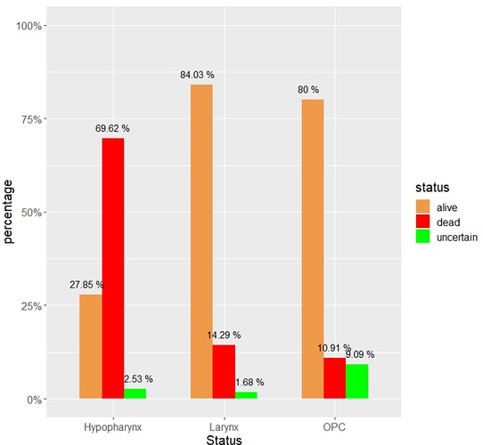
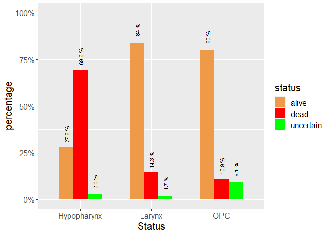
here is my dataframe
data.frame(
  stringsAsFactors = FALSE,
           Subtype = c("OPC", "Hypopharynx", "Larynx"),
             alive = c(88, 22, 100),
              dead = c(12, 55, 17),
         uncertain = c(10, 2, 2)
)
I then enter the following code
tata3 %>% gather(key = "status", value = value, -Subtype) %>% group_by(Subtype) %>% mutate(value = value / sum(value) * 100, status = factor(status, c("alive", "dead", "uncertain"))) %>% ggplot(aes(y = value, x = Subtype, fill = status)) + geom_col(width = .6, position = position_dodge(width = .6, preserve = "total")) + geom_text(aes(label = paste(round(value, 2), "%"), y = value + 3,group = status),position = position_dodge(width = .7, preserve = "total")) +labs(y = "percentage", x = "Status") + scale_fill_manual( values = c("alive" = "tan2", "dead" = "red", "uncertain" = "green"),aesthetics = c("color", "fill")) +theme(text = element_text(size = 15)) + scale_y_continuous(labels = scales::label_percent(scale = 1, accuracy = 1),limits = c(0, 100))
This gives me the graph that I want as attached. The only problem is that some of the values diaplayed appear to be on the graph
can I make this look neater...for e.g. wth regards to the 14.29% in the Larynx, I do not want the '1' to be touching the orange graph.
Many Thanks

