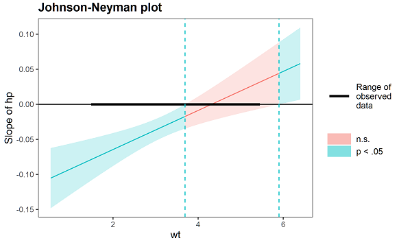
I would like to manually generate a ggplot for Johnson-Neyman technique output given by SPSS PROCESS macro, in this style:
However, I have been unable to figure out how to:
- Colour the space between confidence interval bands and the line for regions of significance and non-significance differently
- Create a legend inside the graph for the three lines: upper 95% CI, Effect, lower 95% CI. I feel text annotations are quite unsightly.
- Label the point at which my moderator becomes significant with 2 d.p. but to have all other intervals without any decimal places.
Here is what I have at the moment, with the green dotted lines pointing to the point where my moderator crossed into significance. In my case, the bands to the left of x = 3.2381 will be n.s. (red) and everything to the right is significant (green).
# The SPSS PROCESS J-N output
jnplot <- tibble::tribble(
  ~chb_MEAN, ~Effect,    ~se,      ~t,     ~p,   ~LLCI,  ~ULCI,
  1, -0.5887, 1.0072, -0.5845, 0.5593, -2.5708, 1.3934,
  1.2583, -0.4308,  0.923, -0.4667, 0.6411, -2.2472, 1.3856,
  1.5167, -0.2728, 0.8402, -0.3247, 0.7456, -1.9263, 1.3807,
  1.775, -0.1149, 0.7593, -0.1513, 0.8799, -1.6092, 1.3794,
  2.0333,  0.0431,  0.681,  0.0632, 0.9496, -1.2972, 1.3833,
  2.2917,   0.201, 0.6063,  0.3315, 0.7405, -0.9922, 1.3942,
  2.55,  0.3589, 0.5367,  0.6688, 0.5041, -0.6972,  1.415,
  2.8083,  0.5169, 0.4743,  1.0897, 0.2767, -0.4166, 1.4503,
  3.0667,  0.6748, 0.4226,  1.5968, 0.1114, -0.1568, 1.5064,
  3.2381,  0.7796, 0.3962,  1.9679,   0.05,       0, 1.5592,
  3.325,  0.8328, 0.3857,  2.1591, 0.0316,  0.0737, 1.5918,
  3.5833,  0.9907, 0.3681,  2.6911, 0.0075,  0.2662, 1.7152,
  3.8417,  1.1486, 0.3727,  3.0821, 0.0022,  0.4152,  1.882,
  4.1,  1.3066, 0.3986,  3.2783, 0.0012,  0.5223, 2.0909,
  4.3583,  1.4645,  0.442,  3.3132,  0.001,  0.5946, 2.3344,
  4.6167,  1.6224, 0.4985,  3.2545, 0.0013,  0.6414, 2.6035,
  4.875,  1.7804, 0.5641,  3.1559, 0.0018,  0.6702, 2.8906,
  5.1333,  1.9383, 0.6361,  3.0474, 0.0025,  0.6866,   3.19,
  5.3917,  2.0963, 0.7124,  2.9426, 0.0035,  0.6944, 3.4982,
  5.65,  2.2542, 0.7918,  2.8468, 0.0047,  0.6959, 3.8125,
  5.9083,  2.4121, 0.8736,  2.7613, 0.0061,  0.6931, 4.1312,
  6.1667,  2.5701,  0.957,  2.6856, 0.0076,  0.6868, 4.4533
)

# compute CIs
errorbands <- jnplot %>% select(chb_MEAN, se, Effect) %>%
  mutate(lowerci = chb_MEAN-se,
         upperci = chb_MEAN+se)

ggplot(errorbands, aes(x = chb_MEAN, y = Effect)) +
  geom_line(aes(x = chb_MEAN), size = 1, color = "#F8766D") +
  geom_line(aes(x = upperci), lty = 2, size = 0.6, color = "grey") +
  geom_line(aes(x = lowerci), lty = 2, size = 0.6, color = "grey") +
  #geom_ribbon(aes(ymin=lowerci, ymax=upperci, x=chb_MEAN, fill = "red"), alpha = 0.3)+
  # vertical line
  geom_segment(aes(x = 3.2381, y = 0.7796,
                   xend = 3.2381, yend = -Inf),
               linetype = "dashed", col = "green") +
  # horizontal line
  geom_segment(aes(x = 3.2381, y = 0.7796,
                   xend = -Inf, yend = 0.7796),
               linetype = "dashed", col = "green") +
  annotate("text", label = "Upper 95% CI", x = 4.4, y = 2.5, size = 3, colour = "black") +
  annotate("text", label = "Lower 95% CI", x = 6.9, y = 2.1, size = 3, colour = "black") +
  scale_x_continuous(breaks = c(0, 2, 3.2381, 4, 6)) + # does not work
  labs(x = "CHB Mean", y = "Effect") +
  theme_bw() +
  theme(panel.grid.major = element_blank(),
        panel.grid.minor = element_blank())
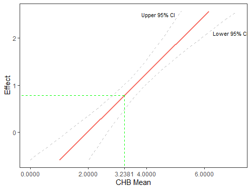
Thanks for any help!