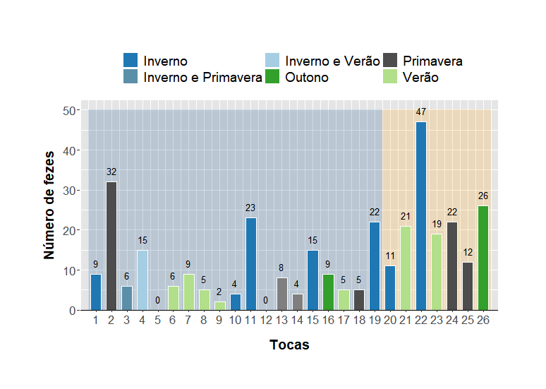
novos.dados <- data.frame(
name_toca = c(1:26),
Estacao = c(
"Inverno", "Primavera", "Inverno e Primavera", "Inverno e Verão", "Outono",
"Verão", "Verão", "Verão", "Verão", "Inverno", "Inverno", "", "Inverno e Outono",
"Inverno e Outono", "Inverno", "Outono", "Verão", "Primavera", "Inverno", "Inverno",
"Verão", "Inverno", "Verão", "Primavera", "Primavera", "Outono"
),
Numero_de_feces = c(9, 32, 6, 15, 0, 6, 9, 5, 2, 4, 23, 0, 8, 4, 15, 9, 5, 5, 22, 11, 21, 47, 19, 22, 12, 26))
nametoca1 <- subset(novos_dados, name_toca <= 19)
nametoca2 <- subset(novos_dados, name_toca >= 20 & name_toca <= 26)
ggplot(novos_dados, aes(x = name_toca, y = Numero_de_feces, fill = Estacao)) +
geom_rect(data = nametoca1 , aes(xmin = as.numeric(factor(name_toca)) - 0.5,
xmax = as.numeric(factor(name_toca)) + 0.5,
ymin = 0,
ymax = Numero_de_feces + 2.5),
fill = "dodgerblue4", alpha = 0.3) +
geom_rect(data = nametoca2, c(20:26), aes(xmin = as.numeric(factor(name_toca)) - 0.5,
HERE, I would like to put the color with transparence on the "tocas" just on numbers 20 to 26
** xmax = as.numeric(factor(name_toca)) + 0.5,**
** ymin = 0,**
** ymax = Numero_de_feces + 2.5),**
** fill = "#FFA319e4", alpha = 0.3) +**
geom_bar(stat = "identity", color = "white", width = 0.69) +
geom_text(aes(label = Numero_de_feces), vjust = -0.9, color = "black", size = 3.5, fontface = "plain") +
scale_fill_manual(values = c("Inverno" = "#1f78b4", "Primavera" = "grey30", "Inverno e Primavera" = "#5B8FA8", "Inverno e Verão" = "#a6cee3", "Outono" = "#33a02c", "Verão" = "#b2df8a")) +
labs(
x = "Tocas",
y = "Número de fezes"
) +
theme_bw() +
theme(
axis.text.x = element_text(angle = 0, hjust = 0.5, size = 13),
axis.text.y = element_text(size = 13),
axis.title.y = element_text(vjust = 2.5, size = 14, face = "bold"),
axis.title.x = element_text(vjust = -2.5, size = 14, face = "bold"),
panel.background = element_rect(fill = "grey90", color = "white"),
panel.grid = element_line(colour = "white"),
panel.border = element_blank(),
plot.margin = margin(50, 50, 50, 50),
panel.spacing = unit(1, "lines"),
legend.position = "top",
legend.text = element_text(size = 14)) +
scale_y_continuous(expand = expansion(add = c(0, 2.5)), breaks = c(0, 10, 20, 30, 40, 50)) +
scale_x_continuous(expand = expansion(mult = c(0.001, 0.001)), labels = 1:26, breaks = 1:26) +
geom_segment(aes(x = 0, xend = 27, y = 0, yend = 0), color = "black", size = 0.5) +
guides(fill = guide_legend(title = ""))
i can't change the back color of the barplots, can any one could help? Thank you!!