I've had this happen a couple of times, but for some reason my geom_line graphs keep appearing like this, when I want it to just show up like a normal line chart instead of the vertical lines that are showing up:
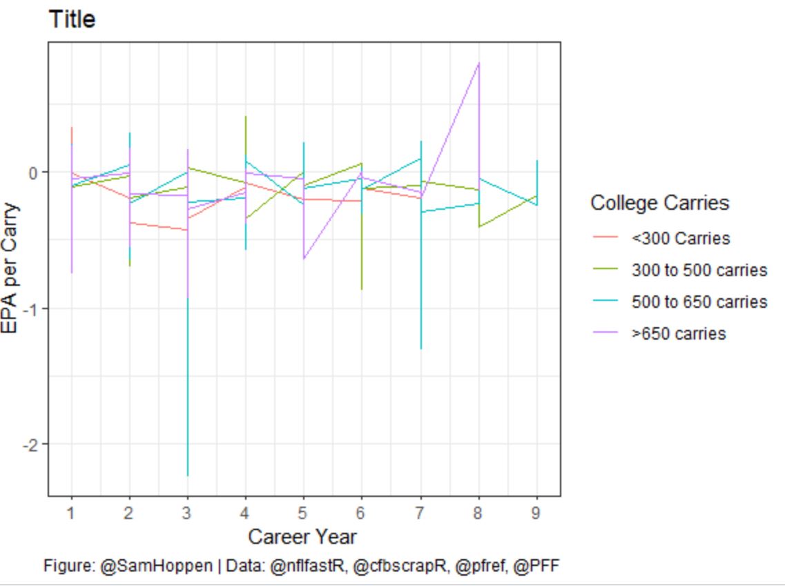
Here's the code that I'm currently using to build the graph:
ggplot(data = stats) +
  geom_line(aes(x = career_year, y = epa_per_carry, color = college_carry_bin)) +
  scale_x_continuous(breaks = 1:9)+
  scale_color_discrete(limits = c("one", "two", "three", "four"), labels = c("<300 Carries", "300 to 500 carries", "500 to 650 carries", ">650 carries")) +
  theme_bw() +
  labs(x = "Career Year",
       y = "EPA per Carry",
       color = "College Carries",
       title = "Title",
       caption = "Figure: @SamHoppen | Data: @nflfastR, @cfbscrapR, @pfref, @PFF")
Along with a snapshot of the data I'm using (the data types, respectively, are double, double, and factor):
career_year    epa_per_carry    career_year
	1	       0.1216154473	    three
	2	       0.0594595389	    three
	3	       0.0024487837	    three
	1	       -0.1014367287	four
	2	       -0.0044945103	four
	3	       -0.1677067222	four
	1	       -0.4531426002	one
	2	       -0.1857921981	one
	3	       -0.4202395962	one
	1	       -0.1157257669	three
	1	       -0.1419462756	one
	2	       -0.1601839741	one
	3	       -0.0894310844	one
	4	       -0.1066593767	one
	5	       -0.2042389571	one
	1	       -0.0037217229	four
	2	       -0.0587913921	four
	3	       -0.0898581487	four
	4	       -0.1454182214	four
	5	       -0.0511530024	four
	6	       0.0083704359	    four
	7	       -0.1471544025	four
	8	       0.8071930460	    four
	1          0.2554156814	    one
	2	       0.0778026993	    one
	3	       -0.1059437433	one
	1	       -0.1013597222	four
What am I missing? Any help appreciated, as always!