Hi
I'm struggling with a simple plot!
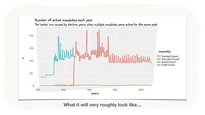
It should look like the attached picture.
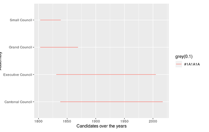
What it does is to show me straight lines.
library(DBI)
library(RSQLite)
library(ggplot2)
library(dplyr)
library(tidyverse)
library(janitor)
library(tibble)
library(stringr)
zh_politicians.db
https://ptsexpert-my.sharepoint.com/:f:/g/personal/partner_share_pts-expert_ch/EuAcuzh7qpJDs84gid-HjHUBh4eLVlpbL4j8EmNNDjX6Dg?e=DaRl4Y
politician_dbq <- dbConnect(RSQLite::SQLite(), "zh_politicians.db")
db_list_tables(politician_dbq)
dbDisconnect(politician_dbq) # use if disconnect
class(politician_dbq)
mandates <- tbl(politician_dbq, "MANDATES") # data read works
mandates_tbl <- as_tibble(mandates)
class(mandates_tbl)
addresses <- tbl(politician_dbq, "ADDRESSES")
addresses_tbl <- as_tibble(addresses)
class(addresses_tbl)
affiliations <- tbl(politician_dbq, "AFFILIATIONS")
affiliations_tbl <- as_tibble(affiliations)
persons <- tbl(politician_dbq, "PERSONS")
persons_tbl <- as_tibble(persons)
class(persons_tbl)
#################
mandates_plot <- mandates_tbl %>%
select(ASSEMBLY, MANDATE_START_YEAR, MANDATE_END_YEAR) %>%
group_by(ASSEMBLY) %>%
arrange(desc(MANDATE_START_YEAR)) %>%
na.omit() %>%
filter(MANDATE_START_YEAR >0, MANDATE_END_YEAR >0)
mandates_bigplot <- mandates_plot %>%
mutate(MANDATE_START_YEAR=as.numeric(MANDATE_START_YEAR), MANDATE_END_YEAR=as.numeric(MANDATE_END_YEAR)) %>%
na.omit
mandates_bigplot_fac <- as_factor(mandates_bigplot) %>% # works
filter(MANDATE_START_YEAR != 0, MANDATE_END_YEAR != 0) %>%
na.omit() %>%
group_by(ASSEMBLY,MANDATE_START_YEAR) %>%
arrange(MANDATE_START_YEAR)
###################
Part 1
Your goal is to do your best with what you were given and explain your thought process along the way.
For example, if a politician seems to be 3 years old or 200 years old, filter him/her out before calculating the average age of politicians…
The MANDATES table has information about when people where elected, when their mandate ended and on which assembly they sat.
Using a line plot, show how the number of people with an active mandate changed over the years. You will have one line per assembly.
You can see above what it will roughly look like. You can base your "active" years just on years, even if this creates some "dents" in the line (i.e. when looking only at active years, not precise dates, some mandates are double counted on election years since the old mandates end and the new mandates start).

