geom_line absent in plot

I am trying to create a line plot with this df named total_sales. It's content is

date tot_amount
Jul-18 165275
Aug-18 158731
Sep-18 160522
Oct-18 164416
Nov-18 160234
Dec-18 167913
Jan-19 162642
Feb-19 150665
Mar-19 166265
Apr-19 159845
May-19 157368
Jun-19 160539

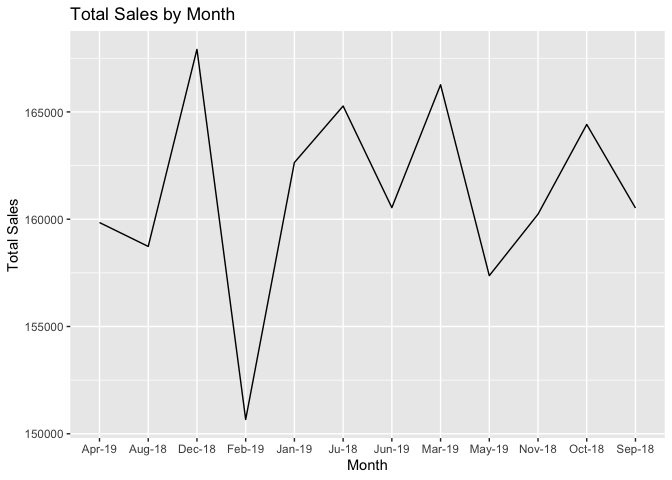
I wrote a code to plot a line graph showing total sales over time.
ggplot(data = total_sales_by_month_year, aes(x = month_year, y = total_sales)) +
geom_line() +
labs(title = "Total Sales by Month", x = "Month", y = "Total Sales")

But this is the plot that was displayed to me.


The result above does not contain a geom_line.
I would appreciate help with this. Thanks

Please post the output of

dput(total_sales_by_month_year)

I do not see a column named total_sales in your example data.

Screenshots are disfavored to illustrate the problem, use a reprex. See the FAQ.

There should have been an error message

Do you need to adjust the group aesthetic

eventually leading to

library(ggplot2)

total_sales_by_month_year <- data.frame(
  date = c(
    "Ju-18", "Aug-18", "Sep-18",
    "Oct-18", "Nov-18", "Dec-18", "Jan-19", "Feb-19", "Mar-19",
    "Apr-19", "May-19", "Jun-19"
  ),
  tot_amount = c(
    165275, 158731, 160522,
    164416, 160234, 167913, 162642, 150665, 166265, 159845,
    157368, 160539
  )
)

ggplot(data = total_sales_by_month_year, aes(x = date, y = tot_amount, group = 1)) +
  geom_line() +
  labs(title = "Total Sales by Month", x = "Month", y = "Total Sales")

Created on 2023-03-31 with reprex v2.0.2

but it is something that seems to trip up everyone when they see it.

1 Like

this is the output of the code
structure(list(month_year = structure(c(18444, 18475, 18506,
18536, 18567, 18597, 18262, 18293, 18322, 18353, 18383, 18414
), class = "Date"), total_sales = c(165275.3, 158731.05, 160522,
164415.7, 160233.7, 167913.4, 162642.3, 150665, 166265.2, 159845.1,
157367.65, 160538.6)), row.names = c(NA, -12L), class = c("tbl_df",
"tbl", "data.frame"))

Here is what I get using the data you posted and your ggplot code. Does the same code work for you?

total_sales_by_month_year <- structure(list(month_year = structure(c(18444, 18475, 18506,
                                                                     18536, 18567, 18597, 18262, 18293, 18322, 18353, 18383, 18414
), class = "Date"), total_sales = c(165275.3, 158731.05, 160522,
                                    164415.7, 160233.7, 167913.4, 162642.3, 150665, 166265.2, 159845.1,
                                    157367.65, 160538.6)), row.names = c(NA, -12L), class = c("tbl_df",
                                                                                              "tbl", "data.frame"))
library(ggplot2)
ggplot(data = total_sales_by_month_year, aes(x = month_year, y = total_sales)) +
  geom_line() +
  labs(title = "Total Sales by Month", x = "Month", y = "Total Sales")

Created on 2023-03-31 with reprex v2.0.2

it does, thanks. But i made this question as clear as possible so that i can get an answer, i'm currently on a project and the df is a subset of the df i am working with. Suppose you are working with a df that with columns date and total_amount_spent. I wrote a code that shows the total amount spent over then used the code to make a line plot. i kept on getting errors one of which is 'Do you need to adjust the group aesthetic'?. I would like to know what i am doing wrong and i would appreciate it if you can guide me.

The subset will plot in the same manner as the set if the arguments to aes are identical. But if you are adding a var and using it in aes not necessarily. So, show the subset data as modified because guessing is bootless.

Here is an example for you to walk through

library(tidyverse)

(good_df <- data.frame(x=1:3,
                       y=4:6))

ggplot(data=good_df,
       aes(x=x,
           y=y)) + geom_line()

(bad_df <- data.frame(x=letters[1:3],
                       y=4:6))

ggplot(data=bad_df,
       aes(x=x,
           y=y)) + geom_line()

# fixing with a group aesthetic
ggplot(data=bad_df,
       aes(x=x,
           y=y,
           group=1L)) + geom_line()

The key to understand is that while numbers have a 'natural ordering' and, dates also are numbers with a natural ordering. character strings do not for the purpose of graphing. a representation of 'dates' in a textual form might look to you as a date, but not be a date class numeric object, and so it will not be clear that the x coords can be related straightforwardly to justify connecting the points into lines.

while your dput() contained a data.frame with actual numeric date types, your opening post shows that you likely had a 'date appearing' textual type. at some point you did a conversion; but you havent considered that this is the reason for your initial lack of a line, and the post example shared ability to see a line.

hope it helps.

yes, i made a conversion. i created a new column that contains the month and year (eg Jan 2018)from the date column (eg 01-01-2018) in my df. the new column's data type is chr. trying to make a line plot using this column doesnt work. what should i do ?

A) Make your date column not be chr but be a date
Or
B) add an arbitrary single value group(as shown in my example code above)

1 Like

It worked !. Thanks alot.