Geom_contour help

Hi, I'm trying to generate a contour plot from a data set I have in Excel. I pulled out three arbitrary columns using the subset function, but I'm kinda lost with what to do from there.

Lets say I have this subset:

  x       y       z

  7       6      5.3
  1     3.14   4.0
  5      2.7    6.1

How would I plot a contour graph of the subset? Is that even possible? Thanks.

geom_contour is for raster-like data which is a grid of values with an observation for each combination of x and y across a grid, e.g.

library(ggplot2)

g <- ggplot(faithfuld, aes(waiting, eruptions))

g + geom_raster(aes(fill = density))

g + geom_contour(aes(z = density))

For non-grid data, geom_density_2d will run a 2D kernel density estimation with MASS::kde2d and plot the results with contour lines, but this is only 2-dimensional—the level is calculated from the joint density.

2 Likes

Is there any way I can convert my data to make it raster-like?

It depends on the data. For the data above, not really in any useful way, as there's just not enough of it. If you have more and it's 2-dimensional, that's what geom_density_2d implicitly does. If your data is on an easily-completed grid, e.g. integers, you can use tidyr::complete with fill = list(z = 0), but this is making some assumptions about your data that may not be true.

Another option is to regress z on x and y with a model—maybe a flexible one like LOESS or splines, possibly with constraints—and then predict on a grid of x and y values. This approach could generate a result out of anything, but may require a lot of tweaking depending on what you're after.

A very simple example using your three points and lm:

library(ggplot2)

df <- data.frame(x = c(7L, 1L, 5L), 
                 y = c(6, 3.14, 2.7), 
                 z = c(5.3, 4, 6.1))

grid <- expand.grid(x = seq(10), y = seq(10))
grid$z <- predict(lm(z ~ ., df), grid)

ggplot(grid, aes(x, y, z = z)) + geom_contour()

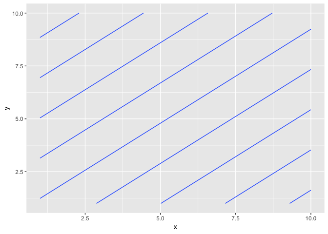
...but this generates lines. If you look at the raster plot you can see why:

ggplot(grid, aes(x, y, fill = z)) + geom_raster()

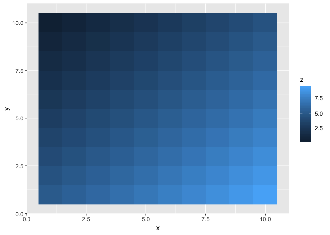
It generated a plane passing through the three points, which is what lm does.

1 Like
Physical.health Mental.health Long.Lasting.Health.Intervention
99.36921686 102.203208846 11.28687491
99.36921686 96.520373549 9.459287961
99.36921686 96.520373549 14.507417029
99.36921686 96.520373549 10.204858396
99.36921686 102.203208846 12.348796193
95.1126067 96.520373549 12.397288623
99.36921686 99.303710146 8.811903226
99.36921686 102.203208846 8.061727537
99.36921686 99.303710146 11.934259645
99.36921686 102.203208846 6.120433002
90.480504407 99.303710146 19.44187042
92.701780365 102.203208846 9.657325968
99.36921686 96.520373549 15.088758847
99.36921686 99.303710146 10.801690191
99.36921686 99.303710146 15.154801764
99.36921686 99.303710146 13.761846594
84.970142215 96.520373549 12.348796193
75.92130871 99.303710146 13.761846594
99.36921686 99.303710146 14.823767877
99.36921686 102.203208846 4.52483457
99.36921686 102.203208846 10.60871818
99.36921686 102.203208846 18.044309995
99.36921686 99.303710146 16.982388713
99.36921686 99.303710146 16.966898736
82.832452089 99.303710146 9.459287961

Heres a small sample of the data I'm working with. Maybe it'll make things more clear.

Here is an example. It is a bit complicated as we need each Z to be a function of a single X, Y (so we have to aggregate data that has the same X and Y). Also with so little data I am trying plotting the contours of a smoothing surface instead of the actual data. With more data you can leave out the production of d2 and use d_summarized in its place. Also note: to load the data into R you would not use the copy/paste type method I am using below; you would instead use something like readxl to read the spreadsheet directly.

d <- read.table(textConnection("
Physical.health	Mental.health	Long.Lasting.Health.Intervention
99.36921686	102.203208846	11.28687491
99.36921686	96.520373549	9.459287961
99.36921686	96.520373549	14.507417029
99.36921686	96.520373549	10.204858396
99.36921686	102.203208846	12.348796193
95.1126067	96.520373549	12.397288623
99.36921686	99.303710146	8.811903226
99.36921686	102.203208846	8.061727537
99.36921686	99.303710146	11.934259645
99.36921686	102.203208846	6.120433002
90.480504407	99.303710146	19.44187042
92.701780365	102.203208846	9.657325968
99.36921686	96.520373549	15.088758847
99.36921686	99.303710146	10.801690191
99.36921686	99.303710146	15.154801764
99.36921686	99.303710146	13.761846594
84.970142215	96.520373549	12.348796193
75.92130871	99.303710146	13.761846594
99.36921686	99.303710146	14.823767877
99.36921686	102.203208846	4.52483457
99.36921686	102.203208846	10.60871818
99.36921686	102.203208846	18.044309995
99.36921686	99.303710146	16.982388713
99.36921686	99.303710146	16.966898736
82.832452089	99.303710146	9.459287961
"), header=TRUE)

library("dplyr")
library("ggplot2")

# geom_contour expects lots of x's and y's and no repeated x & y positions
d_summarized <- d %>%
  group_by(., Physical.health, Mental.health) %>%
  summarize(., Long.Lasting.Health.Intervention = mean(Long.Lasting.Health.Intervention)) %>%
  ungroup(.)

# if we had mor data would not have to try this smoothing step and could just use d_summarized everywhere
model <- loess(Long.Lasting.Health.Intervention ~ Physical.health + Mental.health, data = d)
d2 <- expand.grid(Physical.health = unique(d$Physical.health), Mental.health = unique(d$Mental.health))
d2 <- data.frame(Physical.health = d2$Physical.health, Mental.health = d2$Mental.health)
d2$Long.Lasting.Health.Intervention <- predict(model, newdata = d2)

ggplot(mapping = aes(x = Physical.health, y = Mental.health, 
                     z = Long.Lasting.Health.Intervention, 
                     color = Long.Lasting.Health.Intervention)) +
  geom_contour(data=d2, aes()) + 
  geom_point(data=d_summarized) +
  geom_jitter(data=d, alpha = 0.2, width=0.2, height=0.2) +
  ggtitle("observed mean Long.Lasting.Health.Intervention",
          subtitle = "plotted as a function of Mental.health and Physical.health")

Unfortunately, even with the full on dataset of around 3,000 observations, the contour plot looked like chicken scratch (if anything even was drawn, which for certain column combinations, nothing did) so I had to use the loess interpolating algorithm regardless.

But anyway, that did the trick! Thanks so much!

1 Like

If your question's been answered, would you mind choosing a solution? It helps other people see which questions still need help, or find solutions if they have similar problems. Here’s how to do it: