I want to use geom_col() with position_dodge() to create a plot that shows both:
- Stacked bars for Var1
- Dodged bars for Var2
Unfortunately, the resulting dodged bars do not match the total sum of frequencies by Var2.
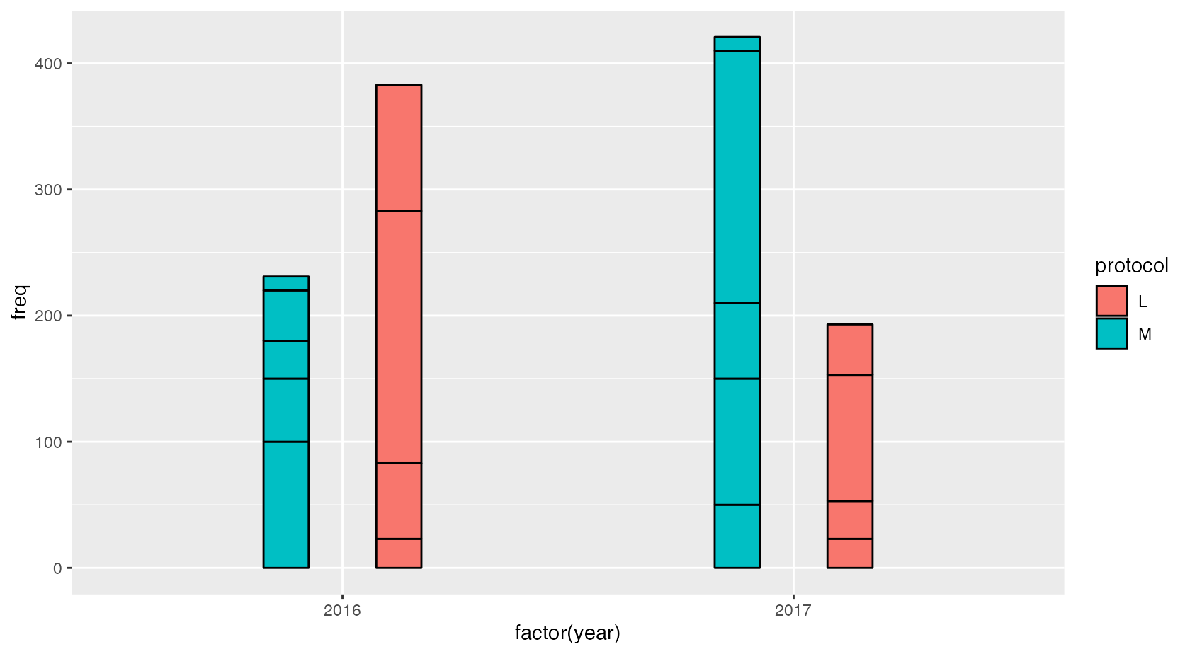
For example, the following is a simulated dataset with some counts divided by country (Var1), protocol (Var2) and year (X-axis), and I want to have different dodged bars by protocol and stacked blocks by country.
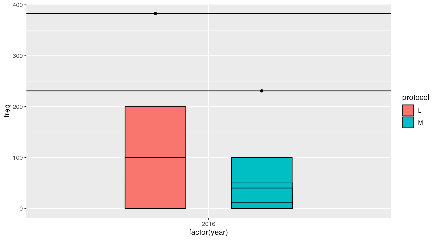
In the plot (reprex below) is clear that the bar totals do not reach the actual totals (horizontal lines with dots)
Also the boxes in the bars are less than they should be (L:2 and M:4 instead of 4 and 5).
What am I missing?
Minimal Reproducible Example
library(ggplot2)
library(dplyr)

# Create sample data
df <- bind_rows(
        data.frame(
            year = rep(2016, 5),
            protocol = rep("M", 5),
            country = c("A", "B", "C", "D", "E"),
            freq = c(100, 50, 30, 40, 11) # sum is 231
        ),
        data.frame(
            year = rep(2016, 4),
            protocol = rep("L", 4),
            country = c("A", "B", "C", "D"),
            freq = c(23, 60, 200, 100) # sum is 383
        )
    )

    # Create summary data
    df_sum <- df |>
        summarise(
            label = paste(country, collapse = "\n"),
            freq = sum(freq),
            .by = c(year, protocol)
        )

    # Plot showing the issue
    ggplot() +
        geom_col(
            data = df,
            aes(x = factor(year), y = freq,
                fill = protocol),
            position = position_dodge(0.7),
            color = "black",
            width = 0.4
        ) +
        geom_point(
            data = df_sum,
            aes(x = factor(year), y = freq,
                group = protocol),
            position = position_dodge(0.7)
        ) +
        geom_hline(yintercept = c(231, 383))
Environment
R version 4.4.2
ggplot2 3.5.1