Hello,
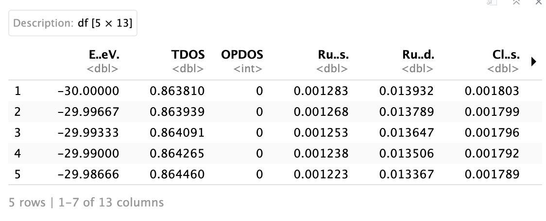
I am trying to generate Density of States plots for some materials that I have data for but I am unsure how to use ggplot2 for this. Here is a picture of how the data is broken up. The x-axis is basically the Energy in eV and each of the other columns corresponds to the grouping of the data. I am trying to get each density plot to overlay onto each of the others but I can't figure out how to do that. All of the examples I have found are for data that also has a category column associated with it but in this case my different categories are the different y-value sets.
Any guidance is appreciated!
I think you need to pivot your data to a longer format using the pivot_longer() function from the tidyverse. If your data frame is named DF, try
DF_lng <- DF |> pivot_longer(cols = TDOS:Cl..s., names_to = "state", values_to="DOS")
There may well be a mistake in that, since I don't have data to test it with.
With the longer format, you can set the fill or color aesthetic of ggplot to follow the "state" column.
If I were to pivot the data then how do I specify which values are used for which axis in ggplot, because wouldn't the columns then end up without names? And each row is named?
Is this what you had in mind:
library(tidyverse)
library(scales)
theme_set(theme_classic(base_size=14))

# Fake data
set.seed(3)
DF = tibble(E..eV. = seq(-30, -10, length.out=10),
            TDOS = runif(10, 0, 0.5),
            Ru..s. = runif(10, 0, 0.5),
            Cl..s. = 1 - TDOS - Ru..s.)

DF.long = DF %>%
  pivot_longer(cols = TDOS:Cl..s., names_to = "state", values_to="DOS") %>%
  group_by(E..eV.) %>%
  mutate(ypos = cumsum(DOS) - 0.5*DOS) %>%
  ungroup()

yl = DF.long %>%
  filter(E..eV.==min(E..eV.)) %>%
  select(-c(E..eV., DOS)) %>% deframe()
yr = DF.long %>%
  filter(E..eV.==max(E..eV.)) %>%
  select(-c(E..eV., DOS)) %>% deframe()
DF.long %>%
  ggplot(aes(x=E..eV., ypos, height=DOS, fill=state)) +
    geom_tile(colour="white") +
    geom_text(aes(label=percent(DOS, accuracy=1)), size=3.5, colour="white") +
    scale_fill_viridis_d(end=0.9) +
    scale_y_continuous(expand=c(0,0), breaks=yl, labels=names(yl),
                       sec.axis=dup_axis(breaks=yr, labels=names(yr))) +
    scale_x_continuous(expand=c(0,0)) +
    guides(fill="none") +
    labs(y=NULL)

Created on 2025-05-05 with reprex v2.1.1
Not quite. I managed to get a plot that is somewhat close but I cant get the lines to be overlayed on the "filled" parts properly.
library(ggplot2)
library(reshape2)
library(dplyr)
dos_data_long <- melt(dos_data, id.vars = "Energy", variable.name = "Orbital", value.name = "DOS")
head(dos_data_long)

dos_data_filtered <- dos_data_long %>% filter(Orbital != "OPDOS")
dos_data_filtered <- dos_data_filtered %>% filter(Orbital != "Fragment_5")
dos_data_filtered <- dos_data_filtered %>% filter(Orbital != "Fragment_6")
dos_data_filtered <- dos_data_filtered %>% filter(Orbital != "Fragment_7")
dos_data_filtered <- dos_data_filtered %>% filter(Orbital != "Fragment_8")
dos_data_filtered <- dos_data_filtered %>% filter(Orbital != "Fragment_9")
dos_data_filtered <- dos_data_filtered %>% filter(Orbital != "Fragment_10")

#duplicated(dos_data_filtered$Energy)

ggplot(dos_data_filtered, aes(x=Energy, y=DOS, group=Orbital)) +
  geom_area(aes(fill=Orbital), alpha = 0.5) +
  geom_line(color = "black", linewidth=0.5) +
  labs(title="Density of States for Compound [1] Orbitals",
       x = "Energy (eV)",
       y = "DOS") +
  scale_x_continuous() +
  theme_minimal() +
  scale_fill_manual(values = c("TDOS"="gold3", "Ru_s"="wheat2", "Ru_d"="tan3",
                               "Cl_sp"="springgreen4", "Xpy_sp"="slateblue3")) +
  scale_color_manual(values = rep("black", length(unique(dos_data_filtered$Orbital)))) +
  theme(legend.title = element_blank())
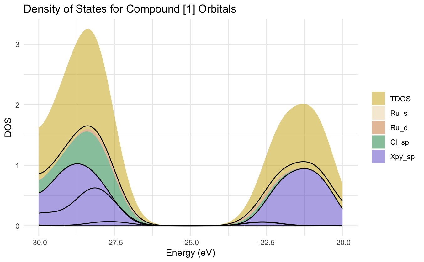
It seems as though the lines don't want to line up with the actual data. Although, the DOS for each orbital type does overlap on Energy values but I don't want them stacked. I have seen papers where the DOS look more like this second figure (replied to this) and I would like to get to something similar I just don't know how to get there.
But I am pretty far from that...
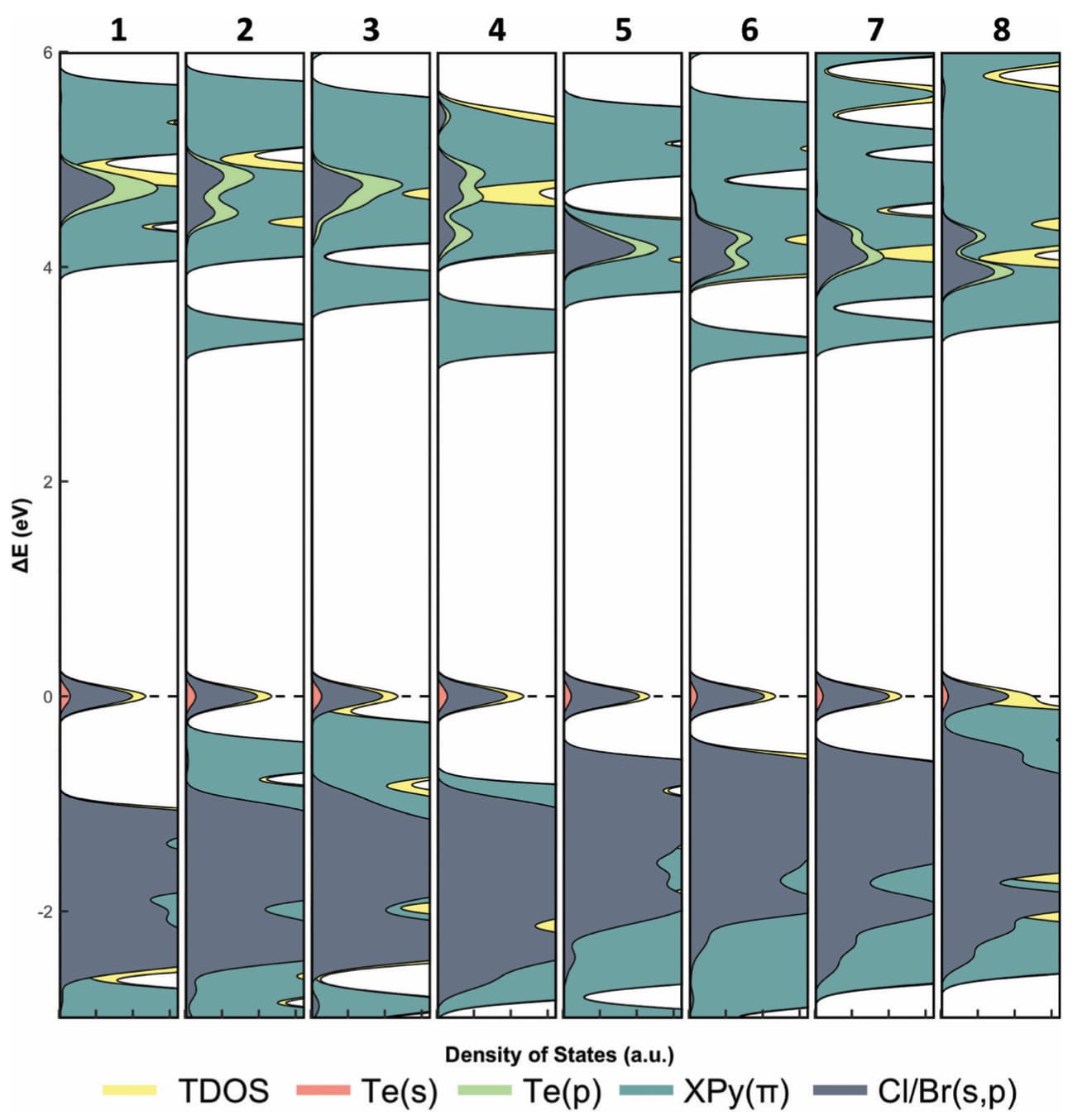
Something similar to this is what I am aiming for but mine will likely be slightly more complicated because I have alpha and beta spin data. (So I have an additional set of data for each compound and would need to "invert" the second set to see the differences between alpha and beta for each one. I am not sure if that makes sense.
For future reference, you can reduce the amount of code needed by doing the filtering in a single filter statement:
dos_data_filtered = dos_data_long %>%
  filter(!Orbital %in% paste0("Fragment_", 5:10))
1 Like
Do you happen to know why the black lines don't match the edges of the filled data?
geom_area() stacks the fill groups by default. geom_line() just plots the lines at their y-values, unstacked, but you can do geom_line(position="stack") to stack them. However, if you just want to add a border line to each area fill, I think geom_area(colour="black") will do it.