Hello everyone,
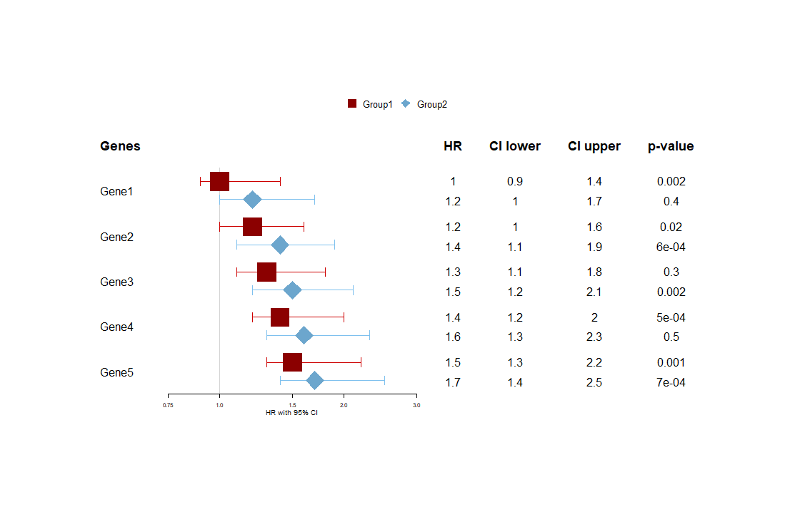
I'm still pretty new at R, so I hope this is not an obvious question. I'm currently trying to visualize my data in a forest plot. For each gene, I have 2 HR for survival data, with respective CI and p-value. I would like to present these HR on the same plot in a different color, with a table next to the plot displaying the actual data. This plot I found online displays it well:
I managed to make this through the Forestplot package using its vignette: Introduction to forest plots
# Load package
library(forestplot)
#> Loading required package: grid
#> Loading required package: magrittr
#> Loading required package: checkmate
# Generate dummy dataset
Genes <- c("Gene1","Gene2", "Gene3", "Gene4", "Gene5")
HR1 <- c(1.0, 1.2, 1.3, 1.4, 1.5)
HR2 <- c(1.2, 1.4, 1.5, 1.6, 1.7)
lower1 <- c(0.9, 1.0, 1.1, 1.2, 1.3)
lower2 <- c(1.0, 1.1, 1.2, 1.3, 1.4)
upper1 <- c(1.4, 1.6, 1.8, 2.0, 2.2)
upper2 <- c(1.7, 1.9, 2.1, 2.3, 2.5)
p.value1 <- c(2e-03, 2e-02, 3e-01, 5e-04, 1e-03)
p.value2 <- c(4e-01, 6e-04, 2e-03, 5e-01, 7e-04)
dummydata <- data.frame(Genes, HR1, HR2, lower1, lower2, upper1, upper2, p.value1,
                    p.value2)

# Text on plot
tabletextdummy <- cbind(c("Genes",dummydata$Genes))

# Plot
forestplot(tabletextdummy, mean = cbind(c(NA, dummydata$HR1), c(NA,dummydata$HR2)),
                      lower = cbind (c(NA,dummydata$lower1), c(NA,dummydata$lower2)),
                      upper = cbind(c(NA,dummydata$upper1), c(NA, dummydata$upper2)),
                      new_page = TRUE,
                      clip = c(0.1,5),
                      lineheight = unit(10,"mm"),
                      line.margin = .1,
                      xlog = TRUE, xlab = "HR with 95% CI",
                      col = fpColors(box = c("red4", "skyblue3"),
                                     lines = c("red3", "skyblue2")),
                      fn.ci_norm = c(fpDrawNormalCI, fpDrawDiamondCI),
                      is.summary = c(TRUE,rep(FALSE,5)),
                      boxsize = 0.4,
                      xticks = c(0.75, 1, 1.5, 2, 3),
                      legend = c("Group1", "Group2"),
                      vertices = TRUE)
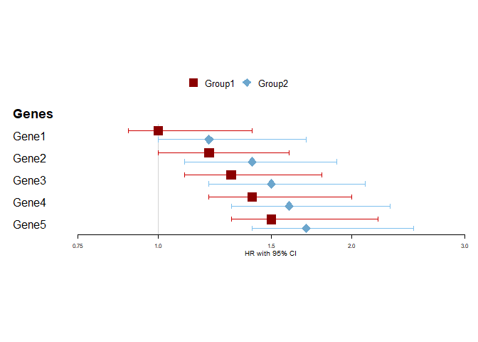
Created on 2021-01-20 by the reprex package (v0.3.0)
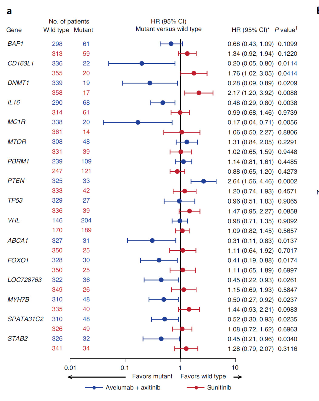
However, when I try to add a table, it renders the 2 HR's per gene next to each other instead of underneath:
# Load package
library(forestplot)
#> Loading required package: grid
#> Loading required package: magrittr
#> Loading required package: checkmate
# Generate dummy dataset
Genes <- c("Gene1","Gene2", "Gene3", "Gene4", "Gene5")
HR1 <- c(1.0, 1.2, 1.3, 1.4, 1.5)
HR2 <- c(1.2, 1.4, 1.5, 1.6, 1.7)
lower1 <- c(0.9, 1.0, 1.1, 1.2, 1.3)
lower2 <- c(1.0, 1.1, 1.2, 1.3, 1.4)
upper1 <- c(1.4, 1.6, 1.8, 2.0, 2.2)
upper2 <- c(1.7, 1.9, 2.1, 2.3, 2.5)
p.value1 <- c(2e-03, 2e-02, 3e-01, 5e-04, 1e-03)
p.value2 <- c(4e-01, 6e-04, 2e-03, 5e-01, 7e-04)
dummydata <- data.frame(Genes, HR1, HR2, lower1, lower2, upper1, upper2, p.value1,
                        p.value2)
# Text on plot
tabletextdummy2 <- cbind(c("Genes",dummydata$Genes),
                         cbind(c("HR", dummydata$HR1),c(NA, dummydata$HR2)),
                         cbind(c("CI lower", dummydata$lower1), c(NA, dummydata$lower2)),
                         cbind(c("CI higher", dummydata$upper1), c(NA, dummydata$upper2)),
                         cbind(c("p-value", dummydata$p.value1), c(NA, dummydata$p.value2)))

# Plot
forestplot(tabletextdummy2,
           mean= cbind(c(NA, dummydata$HR1), c(NA,dummydata$HR2)),
           lower = cbind (c(NA,dummydata$lower1), c(NA,dummydata$lower2)),
           upper = cbind(c(NA,dummydata$upper1), c(NA, dummydata$upper2)),
           new_page = TRUE,
           clip = c(0.1,5),
           lineheight = unit(10,"mm"),
           line.margin = .1,
           xlog = TRUE, xlab = "HR with 95% CI",
           col = fpColors(box = c("red4", "skyblue3"),
                          lines = c("red3", "skyblue2")),
           fn.ci_norm = c(fpDrawNormalCI, fpDrawDiamondCI),
           is.summary = c(TRUE,rep(FALSE,5)),
           graph.pos = 2,
           boxsize = 0.4,
           xticks = c(0.75, 1, 1.5, 2, 3),
           legend = c("Group1", "Group2"),
           vertices = TRUE)
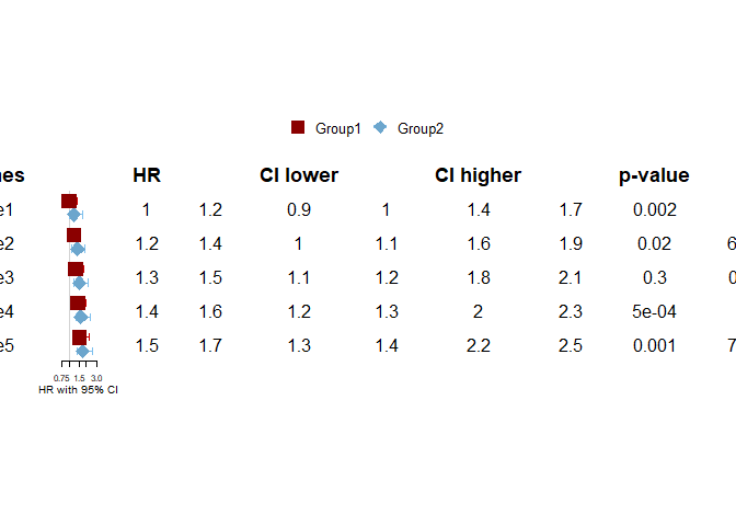
Created on 2021-01-20 by the reprex package (v0.3.0)
I've tried other strategies, such as combining the forestplot with a table through ggarrange, cowplot etc. These always give an error as forestplot doesn't generate a ggplot format.
Could anyone give me advice on how to solve this, or which other package could accomplish this?
Thank you so much!