Hello,
I was following this code.
library(tidyverse)
library(stringr)
library(Cairo)
library(scales)
library(showtext)

font_add_google(name = "Playfair Display", family = "playfair")

hike_data <- readr::read_rds(url('https://raw.githubusercontent.com/rfordatascience/tidytuesday/master/data/2020/2020-11-24/hike_data.rds'))

word(hike_data$location, 1, sep = " -- ") -> hike_data$region
hike_data$region <- as.factor(hike_data$region)
hike_data$length_num <- parse_number(hike_data$length)
hike_data$trackNr <- as.numeric(row.names(hike_data))

hike_data <- hike_data %>%
  mutate_at(c("gain", "highpoint", "rating"), as.numeric)


summary_stats <- hike_data %>%
  group_by(region) %>%
  summarise(sum_length = sum(length_num),
            mean_gain = mean(gain),
            count = n()) %>%
  mutate(mean_gain = round(mean_gain, digits = 0),
         sum_length = round(sum_length, digits = 0))


prismatic::color(c( "#6C5B7B" ,"#C06C84","#F67280","#F8B195"))

showtext_auto()

summary_stats$region <- forcats::fct_reorder(str_wrap(summary_stats$region, 5), summary_stats$sum_length)

ggplot(summary_stats) +
  # custom panel grid
  geom_hline(yintercept = 0, color = "lightgrey") +
  geom_hline(yintercept = 1000, color = "lightgrey") +
  geom_hline(yintercept = 2000, color = "lightgrey") +
  geom_hline(yintercept = 3000, color = "lightgrey")  +
  geom_col(aes(
    x = region, #is numeric
    y = sum_length, #is numeric
    fill = count), #is a factor
    position = "dodge2",
    show.legend = TRUE,
    alpha = .9) +
  scale_fill_gradientn("Amount of Tracks",
                       colours = c( "#6C5B7B","#C06C84","#F67280","#F8B195")) +
  # mean gains per rigion
  geom_point(aes(x = region,
                 y = mean_gain),
             size = 3,
             color = "gray12") +
  geom_segment(aes(
    x = region,
    y = 0,
    xend = region,
    yend = 3000
  ),
  linetype = "dashed",
  color = "grey12") +
  annotate(
    x = 11,
    y = 3130,
    label = "Cummulative Length [FT]",
    geom = "text",
    size = 2.5,
    angle = 0,
    family = ""
  ) +
  annotate(
    x = 11,
    y = 1200,
    label = "Mean Elevation Gain\n[FASL]",
    geom = "text",
    size = 2.5,
    angle = 0,
    family = ""
  ) +
  #annotate custom scale inside plot
  annotate(x = 11.7, y =1100, label = "1000", geom = "text", color = "gray12", family = "")+
  annotate(x = 11.7, y =2100, label = "2000", geom = "text", color = "gray12", family = "")+
  annotate(x = 11.7, y =3100, label = "3000", geom = "text", color = "gray12", family = "") +
  scale_y_continuous(limits = c(-1500, 3500),
                     expand = c(0,0),
                     breaks = c(0, 1000, 2000, 3000)) +
  #add title, subtitle & caption
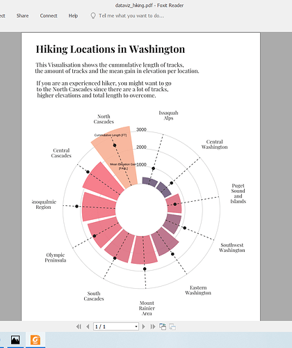
  labs(title = "\nHiking Locations in Washington",
       subtitle = paste("\nThis Visualisation shows the cummulative length of tracks,",
                        "the amount of tracks and the mean gain in elevation per location.\n",
                        "If you are an experienced hiker, you might want to go",
                        "to the North Cascades since there are a lot of tracks,",
                        "higher elevations and total length to overcome.",
                        sep = "\n"),
       caption = "\n\nData Visualisation by Tobias Stalder\ntobias-stalder.netlify.app\nSource: TidyX Crew (Ellis Hughes, Patrick Ward)\nLink to Data: github.com/rfordatascience/tidytuesday/blob/master/data/2020/2020-11-24/readme.md") +

  #transform to polar coordinate system
  coord_polar() +
  theme(
    legend.position = "bottom",
    axis.title = element_blank(),
    axis.ticks = element_blank(),
    axis.text.y = element_blank(),
    axis.text.x = element_text(
      color = "gray12",
      size = 12
    ),
    panel.background = element_rect(
      fill = "white",
      color = "white"
    ),
    panel.grid = element_blank(),
    panel.grid.major.x = element_blank(),
    text = element_text(
      family = "playfair",
      color = "grey12"
    ),
    plot.title = element_text(
      face = "bold",
      size = 25,
      hjust = 0.05),
    plot.subtitle = element_text(
      size = 14,
      hjust = 0.05),
    plot.caption = element_text(
      size = 10,
      hjust = .5)
  )


ggsave(
  path = here::here(),
  filename = "dataviz_hiking.png",
  width = 8.25, #din A4 width
  height = 11.75, #din A4 height
  units = "in",
  type = "cairo-png",
  dpi = 300
)

ggsave(
  path = here::here(),
  filename = "dataviz_hiking.pdf",
  width = 8.25, #din A4 width
  height = 11.75, #din A4 height
  units = "in",
  dpi = 300
)
If I save the graphics in 'pdf', it displays fine.
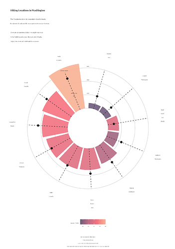
But, when I save in 'png' fonts get smaller.
How can I save in 'png' with correct font size?

