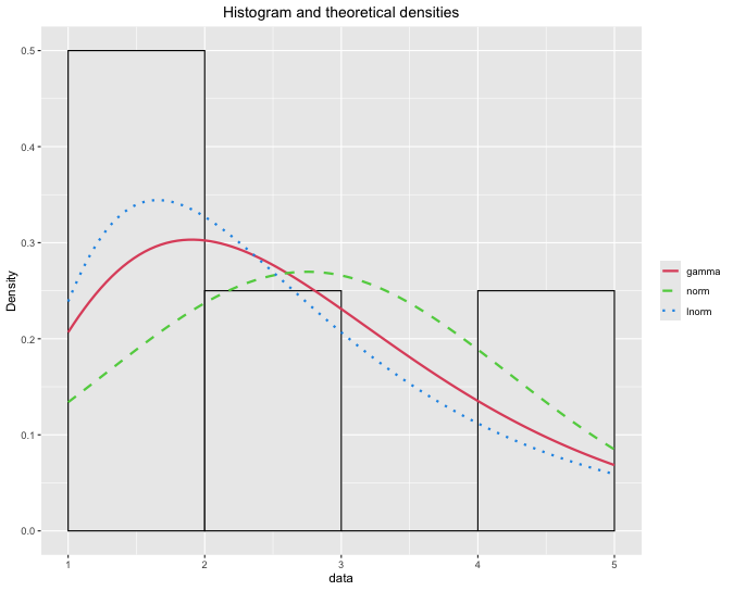
Hi, Joel. I've written the code this way, but I don't know how to insert the 'demp = TRUE' parameter into the code. Writing the code this way, without using ggplot as a plot argument (plotstyle = ggplot), makes it much easier to change the characteristics of the graph.
If anyone knows how to insert 'demp = TRUE, and the curves relative for each of the distributions (gama, normal and lognormal). I would appreciate it.
library(fitdistrplus)
library(ggplot2)
rgb_to_hex = function(rgb){
sprintf('#%02x%02x%02x',
rgb[1],
rgb[2],
rgb[3])}
rgb_color_histogram_0 = c(111, 5, 28)
rgb_color_histogram_1 = c(254, 254, 10)
rgb_color_histogram_2 = c(35, 194, 228)
rgb_color_histogram_3 = c(26, 238, 36)
rgb_color_histogram_4 = c(105, 57, 185)
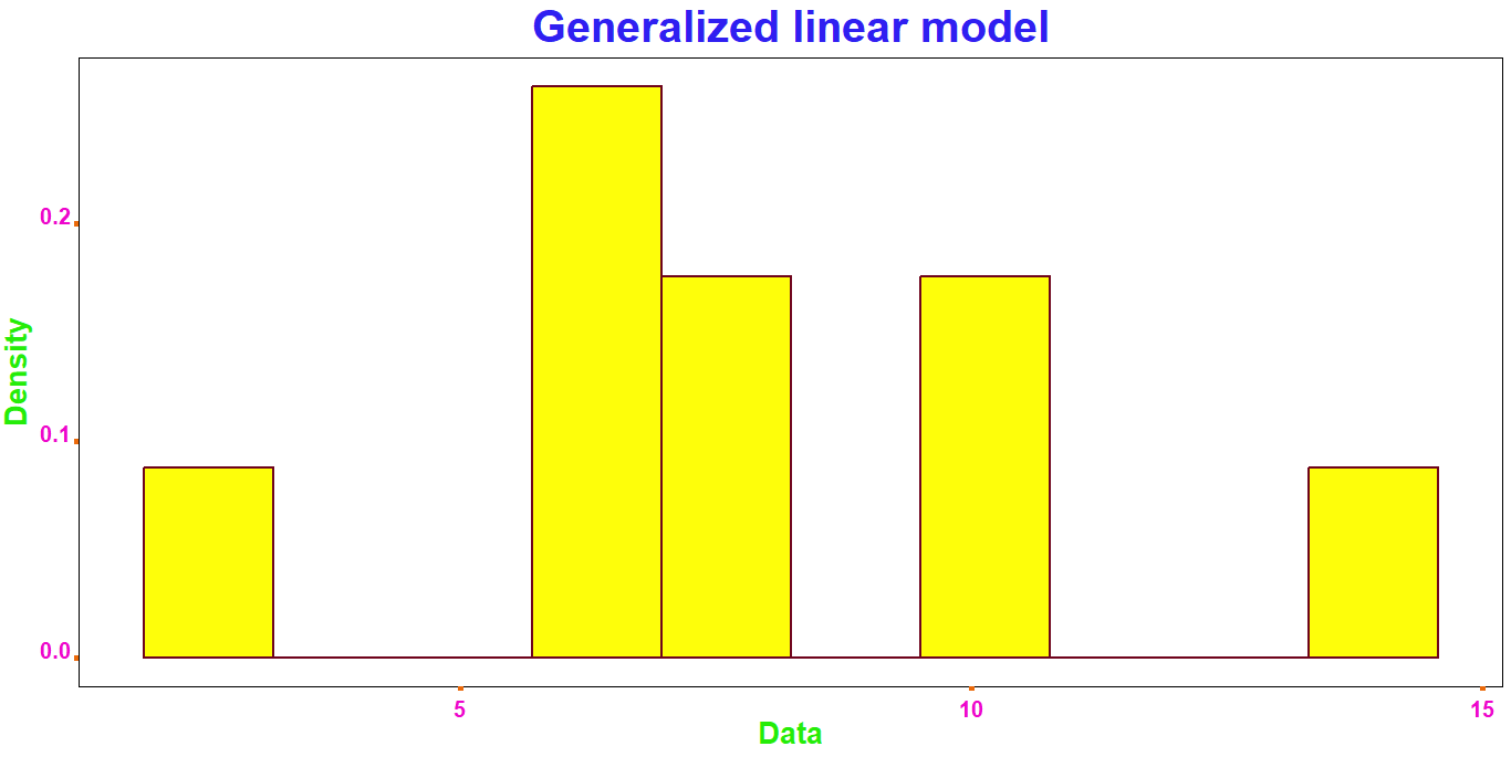
data = c(2.5, 6.5, 6.6, 6.6, 7.0, 8.0, 10.3, 10.6, 13.9)
library(fitdistrplus)
library(ggplot2)
rgb_to_hex = function(rgb){
sprintf('#%02x%02x%02x',
rgb[1],
rgb[2],
rgb[3])}
color_0 = c(111, 5, 28)
color_1 = c(254, 254, 10)
color_2 = c(237, 7, 203)
color_3 = c(237, 7, 203)
color_4 = c(235, 105, 10)
color_5 = c(235, 105, 10)
color_6 = c(37, 236, 9)
color_7 = c(37, 236, 9)
color_8 = c(0, 0, 0)
color_9 = c(255, 255, 255)
color_10 = c(255, 255, 255)
color_11 = c(255, 255, 255)
color_12 = c(47, 31, 241)
data = c(2.5, 6.5, 6.6, 6.6, 7.0, 8.0, 10.3, 10.6, 13.9)
gama_distribution = fitdist(data, distr = 'gamma', method = 'mle')
normal_distribution = fitdist(data, distr = 'norm', method = 'mle')
lognormal_distribution = fitdist(data, distr = 'lnorm', method = 'mle')
dev.new()
data_1 = gama_distribution$data
data_2 = normal_distribution$data
data_3 = lognormal_distribution$data
data_4 = ggplot(data.frame(c(data_1, data_2, data_3)),
aes(c(data_1, data_2, data_3))) +
geom_histogram(aes(y = ..density..),
bins = 10.0,
color = rgb_to_hex(color_0),
fill = rgb_to_hex(color_1),
linewidth = 1.0,
linetype = 'solid') +
theme(axis.text.x = element_text(angle = 0.0,
color = c(rgb_to_hex(color_2)),
face = 'bold',
hjust = 0.5,
size = 15.0,
vjust = 0.0),
axis.text.y = element_text(angle = 0.0,
color = rgb_to_hex(color_3),
face = 'bold',
hjust = -0.1,
size = 15.0,
vjust = 0.0),
axis.ticks.length = unit(0.1, 'cm'),
axis.ticks.x = element_line(c(rgb_to_hex(color_4)),
linewidth = 2.0),
axis.ticks.y = element_line(color = c(rgb_to_hex(color_5)),
linewidth = 2.0),
axis.title.x = element_text(angle = 0.0,
color = rgb_to_hex(color_6),
face = 'bold',
hjust = 0.5,
size = 20.0),
axis.title.y = element_text(angle = 90.0,
color = rgb_to_hex(color_7),
face = 'bold',
hjust = 0.5,
size = 20.0,
vjust = 2.0),
panel.background = element_rect(color = rgb_to_hex(color_8),
fill = rgb_to_hex(color_9)),
panel.grid.major = element_blank(),
panel.grid.minor = element_blank(),
plot.background = element_rect(color = rgb_to_hex(color_10),
fill = rgb_to_hex(color_11),
linewidth = 1.0),
plot.title = element_text(color = rgb_to_hex(color_12),
face = 'bold',
hjust = 0.5,
size = 30.0)) +
ggtitle('Generalized linear model') +
xlab('Data') +
ylab('Density')