fishRman
Authors: Pasquale Buonomo
Abstract: fishRman is a Shiny R Web Application/Dashboard that allows people to easily query, analyze, and map Global Fishing Watch data without any prior knowledge of R, SQL, and BigQuery.
Full Description: One of the burdens of fisheries scientists, researchers, and enthusiasts, is the scarcity or lack of consistent, extensive data on the subject. When such data do exist, they are often only available:
• To universities or other research institutions;
• Through bureaucratic ordeals;
• For a fee.
This issue has been tackled by Global Fishing Watch, an independent, international non-profit organization promoting ocean sustainability through greater transparency, visualizing, tracking and sharing data about global fishing activity for free.
While the datasets are indeed publicly available, they are also rather large (> 100 Gb) and quite difficult to manage, since they require proficiency in the programming language R. The first issue could be solved by subsetting and retrieving from their BigQuery public tables (years 2012 to 2020, included) only the data needed for the specific analysis, but this would require proficiency in SQL query language.
Overcoming these two major barriers, fishRman configures itself as a completely web-based, one-stop solution that provides an intuitive user interface for querying, downloading, analyzing, and mapping Global Fishing Watch data on fishing effort.
Keywords: fisheries science, fisheries management, marine biology, research, user-friendly, non-programmers, SQL, BigQuery, sf package, bigrquery package
Shiny app: https://shyentist.shinyapps.io/fish-r-man/
Repo: GitHub - Shyentist/fish-r-man: A bundle of analytics tools for fisheries scientists
RStudio Cloud: Posit Cloud
Thumbnail:

What can fishRman do?
Query
Querying data is a simple, straightforward process. Just access the application.
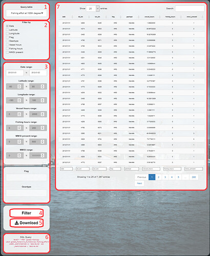
On the left side of the landing page there is a sidebar. Starting from the top, and referring to the picture below, it features a (1) select list, with which users can choose the table to query. There are two tables: daily fishing effort gridded at 0.01 degrees, by gear type and flag state, and at 0.1 degrees, by MMSI (a vessel’s unique ID).
Following, a (2) checkbox group, which updates in accordance with the selected table, allows users to choose the fields by which they would like to query the table. Ticking a box enables the (3) input box of the related field, to be filled by the user.
Note here that range inputs such as dates, latitude, longitude, vessel hours, fishing hours, and MMSI, require the minimum to be inferior to the maximum. Furthermore, the minimum is included in the range, while the maximum is not. For instance, querying by date range ‘01-01-2012 to 01-01-2013’ will return data for the entire 2012 year, and will not include the first day of 2013.
Once all choices have been made and fields have been filled, users can click the (4) filter button. This initiates the query and locks the application until one of two paths is completed:
1. Unsuccessful: Data exceeds 1 million rows, the query is aborted, and users are invited to be more specific in their search.
2. Successful: Data is ready for (5) download as a csv (Comma Separated Value) file, the (6) SQL Query is printed, and the (7) output table has been filled.
The time spent to filter, download, and render data is directly proportional to the amount of queried data, so it is advised to be specific when choosing ranges, especially date, latitude, and longitude.
Analysis
Users can analyze their data by clicking on the (1) ‘Analysis’ tab at the top-left corner of the screen. Here, the left sidebar is divided in top and bottom.
The top sidebar, (2) ‘CSV’ tab, allows users to (3) upload csv files downloaded as described in paragraph ‘2. Query’. Maximum file size is 150 MB. Once uploaded, the dataframe is treated the same as if it were freshly queried, so both kinds of data will be referred to as ‘queried data’. The header and first 6 rows of the queried data are shown in a (4) table to the right, to let users check they are using the correct dataframe.
Clicking on the (5) ‘GPKG’ tab, users can, via the (6) ‘Convert’ button, convert queried data into spatial data, which can then be downloaded as a gpkg (GeoPackage) file via the (7) ‘Download’ button. Just like for csv files, users can also (8) upload previously created gpkg files, up to a size of 150 MB, which are treated as freshly converted spatial data, so both kinds of data will be referred to as spatial data.
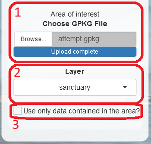
Further down the top sidebar, when spatial data are present, users can (1) upload the gpkg file of an area on which they want to focus their analyses. The area can have any shape, so users are not limited to the squares delimitable by latitude and longitude coordinates, but the (2) chosen layer must be a POLYGON or MULTIPOLYGON. This means that uploading the perimeter of the area of interest, which would be a LINE or MULTILINE object, will not work.
Upon checking the (3) “clip” box, the software will try to subset the spatial dataframe to only retain the points falling within the area of interest. If no point is found, a message is shown to the users, and the box is automatically unchecked. If at least one point is found, no message is returned, and users will be able to perform the analyses described in the next paragraph on “clipped data” and “clipped spatial data”, as we will call the clipped subset of queried data and spatial data, respectively.
Note here that , if the “clip” box is checked, clipped data will always be analyzed instead of the entire queried data, and clipped spatial data will always be analyzed instead of spatial data. So, any time a type of analysis is described as being performed on a type of data, the same type of analysis also applies to the clipped version of such data.
The bottom sidebar is where the actual analysis begins. It is divided into a ‘Descriptive’ and a ‘Spatial’ tab, for analyses performed respectively on queried data and spatial data.
Descriptive
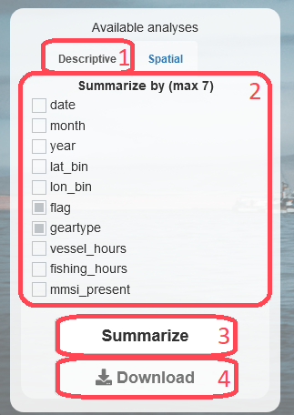
The bottom part of the sidebar in the 'Analysis' tab hosts the (1) 'Descriptive' tab, which allows users to choose any (2) field, even multiple fields at once, by which to (3) summarize the queried data. The resulting summary is rendered into a table showing measures of central tendency (where the distribution is centered i.e. mean, median, and mode) and measures of variability (the spread of the distribution i.e. minimum and maximum variables). It is then possible to (4) Download the summary as a csv file.
Note here that the measures are calculated per each combination of the factors present in the chosen fields.
For instance, one could summarize by flag, obtaining a summary for each flag ('ITA', 'FRA', for instance), or summarize by geartype, obtaining a summary for each geartype ('trawlers', 'longliners', for instance). If one were to summarize by both fields, the result would be a summary per each combination flag-geartype:
1. ITA – trawlers,
2. ITA – longliners,
3. FRA – trawlers,
4. FRA – longliners.
If no data matches a particular combination, no summary is returned for that combination.
Spatial
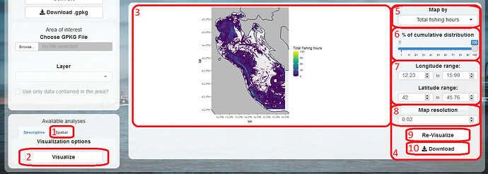
Opening the (1) 'Spatial' tab, if any non-empty spatial data is present in the work environment, the (2) 'Visualize' button can be clicked, showing a (3) plot of the data, and a (4) menu on the right side. Within this menu, users can choose (5) the field to plot, the (6) percentage of cumulative distribution to include, the (7) latitude and longitude to zoom in/out, and the (8) resolution to use. The adjustments and recalculations are performed when the (9) 'Re-Visualize' button is clicked.
At any moment, the plot can be (10) downloaded as a png (Portable Network Graphics ) file.
Note here that the default, and minimum, value for the resolution depends on the table that was originally queried (see paragraph '2. Query'), and defines the length of the sides of each cell of the spatial grid, in degrees of latitude and longitude. Data spreading over larger areas need a higher value for this field in order for the plot to be clear. Increasing this value leads to a new aggregation of data to match the new resolution.
Also note that the percentage of cumulative distribution (c.d.) is what would be called, in lay terms, “the top X%”. If users select 90% of the c.d. for “Total fishing hours”, then the entries are sorted in decreasing order for that column, and summed one by one until the 90% of the sum of all entries is reached (or as soon as it is surpassed).
References
[1] Global Fishing Watch. [2021]. https://globalfishingwatch.org/
[2] Buonomo Pasquale. [2021]. https://github.com/Shyentist/fish-r-man
