Hi HelloWorld1 and welcome to the Rstudio community! Glad to hear you found you're way to Rstudio (and as it sounds you are also using R for the first time - R is the programming language, Rstudie the integrated development environment).
Usually it is common practice to also share the data, or at least a subset, so others can reproduce your steps. You can simply copy the output dput(your_data) so others can directly include it in their scripts.
Now to your question: I assume that you have a data frame consisting not only of two but three rows - otherwise your code owuld not work. So your data frame called test3 likely looks like this:
time | mv  | ekg
x1   | y1  | z1
x2   | y2  | z2
...  | ... | ...
xn   | yn  | zn
If you are referrring to this function called findPeaks() from the {quantmod} package, it does calculate the peaks in your data before passing it to ggplot().
I have never used it before (I have expected that it returns the high values) but here you go:
library(tidyverse)
library(quantmod)
## some random data
test3 <- tibble(
time = 1:10,
mv = runif(10, 0, 1),
ekg = rnorm(10, 0, 1)
) %>%
mutate(id = row_number())
test3
#> # A tibble: 10 x 4
#> time mv ekg id
#> <int> <dbl> <dbl> <int>
#> 1 1 0.745 -0.0670 1
#> 2 2 0.766 1.10 2
#> 3 3 0.752 1.18 3
#> 4 4 0.941 -0.138 4
#> 5 5 0.358 -0.588 5
#> 6 6 0.0430 -0.918 6
#> 7 7 0.738 -1.33 7
#> 8 8 0.624 1.37 8
#> 9 9 0.243 -0.0739 9
#> 10 10 0.770 0.199 10
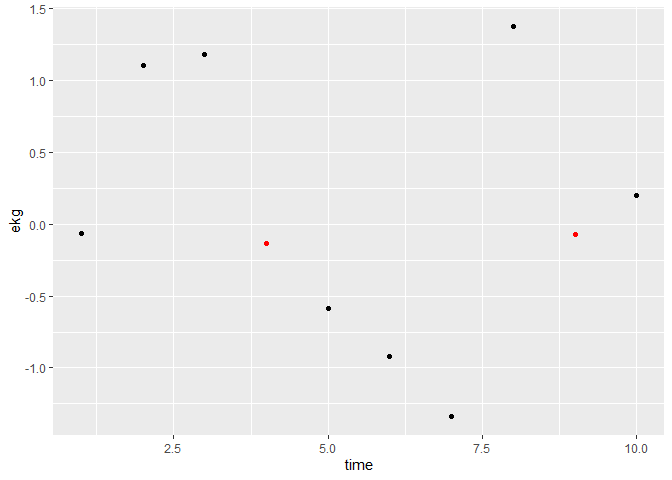
peaks <- findPeaks(test3$ekg, thresh = 1)
## either add as additional layer and overplot black points
ggplot(test3, aes(x = time, y = ekg)) +
geom_point() +
geom_point(data = filter(test3, id %in% peaks), color = "red")
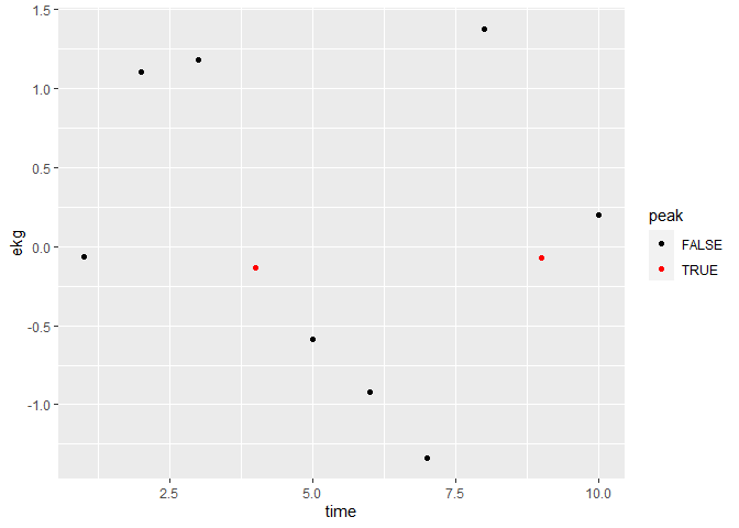
## ... or add a column and map color to that:
test3 %>%
  mutate(peak = if_else(id %in% peaks, T, F)) %>%
  ggplot(aes(x = time, y = ekg, color = peak)) +
  geom_point() +
  scale_color_manual(values = c("black", "red"))
Created on 2020-06-29 by the reprex package (v0.3.0)